121 replies
16h34m
I suspect it tests your monitor and monitor calibration as much as your color perception. In particular, sRGB displays have a pretty severely limited green gamut. If you have a wide-gamut display, the test is probably gonna appear different.
But another problem is with displaying the colors essentially full-window, which is going to be nearly-full-screen for many users. When we're staring at a screen with a particular tint, our eyes quickly do "auto white balance" that skews the results. It's the mechanism behind a bunch of optical illusions.
To address that last problem, I think the color display area should be much smaller, or you should be shown all hues at once and asked to position a cut-off point.
Author here, yes, it tests a mix of your monitor calibration and colour naming. The two types of inferences you can make with this are:
1. If two people take the test with the same device, in the same lighting (e.g. in the same room), their relative thresholds should be fairly stable. 2. If you average over large populations, you can estimate population thresholds, marginalizing over monitor calibrations.
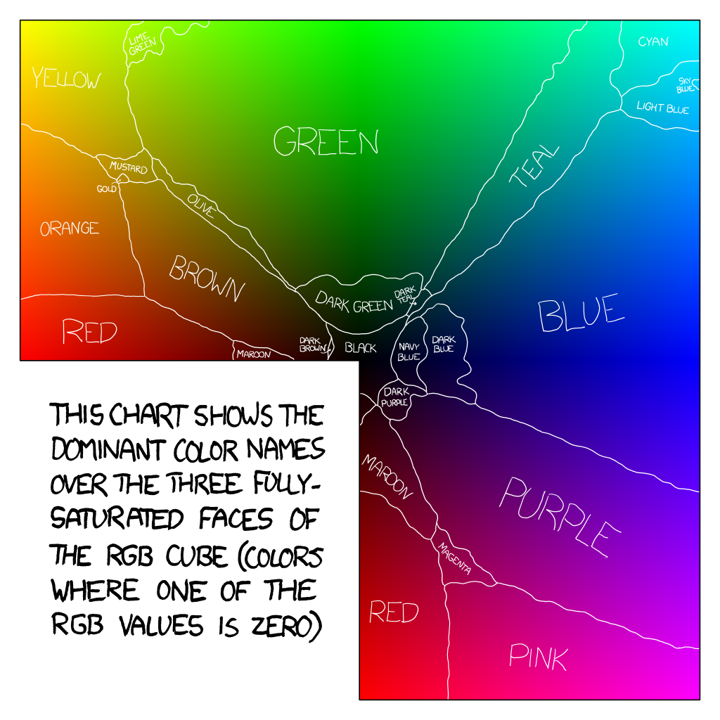
The most interesting thing for me is that while cyan (#00ffff) is nominally halfway between blue and green, most people's thresholds, averaged over monitor calibrations, imply that cyan is classified as blue. I was not expecting that the median threshold (hue 174) would be so deep into the greens.
I got hue 174 as my threshold and really I just wanted to say "neither, this is turquoise/teal" for most of the questions. But blue/green was the only option.
Me too, but I liked the conclusion ("to you, turquoise is blue/green")
That must be the perfect result. I also got 174 but it said "For you, turquoise is green."
But it isn't. Turquoise is turquoise, and since that wasn't an option, I picked one at random.
The whole point is demarcating the line between where colors seem more-blue-than-green, and more-green-than-blue.
That wasn't clearly part of the test. To be ultra-pedantic (this is HN after all), the user's choices don't say "This is more-blue-than-green" and "This is more-green-than-blue". The choices are only "This is green" and "This is blue" forcing you to just pick one, where there is no clearly correct choice. When the color on the screen is neither green nor blue, many people will just pick a random answer.
I bet if the choices actually said "This is more green than blue" the results would be different.
Or people will naturally intuit that they should choose whichever answer they think is closer to true.
On such a random internet doodad most users will pick a random answer period. To see what this thingy tries to do without wasting any time on it. I hope it doesn't try to do gather any meaningful data.
Personally I "tried" to answer truthfully at first and then went absolutely "ok f u, don't care no more" when it showed turquoise :D
Taking how you behave, and extrapolating that it to everyone, (and furthermore being unable to accept that other people might behave differently), is not a winning strategy for life.
There is no winning in life. And I'm doing fine tyvm ;)
Turquoise is blue with green , so if it asked me to pick I’d pick green. Because if they have eggs then pickup a dozen milks HN pedant here
Or most likely people will come out with a severe feeling of dissatisfaction with the results.
Turqoise doesn't feel either more-green-than-blue or more-blue-than-green. It feels neither blue nor green, and I don't see any way to compare it to either.
It's clearly more turqoise than blue. Or green.
Turqoise on a computer monitor is always missing part of itself, so maybe I should've answered based on that, but I don't think the computer monitor was the point.
176 for me its blue
180 and blue and I suspect that language also plays a part (I was brought up in an environment where the word turquoise starts with green, but now live in a turquoise-producing state where the finished product look far blue-r.)
i mean i always saw turquoise as a greenish light blue, so it kinda makes sense
I actually disliked the conclusion, because it forced me to classify turquoise as either blue or green. When it's a mix more than anything.
It lacks the "can't classify" to make it a better tool.
yeah kind of a waste of time, what is this 50% mixture of green and blue? pick one - Blue or Green
answer it should have: Its both
To be honest, when I got turquoise and had to choose blue or green, I just thought "oh whatever" and picked one randomly.
Same, my answer was “neither” after the third color so I just alternated between blue and green until it stopped.
"Neither" is the coward's choice.
Is a crab a mammal or a reptile?
Is a hot dog a sandwich?
Is a burrito a sandwich?
(Yes in New York and Indiana, no in Massachusetts, and the law is silent elsewhere. Personally I believe that because the torta exists, the burrito may have some characteristics of a sandwich but should be considered a wrap)
No, it's a calzone, per https://cuberule.com/
Of course. It's a bologna sandwich in log form.
Finally someone else realizes that hotdogs are basically just bologna.
It's an insect. 6 legs, exoskeleton, etc.
I know you're making a joke about classification, but crabs have 10 legs, not 6.
I'm not gonna fight you on that.
Try looking away between tests.
I tried twice and got 182, then 184. Which I suppose it more or less consistent.
Fun, I got 174 and when I saw the results my reaction was "but that is not turquoise!" which I suppose means I either don't know what turquoise is, or my screen has bad calibration/gamut.
I got 174 as well.
Me too... Apple Silicon era MBA, with Samsung 4K display with corresponding U28D590 driver...
Nobody knows what turquoise is
The point is to determine whether turquoise to you is more green, or more blue.
Here is a chart of HN reader results, based on two pages of comments: https://i.imgur.com/tIQfTjN.png
Mean is 176 Median is 175 Mode is 174
it looks like my default is if there is 40% green in that it is green. Thus it told me that turquoise for me is green. Which if I look at Turquoise the RGB color, that is green. If I look at Turquoise the mineral about half the time it is green and half the time blue.
Same thinking here, though I got 184
I'd love a last step in the test where you're presented with the gradient, but before showing the distribution and the user's score. Allow the user to select where they consider their threshold, then display the final results.
That's fun! I bet people would tend to nudge the threshold toward the middle of the scale. Or you could do a sorting interface, etc.
A sorting interface would be another neat step! And yeah, I think most would gravitate toward the middle. Seeing how "far off" you are would be fun :)
Ooh maybe have the user slide a gradient left and right inside a window, aligning the center of the window with where they think the line is between blue and green (i.e., instruct the user to fill the window with equal amounts of green and blue).
This test gets you sort hues along a gradient. https://www.xrite.com/hue-test
It tells me to rotate my device, implying it should work on my phone, but I can't figure out how to move the colors. Holding and sliding doesn't work. Tapping doesn't seem to do anything.
Does it not actually work on mobile?
Works on my android fine.
Ilovehue and ilovehue 2 are excellent mobile games around this sorting idea, they're quite zen and for all ages, highly recommendend!
I really wanted to be able to drag my vertical bar on the distribution to the right just a bit. :)
When I could see the entire gradient, I actually thought green continued to the right a bit more than where my line was.
Thats genius
I refuse to call cyan either blue or green. It’s clearly in between.
Just like I would never call orange yellow or red.
primary: yellow, red, blue
secondary: green, orange
cyan: not primary nor secondary.
i hope that helps.
That's incorrect.
The 3 primary colors of light are red green blue. The 3 secondary colors are yellow, cyan, and magenta.
The 3 primary colors used in printing are cyan, magenta, and yellow (why it's called CMYK where K is black).
Cyan is primary or secondary in both of the major color models.
https://en.m.wikipedia.org/wiki/Secondary_color#RGB_and_CMYK
CMY and RYB are both valid primary color sets.
RYB, being taught in grade school, has a lot of influence on how people perceive and name colors, which is what this conversation is about.
I refuse to call cyan cyan. I just call it blue-green
Yes, because (at least for me) the thought went "well that's cyan, it's not really blue but if forced to pick, cyan is more like blue so I'll click that". It's like rounding up at 0.5.
For me it was like "if forced to pick, cyan is more like green". So I kept clicking green and got 184.
For me, if forced to pick between two choices that were not correct, I'd just pick one randomly. I think this is a wording problem more than anything.
That's what I'd do if I were being paid to take the survey. Instead I just closed the window as soon as it popped up cyan and only gave me blue and green as options.
This test is useless or of very limited value.
I kept pressing green until the end because you had no 'cyan' button to press when clearly many colors were actually cyan. Cyan is not blue.
Incidentally, my color vision is perfect on all Ishihara tests.
Blue and Green and primary and secondary colors.
Cyan is not. The author decided to cut off the colors list at secondary colors. There is nothing wrong with that.
Not to be mean, but I think every assertion in your comment is wrong.
Blue and Green are English words which sometimes describe primary or secondary colors additive colors. Cyan is (an English word that describes) a primary subtractive color.
Colors are not English words. They're physical reactions inside our eye-brain systems, affected by varying wavelengths of light. (Actually that's not the most accurate description of color either, but it's a more useful model.)
Not that surprising. To most people, pure RGB-blue looks a bit violet. People are used to ink (subtractive) blue more than light (additive) blue. People call the sky blue and water blue; both are closer to cyan. Most people think of a neutral blue as something like #0080ff.
And then our mothers and teachers mock us :-(
Is this color bias the same across genders?
You're not asking gender of the test taker. Your results will be skewed because you're probably getting more men than women. Women in general have more ability to detect green vs blue.
Even more fundamentally, red-green colorblindness is a recessive trait on the X chromosome, thereby affecting biological males in far greater number than females.
It could be a high enough percentage to make the results from this site noticeably different between the sexes.
I'd check whether there are biases depending on which color you start with / which colors you present when.
Wouldn’t this then be best for calibrating VR headsets most?
I did this test with tinted sunglasses, could be another factor (boundary at hue 172)
This might be one case where it might make sense to cluster between the reported operating system. At the moment I only have a family of Macs to test, but I can imagine that Windows users with their different default gamma get back different results.
In USA:
Primary Additive Colors: Red, Green, Blue
Primary Subtractive Colors: Cyan, Magenta, Yellow
But, before digital color displays became popular, the average person had, by far, mostly exposure to subtractive (paint) colors.
US school children are taught from birth that the primary subtractive colors are red, yellow, and blue, simply because those words are easier to pronounce, and so magenta is a weird "red" and cyan is a weird "blue" , until the children discover on their own, or in specialized print/paint schools, red and blue are not primary subtractive colors.
Humans are terrible at naming things.
And to bring it back to Current Thing: Google AI cites this source for its red/yellow/blue claim, even though explicitly this source says that Google gives the wrong answer.
https://science.howstuffworks.com/primary-colors.htm#:~:text....
Will GenAI's aggressive ignorance kill sarcasm and nuance in writing? Or will people learn to ignore AI input like they ignore banner ads?
Another variable is the name of the website. If the page were called "is my green your green" perhaps you'd get the opposite result...
I checked in at hue 174, the median, which is interesting to me as I know that my wife will test to a very different hue as we have occasional disagreements on whether something is 'blue' or 'green' :)
Perceptually (that is, in CIE-LCh color space, for example), the hue component of #00ffff is a lot cloer to #00ff00 than it is to #0000ff. But the website doesn't ask which color is closer, it asks if it's "green" or "blue". And how we use those words has more to do with culture than with perception. We also call the color of a clear afternoon sky "blue", even though that is perceptually extremely far away from #0000ff.
OP have you considered doing a version for this to test contemporary Greek native speakers, vs others ("control" group),
for differentiation of blues?
I remember reading that modern Greek has two color-names for sky- and dark- blue (not sure what the prototypes are for each nor if they have hue components, maybe the "sky" blue is green-shifted?)... always been fascinated by the discussion of "weak Sapir-Whorf" around this and would be quite interested to see if there are any differences in discrimination...
The classic cognitive/perceptual psyche data to gather would be time-to-discriminate, with the prediction being that Greek speakers make faster judgement because they have higher/faster discrimination, than others.
Not sure how you'd pose the question to non-Greek speakers tho :)
I think that's just to your test forcing people to pick either blue or green even though cyan is both, they are just going to pick blue because it's the first option and more likely to be picked randomly.
I classified cyan as green because, well, it's greener than pure blue, and it's also the most greener you can get than blue, in RGB space, without losing any blue :)
Ambient light will also affect the result.
Not necessarily because the ambient light would affect the screen shows (it's emissive, not reflective) but because the brain also does "auto white/colour balance".
For a fun experiment, get your hand on some heavily yellow-tinted party glasses, go outside on a clear day with a bright blue sky.
When you put them on everything will be stark yellow tinged (and the blue sky will be completely off, like green or pink, can't recall which) but after a little while going on your business, perception adjusts and only a much less dramatic yellowish veil is in effect. You'd look at the sky and see almost-blue.
The kicker is when you remove the glasses: the sky will suddenly be of a glorious pink! (or green, can't recall) Only moments later it'll adjust back to be blue.
A certain wavelength may be absolute blue of a certain kind, but the perceptual system is all relative: "wait, I know this sky should be blue because that's what I've always seen, so let's compensate".
The same kind of effect - although less dramatic - can be achieved with lights that can be adjusted from say 2400K to 6500K and having as reference an object that is known "pure white", like a A4/letter sheet of paper.
This effect, in turn, adjusts how "absolutely displayed" colours are identified by way of biasing the whole perceptive system. AIUI that's the rationale behind Apple's True Tone thingy, aiming to compensate for that.
So the result of this test should be somewhat different depending on ambient lighting temperature.
No idea what "AUIU" is, but yes, generally displays should do automatic white balance like iPhones do. I don't know why most Android phones don't seem to do it (pretty sure mine doesn't), and generally TVs/monitors also don't do it. (The required color temperature sensor can't be that expensive?)
AIUI as I understand it
Yeah I don't know what that is
TYDUI (IMTOU) - Then You Don't Understand It (I Made That One Up) ;-)
It's an abbreviation, and you're one of today's lucky 10000 - https://xkcd.com/1053/ for an explanation of the 10000 phrase.
At least I know that cartoon. But generally people strongly overestimate how many people know various abbreviations. For years I didn't care to look up what "IANAL" means. I since have forgotten it again.
[A]s [I] [U]nderstand [I]t
Take the bracketed letters:
AIUI
The rageguy one would say either patents or "whoa the colors really pop I want that shut up here's my $$$" uncancellable LOOKATMEIAMTHESHINY mall mode, but via Occam'r razor I think mostly because they (manufacturers) simply don't care (about consumers, or about making a good product at all)
TVs/monitors (or laptops even, and more phones that you'd believe) with just a simple auto-brightness are stupendously rare even though Apple does it since forever and a half ago.
Yeah, laptops and TVs not even doing automatic brightness is even more absurd. Though Android phones have automatic brightness since forever, so why do many not have automatic color temperature (white balance)? The color temperature sensor can't be much more expensive than a brightness sensor. It's logically just an RGB brightness sensor.
Android does have a night mode which changes the white balance of the screen at sunset and sunrise, but this is just a binary thing and doesn't respond to actual ambient light.
Also my glasses filter blue light.
Fancy way of saying they have a yellow tint (:
they're more like green-ish but yeah
Then they filter also some red light...
That might explain one of my neighbors' driving at a nearby intersection.
Digital cameras also do automatic white balance (between yellow and blue) to mimic the automatic white balance of our eye/brain. If cameras didn't do white balance, outdoor photos with sunlight during noon would look extremely blueish, or indoor photos with artificial light would look extremely yellowish.
I like this illustration of how strong our natural white balance is:
https://en.wikipedia.org/wiki/The_dress#/media/File%3AWikipe...
During some heavy dust clouds from nearby wildfires, the sky was a deep and unsettling yellow. However, I couldn’t get a picture of it, because the automatic color balance removed the yellow overcast altogether.
The same problem occurs with photographing the yellow sky when dust from a Sahara sandstorm (presumably coming across the strait of Gibraltar) blows over Europe every few years. But you can set the white balance manually in the camera.
I mean, it really just tests arbitrary word usage. I have no fucking clue if turquoise is supposed to be "green" or "blue", it's turquoise!
Nah turquoise is green.
No turquoise is blue.
Within the ISCC–NBS System of Color Designation Turqoise (#40E0D0) is classified as a brilliant bluish green. Turquoise blue (#00FFEF) is close to turquoise on the color wheel, but slightly more blue.
More metrics, including sRGB, can be found on https://en.wikipedia.org/wiki/Turquoise_(color)
Apparently I thought so as well. Then again, my display is in night mode...
Oh shit. Turned off night mode and switched sides!
A bit like "is this hotdog overpriced" amd trying to binary search the exact cent where it became overpriced.
That’s easy, any hot dog that is more than $1.50 USD is overpriced.
But you get the price in another currency, and don’t know the exact exchange rate (in place of monitor calibration).
Parent was a joke about the Costco fixed price hotdog.
UK Costco hotdogs are £1.50, which is not equal to $1.50, reflecting both its arbitrary nature and that UK purchasing power is weaker than the exchange rate would appear. (Computer books are a frequent offender here of having the same $ and £ prices)
That might be a language issue. In Danish it's common to use "turkis blå", i.e. turquoise blue. Then again, you can also use "turkis grøn", turquoise green.
But with green/blue there is certain opinion that I have at least.
Turquoise is dark cyan, no? So equal parts green and blue.
the real question is whether orange is red or yellow
These sorts of tests also need to be done in controlled background lighting. Whether people are doing this in a dark room, in a sunny kitchen, or under green led lighting would be a greater factor than anything being tested.
Whether its a dark room or sunny kitchen, i'm not sure whether Turquoise is ever going to be blue or green. The entire question seems more like wordplay.
I don't think that's necessary for an informal test. Human color perception is extremely good at compensating for that and modern screens are relatively uniform and uniform besides. Cultural differences like the person downthread saying they consider anything with the slightest hint of green to be "green" seem far more impactful.
Very good point. I just realized I did this with my monitor on low-blue-light-mode.
I only realized after seeing your comment. As usual, when I turned it off to compare, the hue it shifted to looked super unnatural and I had to re-enable it.
I always forget how much white-balancing my vision does.
If sRGB has severly limited green, what would you say about CMYK?
CMYK is generally even more limited in the colorness to the end of gamut.
I tried it twice, once on each of my two different monitors (a Dell S2817Q and Dell S2409W) made a few years apart and with completely different settings; and I got 175 on one and 174 on the other. So pretty close even given the difference.
I did it on IPS laptop display and got 175. On my OLED phone I got 179. I am more in agreement with the phone results, but the turquoise on the phone looked even greener to me.
I was looking it and thinking that's turquoise. Is it closer to blue or green? Meh, it's close to the middle.
alternatively putting the color in a white box should provide enough context
Also browser choice: https://issues.chromium.org/issues/40401125
This is pretty much the same way that a calibrator works (if you have ever watched a color calibrator running, you know what I mean), but a calibrator doesn't get biased, like the human eye.
In order for it to be a true "neutral" test, each test would need to be preceded by a "palate-cleanser" gray screen, or something, and there would probably need to be a neutral border.
> you should be shown all hues at once and asked to position a cut-off point.
This is actually the way I have seen this stuff tested, before.