return to table of content

I've stopped using box plots (2021)

sigmoid10
98 replies
1d10h

box plots always make distributions look bell shaped

I feel like this is where the confusion stems from for the author and everyone else here. Box plots don't make anything bell shaped (they don't change the distribution), they assume that your data follows a bell/gaussian shape. This is correct in cases where the central limit theorem can be applied (which is almost everywhere) - but when that is not the case, the assumption is wrong and you shouldn't use a box plot anyways, because the values it shows have no real use. There are very real use cases for box plots, but people need to understand the basics of statistics before they can use them.

blueflow
23 replies
1d10h

This should be the topmost comment. Box plots are made for visualizing generalized normal distributions and nothing else.

Edited to preempt nitpick.

pocketsand
18 replies
1d8h

Why? They’re non-parametric and make zero assumptions of normality.

blueflow
17 replies
1d7h

How else would you calculate the quartiles to render the boxes?

munch117
16 replies
1d7h

Count data points in each quartile. You can do that for any sortable data, independent of distribution.

blueflow
12 replies
1d7h

If you do that in your paper, you better write next to the graph that you did that.

thaumasiotes
6 replies
1d7h

Arguing that nobody who might be professionally expected to look at a box plot can be reasonably expected to understand how box plots are defined doesn't make a compelling case that using them is a good idea.

blueflow
4 replies
1d6h

If the method how the plot boxes are calculated is not clear (this thread references at least two different methods), you'll need to explicitly write it down which methods you did use.

thaumasiotes
3 replies
16h34m

this thread references at least two different methods

No, as the sidethread comment notes, there is only one way you can compute quartiles. You seem to be arguing that the correct thing to do is to impute them, and that calculating them is such a deviant practice that it would need to be specially remarked on.

blueflow
2 replies
11h32m

Isn't this what i was saying from the beginning?

  Box plots are made for visualizing generalized normal distributions and nothing else.
And now people in this thread argue you can calculate them from something else. Not sure if you are replying to the right post.

thaumasiotes
1 replies
9h23m

That might be what you were saying from the beginning, but the only thing that that would establish is that you're completely out of touch with reality. Box plots are made for visualizing quartiles.

Your theory would imply, among other things, that the median line going through the box part of a box plot always divides it in half, which obviously is not the case.

blueflow
0 replies
9h2m

No? Exponential Gaussian?

Whatever you do, you should explain first what you do that your whiskers stay meaningful and are not just whatever randomness your outliers produced.

A4ET8a8uTh0
0 replies
1d4h

It is actually a fascinating argument that shows how little of what is being decided is based on actual data ( or at least our understanding of it ), but rather that data visualization is being used to push already pre-approved decisions with data being used merely as a 'for' argument.

I agree that if there is an indication that if most professionals don't really know what boxplot is supposed communicate, maybe it should not be used.

munch117
4 replies
1d7h

Perhaps I expressed myself poorly, and left room for misunderstanding, because I cannot possible imagine that we have any real disagreement on how to compute quartiles.

Any set of numbers I give you, you can compute quartiles for it. There is no algorithm for doing that that breaks down if the numbers don't follow a normal distribution.

blueflow
3 replies
1d6h

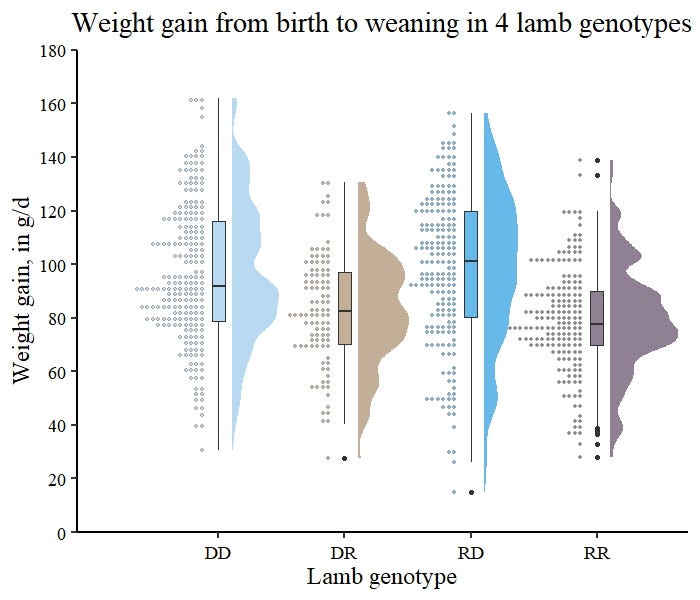
Look at this SVG from wikipedia: https://upload.wikimedia.org/wikipedia/commons/1/1a/Boxplot_...

When you calculate the box plot using normal distribution parameters, the outliers are outside the outer bracket.

If you split the dataset into 4 equal parts, the bracket will be larger because the outliers are still inside it.

The methodologies are not equal.

This thread is the first time i heard people do the "split dataset into 4 quarters" and using that for box plots.

ColFrancis
1 replies
18h57m

For what it's worth, you've convinced me that my beloved box plots need to be explained if I want to use them again.

The SVG you've provided clearly shows that the box plot splits the data in 4. The interquartile range (IQR) is clearly marked and it even has a comparison for what the standard deviation (variance) measure would be.

Secondly, if the data truly came from a normal distribution, there are no outliers. Outliers are data points which cannot be explained by the model and need to be removed. Unless you have a good reason to exclude the data points they should be included. This is why I like the IQR and the median, they are not swayed by a few wide valued data points. The 1.5*IQR rejection filter I think is lazy and unjustified. Happy to discuss this point further as it is a bug bear of mine.

blueflow
0 replies
9h54m

When i said "splitting", i meant it like my parent explained: Basically sorting your datasets and then splitting into quarters.

What you want to explain to me (IMHO to the wrong person) is the correct approach of calculating a mean and standard deviation and drawing the box from that. Lets stay with that (and thats what i said earlier in the thread)

After i wrote the post you replied to, i realized that the pure "splitting" method for box plots is nonsensical since the outer brackets interval is determined by the two most extreme values. They are too random to be meaningful. It does not make sense to draw a box plot from that.

pocketsand
0 replies
1d

As I'm sure you know, there are a lot of variations on how quantiles are calculated in various software. The 25th percentile, e.g., doesn't always line up with a value in the dataset, so sometimes nearest rank methods are used, otherwise a linearly interpolated data point, where interpolation is done in various ways.

In any event, none of these methods assume normality, or rely on CDFs of a normal curve.

If they did, every box plot would be symmetric.

The fact some people think that boxplots are constructed in such a way is a pretty good reason to take the author's article seriously as for how boxplots are confusing.

blueflow
2 replies
1d1h

On second thought, this method makes the outer brackets / whiskers pretty much useless since their position is determined by the largest outliers, which is quite much random.

Falkon1313
1 replies
16h56m

That's not how they're drawn. Outliers (More than 1.5 times the interquartile range outside the 1st/3rd quartile) are plotted as dots beyond the whiskers. The whiskers go at Q1-1.5×IQR and Q3+1.5×IQR.

blueflow
0 replies
11h35m

Better is! Look what i was replying to.

cjk2
2 replies
1d10h

This is also wrong. Gaussian curves are symmetric. Box plots do not have to be. In fact representing skew in a batch is one of the fundamental purposes of them.

crazygringo
1 replies
22h1m

But representing skew is precisely to show how "off" from a Guassian it is.

Because real data is never perfectly Guassian, or perfectly anything.

But the idea of a box plot is that it's for data which is in theory Gaussian or a similar unimodal kind of bell-shaped curve.

Then you can look at the box plot and see if it actually is -- are the two boxes roughly equal-sized? Are the lines a bit longer than the boxes but not insanely so?

blueflow
0 replies
10h5m

You model skew in Gaussian distributions by adding an exponential parameter.

munch117
0 replies
1d7h

But is that what they're actually used for?

The data has been reduced to three numbers, throwing away most of the information that you would need to assess whether the distribution is gaussian or not. If it's not, how will you ever know?

rcxdude
14 replies
1d9h

Nah, there's nothing in a box plot which assumes a bell-shape. It does, however just visualise the parameters which reasonably well characterize a smooth single-mode distribution regardless of the underlying distribution. So it's a valid criticism of using box plots, especially when the alternatives can just as well visualise a bell-shaped distribution, as well as showing when it is not.

quietbritishjim
11 replies
1d8h

smooth single-mode distribution

That IS a bell curve. While it's true that the Guassian distribution is often called a bell curve or even "the" bell curve, a non-Guassian single mode distribution is still absolutely bell shaped in a general sense.

So, although you started your comment with "nah", you're actually in agreement with the content you replied to.

conformist
10 replies
1d7h

In the mathematical sense this is clearly not true - it’s easy to come up with a smooth single mode distribution that doesn’t look like a bell.

thaumasiotes
7 replies
1d7h

Is it? How?

You could include a lot of little bells far from the single mode, but that's reading a little too much into the literal meaning of "single mode" - a "bimodal" distribution isn't one where the two most common values are both modes. It's one where there are two distinct local maxima.

The tails to the left and right must asymptotically approach zero (or you don't have a smooth distribution, because you have discontinuities somewhere), and if there's just one local maximum, your curve will look like a bell.

commathingy
6 replies
1d6h

The exponential distribution (modal value 0) is not bell shaped. If you don't like it's range of non-negative, then take some smooth mollification

thaumasiotes
4 replies
1d5h

And the smooth mollification will look like...?

canjobear
2 replies
1d3h

It looks like a spike, not a bell.

cycomanic
1 replies
23h23m

A spike is not smooth (typically meaning continuous in the variable and its first derivative), which was one of the conditions.

timy2shoes
0 replies
22h38m

Then take a Cauchy or a t-distribution. Basically anything with a longer tail than exp(x^2). The Gaussian summary will be misleading because of the tails.

pxx
0 replies
1d4h

in the simplest case... just mirror it (some call this a Laplace distribution). if you don't like how it's not differentiable at the mode there are further smoothings (see, e.g., the wikipedia article for this distribution) but this simple construction is continuous.

davidguetta
1 replies
22h50m

The bell curve IS the smooth single mode with LOWEST ENTROPY.

nequo
0 replies
19h30m

Do you mean greatest entropy? Not if the support is, for example, the positive reals.

kazinator
1 replies
8h21m

The problem is that the four quantile groups contain equal numbers of items, but are not represented by equal areas, even if we replace the whiskers with a bar of the same width as the box.

The bottom whisker contains 25% of the data, yet is just a thin line, which can furthermore be arbitrarily short.

It really is a dumb visual presentation.

The only way to use it is to recover the five parameters from it, and then stop looking at it.

For that purpose, a QR code would be just as good, if not better. You'd need a device with a camera to get the parameters (but "everyone" has that now), and when you're looking at it with your bare eyes, it doesn't tell you any visual lie.

seanhunter
0 replies
2h34m

The only way to use it is to recover the five parameters from it, and then stop looking at it.

...which is its intended use case since Tukey invented it as a way of visualising the "5 number summary". I think part of his criteria were that it should be easy to make by hand which is clearly no longer a consideration so there are plenty of reasons to just do something else most of the time these days.

Beldin
13 replies
1d10h

Box plots [...] assume that your data follows a bell/gaussian shape.

Not sure how to square that with this statement on Wikipedia's page on box plots:

Box plots are non-parametric: they display variation in samples of a statistical population without making any assumptions of the underlying statistical distribution[3]

sigmoid10
12 replies
1d10h

If you want to see why that is not fully correct you should read the article. For a box plot you need to calculate mean, variance and certain percentiles. These values don't make sense if your distribution does not follow a certain shape (because these values unambiguously define such a shape). See the examples in the article for what happens if you still try to use them in those cases. You can still extract the values of course (hence probably why wiki says they don't assume anything), but you lose significant information about the distribution. So you can no longer reverse the process.

rcxdude
4 replies
1d9h

The mean and variance are not features of a box plot. Box plots show the quartiles, which are about the cumulative distribution.

lolc
3 replies
1d8h

Which is why I find the article so compelling because I'd always read box plots as being about variance. To me the plot implied a quite normal distribution.

fjkdlsjflkds
2 replies
1d3h

Note that "not knowing how to correctly interpret a boxplot" is not equivalent to "boxplots are useless".

lolc
1 replies
22h47m

If people like me are in the audience, they might be worse than useless.

fjkdlsjflkds
0 replies
13h4m

Sure. But if someone is using, for example, a notched boxplot to quickly evaluate differences in medians (i.e., they know how to correctly interpret a boxplot), it can still be a useful plot that conveys specific information that you would otherwise not get when looking at a violin plot, histogram, kernel density estimate or a strip plot.

My point, again, was: just because a boxplot is not useful to some people, doesn't mean that it is not a useful plot (particularly when augmented with a rugplot or a strip plot). Plots are not just used to convey information to others: they are also a useful tool in exploratory data analysis.

Notice that you can also apply the same critique to almost any plot: some people don't know how to interpret a violin plot (or kernel density estimate plot) correctly... does that make them useless?

The main advantage of a boxplot is that it is parameter-free (unlike histograms, violin plots and kernel density plots) and quickly conveys very specific information (median, range, quantiles, confidence interval for the median) that other types of plot usually don't.

Evidlo
3 replies
1d8h

So you can no longer reverse the process

I've never understood this to be the purpose of a boxplot, only a means of visualizing a distribution's quartiles.

You've gotten a flood of comments from upset people, so I'll keep it short by saying that a boxplot doesn't actually do what you claim for Gaussians, as the 0 and 100 percentile "whiskers" would be at plus/minus infinity. As for a bounded bell-shaped distribution, there are several non-unique ways to define such a distribution.

crazygringo
2 replies
22h6m

as the 0 and 100 percentile "whiskers" would be at plus/minus infinity

The point is not to plot an ideal Gaussian, the point is to plot the data.

In real life the whiskers are the actual minimum and maximum values observed.

crazygringo
0 replies
2h42m

There are two standard ways of doing box plots. One is miniums and maximums, the other is the 1.5 IQR method.

The very Wikipedia article your image comes from explains this:

https://en.wikipedia.org/wiki/Box_plot#Whiskers

gradstudent
0 replies
1d7h

because these values unambiguously define such a shape

I think this is a misunderstanding, and I think it is shared by the author of the article. Boxpolots show ranges. That's it.

These335
0 replies
1d9h

Mean and variance have nothing to do with boxplots, you are mistaken.

JumpCrisscross
0 replies
1d9h

For a box plot you need to calculate mean, variance

Quantiles and medians. (Plus min and max.) Non-parametric.

treflop
9 replies
1d10h

I agree. The author simply used the wrong chart.

The author's example has a bimodal distribution (TWO peaks) and chooses a type of chart that has ONE peak (a box plot).

A little baffling tbh.

rcxdude
7 replies
1d9h

Well, to start with, how would you determine that about your distribution in the first place? And if that works well enough, why use a box plot afterwards?

WWWWH
3 replies
23h11m

Yes, exactly! Just plot all the bloody data and be done with it. No one is doing this by hand anymore so it is no extra work.

To my mind, if you have a genuine EDA attitude you plot it all.

crazygringo
2 replies
22h9m

Just plot all the bloody data and be done with it

Well no, because you can compare the datasets by eye and say questionable qualitative things about them, but you can't make definitively true quantitative statements about them.

Show me two plots of data points and I can show you two people who will in good faith argue over which one has the higher mean or higher median or higher variance. Because you often can't tell.

The entire point of something like a box plot is that it does part of the quantitative analysis for you. You can see where the median is. You can see the width of the quartiles.

theamk
1 replies
15h30m

But there are much better ways to do this than box plots! Lots of CS papers use CDF and it's great and very informative once you get used to it (although you do need to get used to them). You can have violin plots with all the box plots elements and more. Even if you want to restrict yourself to quartiles, author's design concepts with narrow/wide bars makes much more visual sense, and still convey exactly the same information as box plots.

crazygringo
0 replies
2h33m

It depends on the purpose.

CDF plots are great for plotting a single distributions, but contain way too much information if you want to plot 6 distributions next to each other for easy comparison.

Violin plots are interesting but also quite complicated, since you have to arbitrarily choose a kernel shape and this artificial smoothing can make it look like you have much more data than you really do.

I really don't like the author's "alternative designs" because I think they're even more open to misinterpretation than box plots. It's hard to judge though, because the central problem is that the author is trying to represent a bimodal distribution, and shouldn't be using box plots or the 2 "alternative designs" for that.

treflop
0 replies
1d9h

Well usually when you are analyzing some data, you toss it into the most basic chart like a histogram.

And a histogram for the author's example is perfectly acceptable to show that single data series.

But imagine if you have 10 different normal data series and you want to compare their medians and distributions between each other... well are you going to put 10 histograms side by side and expect the reader to compare them? No -- that's where the box and whisker plot shines.

smcin
0 replies
1d7h

Simple, use a histogram.

The author's first histogram clearly shows most of the distribution lies in [20,100), then the [10,20) bin is empty but the [0,10) bin is quite full. Hence, that's not a single-mode distribution. It has two modes, one around [50,60) and the other in [0,10).

cjk2
0 replies
1d9h

Because it's very hard to rationally compare multimodal batches without single test statistics. And they present five summary figures for each batch, each of which are reasonable metrics to compare batches with.

thaumasiotes
0 replies
1d7h

and chooses a type of chart that has ONE peak (a box plot)

Huh? A box plot doesn't have any peaks. A box plot is a histogram subject to the constraint that every bar in the histogram is equally tall. There can never be more than zero peaks.

ozyschmozy
6 replies
1d9h

There are very real use cases for box plots,

The author argues otherwise, can you give an example of a use case where box plots would be preferable to the alternatives the author suggests?

rzmmm
2 replies
1d9h

Often people are interested in exact quantitative statistics like IQR, median, top/bottom deciles which are commonly represented in box plots. The alternatives are visually simpler but they contain less quantitative information.

oefrha
0 replies
1d7h

The alternative plots in TFA after

Design concepts such as the ones below make more ‘visual sense’ than box plots:

present the exact same info in much less visually confusing ways, through the use of brightness (weight) and area. Just better box plots.

And of course you can always draw some lines for the quartiles on any kind of plot with a linear scale for the value.

ajuc
0 replies
1d5h

If you want quantititive information it's better to use a table anyway - precisely because it doesn't mislead you about the internal distribution.

ohmyiv
1 replies
1d9h

There are very real use cases for box plots,

The author argues otherwise

No, in the article he says he wouldn't recommend them _in most_ situations. It's a part that a lot of people here seemed to have missed whether arguing for or against box plots.

Despite making more visual sense than box plots, I still wouldn’t recommend these design concepts or box plots in most situations because…

(Emphasis mine)

Ringz
0 replies
1d9h

From the article:

„So, no, I can’t think of any situations when a box plot would be the truly best choice, other than those in which the audience demands box plots because that’s what they’re used to seeing. If you can think of any such situations, though, please let me know on LinkedIn or Twitter.“

„Other reviewers suggested that the conclusion should be that box plots are a useful chart type, but only for statistically savvy audiences. Again, I’m going a step further, suggesting that even those audiences would be better served by other chart types in virtually all situations.“

cjk2
0 replies
1d9h

Comparing location, spread and skew of multiple batches.

cjk2
5 replies
1d10h

Exactly this on the last point. Although rereading this the distribution point is explained poorly.

People waltz in with assumptions and then complain when they don’t work because they don’t really understand the tools they are using. The author is one of them. It’s a bad article and the author should not be using or demonstrating things they clearly don't understand.

munch117
4 replies
1d8h

Isn't that the whole point? That the graph type is very easy to misunderstand. If you are right, and not even a professional data visualization consultant properly understands the graph, then who will?

cjk2
3 replies
1d8h

Some of us are perfectly qualified to understand them and the nuances.

munch117
2 replies
1d7h

A plot that requires the reader to be perfectly qualified is a bad plot.

cjk2
1 replies
1d7h

They teach this to 15 year olds in the UK.

If it's a bad plot, perhaps some introspection is required...

magicalist
0 replies
23h30m

They also teach pie charts and use color scales with non-uniform brightness. Just because it's possible to read a plot doesn't make it a good plot.

crazygringo
4 replies
1d1h

Yes.

A lot of people here are commenting that no, technically box plots don't assume any distribution. And I mean, technically you can ride from NYC to SF in a lawnmower.

But I completely agree that box plots shouldn't ever be used for anything but unimodal distributions similar enough to a bell/gaussian distribution.

All of the criticism of the article seems to be that they're misleading when the distribution is not bell/gaussian, e.g. bimodal.

To which my reply is, of course. Box plots shouldn't be used then. But if your distribution is bell/gaussian, they seem fine and I see no particular issue with them.

theamk
0 replies
15h34m

Well, how do you readers know if your distribution is bell/gaussian? Sure, sometimes you plot means of large samples, and then it is true by construction; but a lot of time people use box plots when there is no intrinsic reasons for data to be gaussian. Like most experimental papers.

Or take the first example from wikipedia page on box plot [0]: "Box plot of data from the Michelson experiment", which is just 20 points per run. Would I want to see this in the paper? No please. There is no evidence that the experimental data is gaussian (or even single-modal). Or further down that page, "A series of hourly temperatures" - why would one box-plot it either?

And even if you claim your data is gaussian by construction, maybe because you surveyed lots of people - I still want to see the evidence, as it's pretty simple to make experimental mistakes that turns data non-gaussian (say you only surveyed two neighborhoods with very different properties)

In other words, the domain where box plots are sufficient is very small. Most publications should never use them.

[0] https://en.wikipedia.org/wiki/Box_plot

pictureofabear
0 replies
22h0m

This article is very click-baity.

Boxplots are a single tool for data analysis. They do not apply in every situation, nor do any other tools. The same goes for pie charts, which are constantly being accused of always distorting data. Pie charts, like box plots, have their place.

mannykannot
0 replies
15h0m

The article's full argument seems to be that there are alternatives which are applicable where box plots are not and, at least in most cases, better where they are (there is a tacit (IIRC) subtext of "given that we're using software to do the plotting.")

This is debatable, but noting that box plots are satisfactory for unimodal gaussian-ish distributions is not a very persuasive response.

hoosieree
0 replies
16h33m

Murphy's law for data viz:

If a plot can mislead, it will.

IanCal
4 replies
1d9h

they assume that your data follows a bell/gaussian shape

No they don't. They show quartiles mostly, and don't assume symmetry or any parameters of a gaussian.

kamma4434
3 replies
1d7h

What you say is technically correct, but in the sense where you can put rat poison in One of those ceramic cookie jars they sell in houseware shops. There is nothing wrong in doing it, but it may lead to interesting failure modes Because someone can have implicit assumptions about what’s in there.

afiori
2 replies
1d3h

Quartiles are relevant for almost any distribution

crazygringo
1 replies
22h12m

If by "almost any" you mean "unimodal".

Quartiles are not relevant, i.e. can be highly misleading, for a bimodal distribution or beyond...

afiori
0 replies
21h48m

they are misleading if you assume unimodality, but are always relevant. If you care about how many modes there are then likely you would prefer deciles or centiles.

But even in the first image of the article the fact that two quartiles are close together means that there some density peak around there.

I agree with the author that box plots are not good plots, but quartiles/deciles/medians are useful even for multimodal distributions

fnordpiglet
2 replies
1d1h

Sorry I don’t understand. The central limit theorem describe the distribution of the sample means from a population. It describes the distribution of the mean, not the distribution of the population itself. The shape of the distribution of the sample mean isn’t super interesting when you’re interested in the distribution of the samples themselves as a proxy for a population. So I’m not sure I understand your assertion. Could you explain more your reasoning? Maybe I’m missing something, but the estimation of the sample mean distribution isn’t the only metric that’s useful, and almost nothing in nature is normally distributed otherwise. Normal distributions are generally a useful assumption mostly because of the analytic form of the Gaussian and our understanding of how to work with it. But that estimation isn’t useful as it might seem. A Poisson distribution is much more common for instance.

sigmoid10
1 replies
10h58m

I't appears you don't understand the central limit theorem fully. You gave the definition you find in textbooks, but you don't see how it applies to real world measurements and already explains your question. I can only recommend to visit a university level statistics course at this point. Maybe you will understand when you actually deal with some real data. Then you will indeed see its consequences pop up everywhere. The issue (also for the blog author) is that it is often implicitly assumed. It is one of many common pitfalls in statistics. You should also learn what the difference is between a poisson and a gaussian distribution. They may look similar, but there is a drastic difference in their definition and they are used in very different circumstances.

jncfhnb
0 replies
6h27m

The GP here did not claim a poisson was the same thing as a Gaussian. They also don’t look similar.

As far as I can tell you’re making the introductory student error of thinking the central limit theorem means any sufficiently large sample makes a distribution look normal.

imachine1980_
1 replies
23h4m

Could you please elaborate on the reason? I assume it’s related to a unique null derivative instead of multiple maxima, but I couldn’t find any papers or information on this.

Additionally, I find the article informative but believe it could be improved with this clarification. As someone who has worked with data analytics but is not a mathematician or actuary, I know people who probably review these types of graphs. Now, I understand that it is essential to check the underlying data distribution to avoid being misled by the information, even if the source and axes seem trustworthy

sigmoid10
0 replies
9h4m

related to a unique null derivative instead of multiple maxima

I think the word you're trying to use is "bimodal" and yes, that is one example where the author's reasoning fails. But it's not the only one.

I couldn’t find any papers or information on this.

You said you have no formal higher education in mathematics - how would you even go about finding (let alone understanding) papers? Regardless, just to be clear, this is not something you would learn from papers but from introductory textbooks and university courses. Everyone who has to deal with statistics in science needs to go through a whole lot of extra education exactly because there are many pitfalls like this.

it is essential to check the underlying data distribution to avoid being misled by the information

That is another half-truth that everyone on the outside seems to agree on, but it is useless in practice. What do you do if the underlying data is not accessible. And what if you don't have the means to process it for every paper you read (which is what usually happens)? Then you have to rely on the actual tricks of the trade, which will come naturally if you worked with tons of statistics before. There are lots of telltale signs that let you spot bad analyses by only looking at a plot or summary chart. Granted, you won't catch all of them, but it often takes real malice and deep statistical competence on the author's side to cover up these things.

amelius
1 replies
1d8h

A bell shape has no minimum/maximum, like the box has.

Hendrikto
0 replies
1d7h

In theory. In pratice you always have a finite sample size and thus a min and max.

wesleywt
0 replies
1d9h

This is exactly why the author says you should stop using Box plots. The plot is easy to misinterpret.

vehemenz
0 replies
1d4h

The argument is more about the relation between the visualization and the audience, not the data and the visualization. I see a lot of commenters missing this point.

lkdfjlkdfjlg
0 replies
1d8h

Boxplots don't assume anything about your data. They just measure percentiles and put them on the y-axis.

kylebenzle
0 replies
22h45m

Yes! You are right and my gears were grinding the whole time reading that article because right of the bat they make some gross and incorrect assumptions.

A box plot isn't trying to show the same thing a histogram is, it's like saying we should stop using Venn diagrams because they confuse people when trying to show the exact amount of overlap, so pie charts are better...

It's silly.

jncfhnb
0 replies
1d2h

people need to understand the basics of statistics before they can use them.

they assume that your data follows a bell/gaussian shape. This is correct in cases where the central limit theorem can be applied (which is almost everywhere)

You sir just failed basic statistics

mkl
17 replies
1d10h

The only advantage box plots had is that they can be drawn by hand. Now that computers are ubiquitous this is no longer valuable.

Violin plots and bee swarm plots are better. Jittered strip plots can be okay if you're careful to avoid saturation (or more points added in the saturated region will disappear as they can't make it any darker).

sanderjd
7 replies
1d

Could you summarize the criticisms in this (pretty long) video, and what she is proposing as a better alternative (beanplots? or is she criticizing those too?)? I couldn't figure it out from perusing the transcript.

I think it's useful to be able to compare the approximate shapes of histograms during exploratory data analysis. Is the thesis of this criticism that this isn't actually a useful thing to do, or that violin plots don't achieve this, or is it "just" an aesthetic argument?

seanhunter
2 replies
12h54m

The summary is she is saying you almost always want to show one of two things (and not both):

1) To show the distribution, in which case just the histogram arranged horizontally in the traditional fashion is far better than a violin plot with 2 copies of the histogram vertically and some extra quartile stuff tacked on, especially since lots of standard libraries to do violin plots do kde with very extreme smoothing so the distribution they show can be very misleading as to the real empirical distribution.

2) To highlight the summary statistics (quartiles and median) in which case just the boxplot is better because generally these are hard to read on a violin plot

In case #1 this is usually because the distribution differs significantly from a Gaussian in some interesting way that would make a boxplot irrelevant or misleading. (eg it is bimodal or multimodal).

In case #2 this is usually because the distribution is Gaussian (or otherwise standard) and you want to compare it with other standard distributions. You don't need all the information in the histogram and to include it all would obscure the important point(s) you're trying to make about the median and quartiles. What is considered standard is going to depend a lot on the domain, audience and subject matter. In her case, she's an astrophysicist, so if you're looking at say red shift data from some observation, other astrophysicists will know the distribution you would expect to get from that sort of observation for example.

That video is basically a summary of all the conversation attached to this article in some ways.

hoseja
1 replies
9h47m

3) They look like THAT

seanhunter
0 replies
7h3m

Well yes.

interroboink
1 replies
22h58m

Her criticisms of violin plots seem to be (1) they combine histogram-style information with box-plot-style information, when you generally would only want one or the other [ie: don't use boxplot for bimodal, don't use histogram when boxplot suffices], (2) The histogram-style information is not comparable between blobs of data, since they're not visually aligned, have no tick marks, etc — a plain histogram is better for this, and (3) she finds them ugly on a personal level.

EDIT: Maybe she'd be fine with using them in an exploratory manner. She seems to mainly be complaining about using them in publications, meant for other people to consume. Also: I did not watch the entire video (:

sanderjd
0 replies
21h35m

Thanks for this summary! I definitely hadn't seen the point about comparability between blobs of data because of the alignment. But that really seems like an odd point to me, as I almost entirely see / use these with time series data, where pretty much the whole point is to compare the evolution of the values over time using their "vertical" location, with a was to see the shape of a distribution of values at each point in time, at a glance.

SebastianKra
0 replies
20h48m

Her argument that convinced me, is that the same result can always be better represented with multiple histograms - z-stacked, side-by-side, 3D or ridgeline-plots (ridgeline plots look awesome). Check out her examples at 21:11.

Compared to these alternatives, violin plots are comically bad.

Aachen
0 replies
20h3m

The two other replies are her main point(s), but the video also spends some time on another issue that she labels as minor but I found interesting to hear the perspective on. I'll try to do it justice:

They look like vulvas. We're all adults, it's not a problem typically, but given that it's an aesthetic choice (noticing how half of the chart conveys the same info without this property), why? And it does come up, like if someone does make a joke about it, a room full of typically only well-meaning men will now look to her if she's comfortable with the joke and, what was okay before, now turns into a feeling of being singled out and outside the rest of the group

frodo8sam
5 replies
1d10h

I'll take a plain histogram/kde plot every day of the week over those damn violin plots. I think box plots are quite usefull as they are easy to read but only if you trust the author has actually looked at the histogram. And you can typically not trust the author to have done that.

catlifeonmars
0 replies
18h30m

For the latter, it looks like the histogram is probably sufficient. The violin plot just adds extra visual noise.

klysm
1 replies
1d3h

A violin plot is literally just a KDE sideways.

seanhunter
0 replies
12h50m

It also has a box plot tacked on because "why not"?

mkl
0 replies
1d9h

Violin plots essentially are KDE plots, but you can put multiple of them on the same axes to compare groups.

klysm
0 replies
1d3h

100% on the money. Box plots are an archaic technique for working around limitations that no longer exist.

jhbadger
0 replies
1d9h

I'm surprised the article just briefly mentions violin plots. Those are becoming popular in biomedical research -- much more common than the plots he suggests. And you can always overlay them with the jittered points if you want too.

iainmerrick
14 replies
1d6h

Lots of people defending box plots here -- a lot more than I expected!

What I don't see is anyone saying "box plots are useful because they're the best kind of chart for [specific use case]". I can't off-hand think of any situation where I'd rather see a box plot than a strip plot or violin plot. When and why would you want to summarise the data so coarsely and visualize it so un-intuitively?

lkdfjlkdfjlg
4 replies
1d6h

What I don't see is anyone saying "box plots are useful because they're the best kind of chart for [specific use case]".

Box plots are useful because they're the best kind of chart for when I have multiple populations and I want to quickly glance whether it's reasonable to assume that the populations have the same median, or not (you do that comparing not just the medians of the populations but also the shaded areas)

weebull
1 replies
1d2h

If you're only comparing medians, then just plot the medians. Why a box plot with the quartiles?

lkdfjlkdfjlg
0 replies
22h53m

Ok, so the difference between medians is 42.7. Is that a lot or a little?

johnbcoughlin
1 replies
1d3h

I can't see why a jitter plot with dark lines marking the quartile wouldn't be strictly better for this.

aniviacat
0 replies
1d3h

That's just a box plot with extra steps.

Sure, the jitter plot provides more data, but if you only make use of the quartiles anyway, that extra data is but an unnecessary distraction.

kaitai
3 replies
1d1h

I deal with a lot of business people who have processes that rely on 15th/85th percentile, or 25th/75th percentile. They want to see the median, the low/high percentiles, the max/min or outliers, and they don't want to see all the data points jittered in between. It's just overwhelming extraneous information. They in fact like tables with those numbers written down, but they want to compare ten different (time series of historical prices for different markets) and see it on one Powerpoint slide. The box plot allows a fast visual comparison of medians and other key percentiles (label the plot with the percentiles if you're doing something non-standard!). With jitter or violin they get hung up on weird random stuff and it derails meetings.

Important caveats: the generating processes for all these quantities are the same in a physical sense, so they are comparable. All the distributions are roughly lognormal-ish, so they are single-peaked distributions, as folks are discussing here. The point of the visualization in theses cases is not to understand the properties of the distribution per se, it's to show the important percentiles because they have business implications.

callalex
1 replies
12h0m

Who drew those boundaries at 15/85? What makes those boundaries useful or correct?

s1artibartfast
0 replies
9h40m

It sounds like they are business relevant parameters. They are self selected and independent of the data or distribution.

The point is that they are parameters of relevance to observer.

I work in medicine sometimes work with box-plots for this reason. The questions "what is the 25th percentile outcome" is perfectly legitimate

iainmerrick
0 replies
22h37m

That’s a good explanation, thank you!

DonsDiscountGas
3 replies
1d4h

Violin plots are massively overhyped, IMHO. If your data is simple and unimodal, use a boxplot. If the distribution is more complicated and you need some detail, use a histogram or a ridge plot. Violin plots are never the best option; they're curvy so a little more pretty but don't do a good job of conveying information.

inciampati
1 replies
1d3h

They really help when you're working with huge numbers. It's just a different kind of density plot. A vertical histogram can be nice too. Or you can use color and overlay a few regular old histograms. Go wild.

parpfish
0 replies
1d2h

Overlaid histos can be confusing because people don’t know if they are stacked or overlapped.

One solution is to smooth into a kde and then use transparency to indicate overlap, but that’s introducing more complexity than you want for a quick n dirty first pass

weebull
0 replies
1d3h

If your data is simple and unimodal, use a boxplot.

How is the reader to know you've used the right plot? How are they to know that you haven't hidden a bimodel dataset behind a box plot because it makes your conclusions easier?

If the distribution is more complicated and you need some detail, use a histogram or a ridge plot. Violin plots are never the best option; they're curvy so a little more pretty but don't do a good job of conveying information.

They are just multiple, non-overlapping histograms plotted next to each other. They allow you to compare distributions without them getting in the way of each other.

I can understand if it's the fitted PDF that you think hides the original data. That is unnecessary IMHO.

s1artibartfast
0 replies
10h40m

When and why would you want to summarise the data so coarsely and visualize it so un-intuitively?

Sometimes less is more; Box plots are specifically good for showing and comparing quartiles.

If you want to compare several groups and care about gross differences, they are an excellent tool. They are an excellent to when you believe the data is normal and think the histogram is misleading. they are also great if you think the data isnt normal but care about quartiles.

Any time you would be happy with a table of the 5 datapoints (min, max, median, 25th, and 75th percentiles), box plots a great tool for graphic comparison.

SillyUsername
14 replies
1d10h

So the diagram should not be used because of an education problem with some audiences?

Isn't that a bit like banning cars because some people can't drive?

Some diagrams are simply not for mass consumption and this is one, particularly because it is designed to illustrate an interpretation of ranges instead of the direct/linear representation of the raw data.

Of course I'd illustrate this fact as a Venn diagram comparing "box diagram" Vs "people" (intersection those who understand it) but I'm afraid the universal set may be mistaken as "those people who don't have eyes" rather than literally everything else.

Perhaps we should stop using that too, since it's non obvious what the universal set is.

All diagrams have some ambiguity and can be misinterpreted, sometimes it's deliberate (e.g. bar chart vertical axis not starting at 0 or scale not being linear) and that's why there's the saying "There's lies damn, lies, and statistics." That doesn't mean some diagrams are not useful, just that it's not suitable for some audiences who may misinterpret the data.

quenix
3 replies
1d9h

Driving isn't a medium of communication, so this is an apples to oranges comparison.

If a medium of communication is misunderstood and found to be misleading to your audience, it doesn't really matter whether it's an education problem or not. It ceases to be a good communication medium.

The entire purpose of data viz as the author discussed is to convey ideas to other people. The author argues that people tend to misunderstand this specific chart type. It is valid, then, to dismiss the visualisation as bad for public communication.

Unfortunately, the technical merits of these things don't matter if most people don't understand them.

SillyUsername
1 replies
1d9h

As I've mentioned in other comments less succinctly, data hiding is sometimes useful of for drawing attention to other areas.

There are the better graphs the author mentioned for general purpose use, but the graph itself isn't at fault any more than using a bar chart with a poor scale (e.g omit 0-20) to do the same hiding.

cqqxo4zV46cp
0 replies
1d8h

What specific issue do you have with this article? “The graph itself isn’t at fault” is very “guns don’t kill people, people kill people”. Who cares? This distinction is utterly meaningless semantics. Why do you feel a need to ‘stand up’ for box plots? Why is this a tribalistic religious war?

JumpCrisscross
0 replies
1d9h

Driving isn't a medium of communication

There is a lot of implicit (e.g. traffic signals) and explicit (e.g. indicators and horns) inter-driver communication that is at the heart of most crashes.

mkl
3 replies
1d10h

When there are alternatives that are clearer and also don't have this education problem, why use box plots? You seem quite keen on them, but why?

SillyUsername
2 replies
1d9h

There are a few advantages (see visualization section here pls http://en.m.wikipedia.org/wiki/Box_plot ) but my main concern is that the problem is not with the diagram, it's with idea that it's somehow faulty.

Sometimes you may want to highlight some core representation of data without the distraction of outliers (yes that does mean some people will use it for deliberate misrepresentation). But in this regard it's useful, as is on bar graphs not starting the vertical at 0 (because you want to illustrate relate difference not absolute amounts).

Angostura
1 replies
1d9h

The article doesn’t really argue that they are “faulty” just that there are better alternatives in the large majority of cases. I think he makes a compelling argument

SillyUsername
0 replies
1d9h

Fair enough, it was the comment that "better-designed chart types" that caught my eye. "better designed for general use" should have been the context I read it in.

317070
2 replies
1d10h

It's not like banning cars, it is like banning horse carriages on high ways.

We have better technology nowadays, including for plotting, so why not ditch the old?

The author of the blog post has some good arguments. From your post, I cannot distill an argument as to why you would prefer specifically a box plot over a strip plot.

SillyUsername
1 replies
1d10h

Yes the other diagrams are better for mass consumption, and illustrating direct representation of the data distribution.

But that's not the purpose of a box diagram and the article even did a side by side comparison showing an apples and oranges comparison of 2 total different representations of the data.

Those diagrams were never meant to represent the data in the same way.

The article simply could have shown a better way of illustrating the data, rather than implying box diagrams are incorrect, which they aren't, any more than choosing a bad graph or axis is (CF. parent comment)

cqqxo4zV46cp
0 replies
1d8h

IIn all of your replies you make snide reference to “general audiences”, “mass consumption”, etc. You very obviously place yourself in a higher class because of your ability to correctly interpret box plots. Can we please just move past that though? The vast vast vast majority of box plots are for “general consumption”. The vast vast majority of box plots are used in place of a more suitable chart type. You seem to be arguing that, because a box plot is hypothetically suitable for some (in the grand scheme of things) corner case, that the author’s point is faulty. I think that you are completely overstating the importance of the hypothetical ‘correct case’. You’re getting stuck on a point that nobody, least of all the author, is making.

sloowm
0 replies
1d7h

Why would you even use plots at all. You could just show the numbers for the 4 points represented in the box plot and people with proper education would understand. If people need diagrams it's just an education problem with some audiences.

But the real education deficit shown here is psychology education. Humans are bad at doing some calculations inherently. They are not able to properly asses pie charts and easily confused by numbers with a lot of digits. Even before these studies were done people were able to come up with visualizations that were better suited for human understanding.

People chose to use box plots because the visualization was better to understand by people than the numerical representation of the same information. Luckily there are now even better tools to represent the same numerical data in a way that is even better to understand.

So, if you are truly educated properly you don't use visualization.

munch117
0 replies
1d5h

So the diagram should not be used because of an education problem with some audiences?

A problem like this one that he mentions, "People associate longer shapes with greater quantity", is not something you can fix by teaching. Even if you know intellectually that the association is, in this case, wrong, you can't free yourself from the association. It's hardwired into the brain.

People who work with this sort of diagram a lot will eventually build up context-specific associations that work better, overriding that instinct, to the point where it feels seamless. But even if it feels seamless and easy, the dissonance is still there, and may lower your comprehension speed and slightly impair your judgment.

As a statistics expert, you are never going to notice that, because your baseline comprehension speed and judgment on the subject is so good, that this very minor impairment is lost in the noise. So you may not be a good judge of the usability qualities of the diagram type.

cqqxo4zV46cp
0 replies
1d8h

If this is your approach, the only way you ever could’ve made anything actually useful is by sheer coincidence. Box plots, and their alternatives, are communication tools. Do you not care to find a more clear way to communicate? In drawing an immediate comparison with banning cars, you’re being completely unjustifiably standoffish.

cjk2
13 replies
1d10h

No you shouldn’t stop using box plots. You should use them for when they are appropriate - showing location and spread. And not shape! There’s absolutely no information on modality or distribution presented past quartiles and limits.

They are mostly useful for comparing batches not analysing an individual batch.

The author doesn’t know what they are talking about and is telling people as if they do. If he read any of Tukey’s material he might know. But no name dropping is enough clearly…

ohmyiv
7 replies
1d9h

No you shouldn’t stop using box plots. You should use them for when they are appropriate

Yes, the author is aware of that. They even stated so:

Despite making more visual sense than box plots, I still wouldn’t recommend these design concepts or box plots in most situations because…

Seems a few people missed the "in most situations" part. He's saying he stopped using them for whatever reasons because it isn't working for his audience. So as the title suggests, maybe we should all take a look at our use of box plots and see if there are better alternatives.

Also remember who he's talking about when it comes to reading box plots. He's not talking about people who understand box plots. He's talking about others that don't know or understand box plots, which seems to be thousands of people he's had to explain it to, according to him.

cjk2
6 replies
1d8h

The author doesn't use the correct terminology and does not understand box plots themselves so they are in no position to explain them to anyone. They explain in terms of absolutes with no rational or scientific explanation and entirely miss the point of the methodology and tools. That is a not a good position to start or a good person to take advice from.

Not only that, the cases presented are likely better dealt with via inference tests. But the author's knowledge doesn't extend that far. And even going as far left, the posed question isn't even defined in the article. So how was a suitable methodology chosen? Well it wasn't - lets just throw this pretty picture up and whine about it.

The author is way out of their depth and should retract the article and take a formal, accredited statistics course.

ohmyiv
2 replies
1d8h

The author is way out of their depth and should retract the article and take a formal, accredited statistics course.

Maybe you should learn about the author before you make such assumptions. I find it hilarious you think he should take statistics courses when he teaches data visualization workshops to places like NASA, IRS, and the UN.

I'm done with this thread. Such a joke.

cjk2
1 replies
1d8h

Oh I know the author.

Just because you’re high profile in the data viz industry doesn’t mean you should be commenting on statistics especially with such a clear misunderstanding going on.

Some of us are definitely more qualified to speak on these matters and we still don’t think we’re qualified to teach it.

ubercow13
0 replies
1d2h

If box plots require an formal and accredited statistics course to understand, but as you mention they are taught to 15 year olds (presumably incorrectly) in school and used by people with power making decisions that affect everyone in organisations such as the UN and NASA, then even if the author is unqualified it seems their point is 'accidentally' correct. No one should be using these plots except extremely smart and trained people who do know how to read them, as it could have serious negative consequences.

cjk2
0 replies
1d8h

Nope.

I'm not one to appeal to authority either which is why I am making objective arguments about what is presented.

And yes he should go on a stats course. I dread to think the chaos he’s spread to people who don’t know better.

pocketsand
0 replies
1d8h

I do stats and data viz for a living and the article seemed perfectly reasonable to me.

He isn’t dogmatic.

He makes reasonable arguments.

I’m confused by these hopelessly uncharitable readings of the article.

magnio
3 replies
1d7h

You are looking at this as a technical problem, where box plot is a compact visual representation of variance and outliers that is perfectly perfunctory as it is cromulent.

The author is approaching this as a human problem. Plots are not made for machines, they are for people to read, and the author specifically wants as many people can read and parse plots easily as possible. As lamentable as math education might be, we have to work with what we have, and I do think it is a reasonable goal. I agree with the author that it should not be necessary to know what quartiles are in order to see how spread out a distribution is.

cjk2
2 replies
1d7h

So your approach and the author’s is to dumb a technical measure down to a level where the observer doesn’t need to understand what they are looking at.

Well that explains the entire data visualisation and dashboard consultancy nicely.

How does anyone rationalise the information they have if they don’t make an effort to understand it. Or how can they even select a visualisation method or comparison method. We are truly fucked!

nkrisc
0 replies
16h4m

Do you want to be right, or do you want to be understood?

You can’t control what other people do. You can try to meet them where they are, or hope they’ll catch up with you. Hopefully it’s not your problem if they fail to.

kibwen
0 replies
1d2h

> So your approach and the author’s is to dumb a technical measure down to a level where the observer doesn’t need to understand what they are looking at.

this is precisely why i don't bother with capitalization in my sentences.

in fact even punctuation isnt necessary i dont see why i should dumb down my explanations for people who arent going to make an effort to understand them

actuallyevenspacesaresimplyredundantandasufficientlysmartreadershouldjustunderstandmymeaningwithoutmeneedingtodelineatemywordswhataretheyachildifthiswasgoodenoughfortheancientromansthenitsgoodenoughforme

hckvnvwlsrrdndntndfnynsysthrwsthnmycnclsnsthtthrbrnsrnsffcntlylrgtcmprhndmygns

sloowm
0 replies
1d7h

You absolutely should stop using box plots. The only reason to use them is because you have to draw a representation by hand and do not have access to a computer.

A box plot is a data compression technique for compression by hand. There are now better automated techniques that both preserve data quality and visual quality better.

bdjsiqoocwk
9 replies
1d10h

The author just has a bad intuition. On the first picture he says "this looks like a small quantity". No, you can't say that. All you can say is that half the data points are in the shades part. You don't know where the rest are.

ncruces
4 replies
1d9h

You don't know where the rest are.

Of course you do: they're in the whiskers; half in each whisker.

That's the entire point of the picture, BTW.

lkdfjlkdfjlg
3 replies
1d8h

You're right. I guess that's not the author's mistake then. His mistake is assuming "the whisker is small, therefore it has a small number of datapoints".

ncruces
2 replies
1d7h

That's not his mistake. He knows this, but repeatedly failed to convey this to others.

That's like the entire point of the post: they're hard to teach to others (they're unintuitive) and there are better (more intuitive) alternatives.

I dunno if I agree, but it's ironic that this thread started with a poster complaining about the author's bad intuition, while apparently managing to not have a good grasp of box plots themselves.

lkdfjlkdfjlg
1 replies
1d6h

What are you talking about? I have a perfect grasp of these things. As I said, half is in the shape area. You must've missed that.

Also, that IS his mistake, it's literally the first thing in the post. And this stuff isn't hard or hard to teach _at all_ has long as you're at least 5.

ncruces
0 replies
1d5h

This thread started with bdjsiqoocwk, who wrote:

You don't know where the rest are.

This is wrong, period. And the fact it's wrong is pretty much the entire point of the article.

Are bdjsiqoocwk and lkdfjlkdfjlg the same poster?

Please don't pick a needless fight.

Jaxan
1 replies
1d10h

I don’t think intuition is the right word. If you have never seen a box plot before, your intuition will not help parse it. (Unlike violin plots.)

wyldfire
0 replies
1d10h

In my experience of sharing violin plots with people who are unfamiliar with them, it's not intuitive that the curve represents the distribution. Even with the scatter plot over/underlaid.

But that's okay, I don't mind explaining it and then the graph is easier to interpret imo.

wesleywt
0 replies
1d9h

You need to develop the intuition in the first place to read box-plots. The author argues that there are other plots where you don't require intuition.

kzrdude
0 replies
1d6h

The "this looks like a small quantity" comparison is wrong, because it's pointing to the lowest quartile, which has a cutoff which looks like 0 to <8 or so. While the histogram count compared to is using a bit of 0 to <10 - so it's not comparing the same counts, unfortunately. Having the historgram also count quartiles (or bins that add up evenly to quartiles) would drive that point home a lot better.

Apart from that quibble, it's a point very well taken.

Scea91
4 replies
1d10h

I use violin plots but a complication is that the shape depends upon the bandwidth hyperparameter of the kernel density estimator that is used inside. The plot can differ a lot for different bandwidth values.

Selection of the 'proper' bandwidth is a classic bias-variance tradeoff problem.

IshKebab
3 replies
1d9h

While true, that's not an additional problem compared to box plots which effectively just set the bandwidth to maximum. So IMO they are strictly better.

IanCal
2 replies
1d9h

I find violin plots suggest far smoother results than actually exist so you need to be careful with the amount of data.

karmakaze
0 replies
1d3h

What about using rotated, symmetric histograms--like a quantized violin plot?

IshKebab
0 replies
1d6h

I agree but so do box plots. I think probably the best thing is violin plots when there's lots of data and bee swarm plots when there isn't. But either are better than box plots.

mjfisher
1 replies
1d10h

The author mentions those at the bottom of the article, but two problems highlighted still remain:

* There's another intermediary concept (kernel density estimation) between the audience and the data

* They're still likely to misrepresent tight groupings and discontinuities, which will be smoothed out

adammarples
0 replies
1d7h

Histograms and box plots are just clunky kernels density estimates too

montebicyclelo
7 replies
1d10h

The author has experience of teaching box plots in various organisations.

The author has found that compared to other types of plots, people struggle to learn how to intepret box plots.

The author proposes some alternatives that they believe to be easier for people to interpret:

- Strip plots (for few data points)

- Jittered strip plots (for more data points)

- Distribution heatmap (for even more data points)

----

This aligns with my experience of trying to convey information to non-technical or moderately technical people; box plots are a struggle for them. To me it does seem like the proposed alternatives would be more accessible.

Sure, we could try to better educate people about box plots, (as the author has done professionally); or we could consider using something that requires less effort for people to comprehend.

scrollaway
5 replies
1d9h

Yeah I'm shocked at the awful quality of comments here. This is a clear and straightforward article laying out the issues with box plots and appropriate alternatives, from a professional who works in the field and spends his life explaining these.

And still half the comments are like "But I know better!"... yeah, I'd wager most here don't.

SillyUsername
4 replies
1d9h

I'm qualified in maths related computing and statistics to exam invigilator level, if that helps offset your bias.

sloowm
2 replies
1d6h

That background would make you explicitly unqualified to asses the quality of box plots as a visualization method. Box plots are used throughout various fields of research that are far less mathematical in nature.

SillyUsername
1 replies
1d4h

Rubbish. They're used extensively in probability statistics and confidence intervals. Field of research has bugger all to do with it :tears:

sloowm
0 replies
23h36m

You not understanding what my comment means is incredibly thematic.

scrollaway
0 replies
1d8h

No bias -- By commenting a lot, you're overrepresenting the average HN audience. Which kind of nullifies your point, doesn't it?

You argue in other comments that it's just an education problem, but box plots are used with people who don't have this exact education you mention, and the article explains that a drawback of box plots is exactly that it isn't intuitive and takes several minutes of explanations.

In other words, the article says "I've stopped using this because they require education", and your retort is "Don't stop using these, you just need to educate people".

SillyUsername
0 replies
1d9h

I'm not suggesting that the other diagrams shouldn't be used, just that box diagrams aren't wrong, they hide data, which is sometimes useful.

I wish we could educate everyone in the ways data can be misrepresented - scale, non 0 axis starting, omitting categories, combining groups, colours, point sizes not representative of data - and they can all be levelled at other graph types, singling out box plots for hiding is no different, but IMHO not justification for not using them with the right audience.

zaptheimpaler
2 replies
1d8h

I always find new types of plots very interesting. Is there a nice resource showing all the common types of plots, when to use them, alternatives, code etc?

cb321
0 replies
1d4h

The @amelius sibling has nice links to "graphics" choices, but I feel like the overall topic of the original article and this comment thread is more about the interaction of that with "statistical choices" as per my other comment (https://news.ycombinator.com/item?id=40766618) pointing to plots you might like to peruse.

For example, though the final example in the reference there is graphically "only" shading the "outer band" darker than the inner alpha-blended region, this seems important statistically/visualization-wise since the unknown true parent distribution/ensemble samples are, well, sampled from need only be any monotonic curve within the whole region.. (not even differentiable if mixed discrete-continuous values may happen).

These335
2 replies
1d9h

Sure there are alternatives and I agree with the author's criticisms overall. But boxplots are a staple in statistics, and if your audience can reasonably be assumed to have some level of statistical training then boxplots are perfectly reasonable in my opinion.

sloowm
0 replies
1d6h

Are you sure that well trained audiences are able to accurately asses box plots. For instance, most drivers think they are better than average drivers.

It being a staple in statistics is also not a good argument. The information conveyed through box plots is used in lots of fields with different education backgrounds. If a visualization, which in itself is a human simplification of data, is hard to understand, it will be misunderstood by some. This means these people will not be able to advance their field of research as well as with better visualization methodologies.

cqqxo4zV46cp
0 replies
1d8h

Would you care to address the specific argument that the author makes about not using box plots with audiences? I swear, statisticians are among the most inertia-prone groups of people that I’ve ever worked with. You need a certain degree of “do it this way because it’s done this way” to deal with the amount of BS going on in this field.

ekianjo
1 replies
1d10h

just use boxplots with an overlay of the actual data and any confusion goes away

flumpcakes
0 replies
1d10h

This is the way to go in my opinion. I think it’s the easiest, most straight forward, and not confusing to the reviewer. You shouldn’t be using box plots to describe the shape of data to begin with, but having a ghost/after image/super imposition can probably only help in cases where you need to communicate that the shape is different, even if the statistical nature is the same.

y42
0 replies
1d10h

In short and unsurprisingly: Not every analysis and data set works with every visualisation.

wodenokoto
0 replies
1d9h

I’m a big fan of the jittered strip plot and I often ad special logic to color dots at the edges of a largish gap. This is super useful if you are plotting the distribution of daily messages and just plotting dots will hide that there are days without messages

svara
0 replies
1d3h

The alternatives he proposes have their problems too.

Just plotting points will lead to saturation in high density areas that depends on point size and opacity.

Making bin color proportional to point density will require normalization to make the plot readable in many cases.

While I like these plots too in certain situations, I would argue they're actually less elegant than the boxplots for those reasons.

And come on, boxplots aren't that hard to explain to someone who already is used to working with percentiles.

singingfish
0 replies
1d8h

And no mention of notched box plots which make a lot of the troublesome aspects go away?

riedel
0 replies
1d6h

Actually you may nicely integrate box, violin, bee/scatter plots [0]. For simple visual ANOVA testing box plots are great. On the other hand violin plots are great to quickly check distribution assumptions for testing and together with scatter plots give you a good impression of the sample.

[0] https://davidbaranger.com/2018/03/05/showing-your-data-scatt...

rhdunn
0 replies
1d10h

When profiling slow queries/code I often collect the elapsed time of a test where I take 5-10 runs and calculate the mean/average, standard deiviation, min, and max.

As well as using line charts on the average, I've used a box plot (with the edges of the box being the mean +/- 1 standard deviation) to get an idea of whether a given change is significant or not. I.e. if the boxes are close together I will ignore a change I've made, only committing changes that provide a significant jump in performance. The box plot is a useful way of visualizing that.

They can help with seeing highly variable performance (long box) from consistent performance (narrow box).

I can see this in the data (mean, standard deviation) but having it represented visually can help -- especially looking at the data over several iterations, or when looking for patterns from changing a variable (like the number of items in the data being processed).

I've also used linear regression calculations when data has looked linear or quadratic to check/confirm that assumption. -- You can overlay that on top of the data by computing the values for each value of n along side the actual data average and then including the average and calculated values in a line chart.

pvaldes
0 replies
10h41m

That problem has been solved long time ago. When a box plot is not enough, just use violin plots

On gnu-R:

install.packages('ggplot2')

?ggplot2::geom_violin

psyklic
0 replies
1d10h

Box plots make distributions easier to reason about by oversimplifying them. In a similar way, the mean can be very misleading (but we likely won't forbid its use!).

IMO a good takeaway might be to always use a plot that fairly represents the underlying distribution.

moi2388
0 replies
12h14m

I’m probably wrong, but this entire article felt as an advertisement for violin plots without it being mentioned once

klysm
0 replies
1d3h

I think there is an aversion to just showing the damn distribution as a histogram or KDE. I hear arguments from product owners that it’s “too complex” etc.

kkfx
0 replies
1d8h

Honestly? I do not care much about charts in general, while I do care much about the availability of the data used to produce a chart... In way too much cases I see plots and no data, sometimes data are there but not easy to use, and another thing I do care is the ability to tweak a graph.

The above are between the reasons I prefer remote meeting where data are to be shown instead of in person: anyone attending should have a computer ready to use and IF data are shared and ready usable I can live tweaks a plot ad reason on it while I listen end eventually pose relevant questions shown at my own turn something. Surely not all presentations are meant to be interactive session, but being able to interact even in async form reading a journal article, playing with the data and eventually drop a mail to the author is a nice thing, typically uselessly hard today where in tech term it can be extremely simple.

That's another reason I have presentation software/office automation one instead of plain org-mode, Jupyter, R Studio etc because change things it's hard while it should be easy. Org-mode is excellent to present but not really interactive, I have to regenerate plots to see changes or push data to external software, Jupyter is not really meant to present, R Studio offer nice LaTeX integration and tabular view but do not offer nice means to present, though they are still FAR better then presentation software and even if have some safety aspects to be taken into account I prefer countless of time receiving an active document (org-mode, jupyter notebook etc) instead of a pdf or even worse some office formats.

karmakaze
0 replies
1d8h

There are other distribution chart types that can be useful in specific situations, such as frequency polygons, violin plots, cumulative distribution plots, and bee swarm plots, but the three types that I described above are the easiest ones to grasp, and are able to communicate most of the insights that are needed for day-to-day decision-making in most organizations. (I’m not mentioning histograms here because they’re generally only useful for visualizing a single set of values, whereas box plots and their alternatives are for visualizing multiple sets of values, which is a different use case.)

There's generalizations and 'specific situations' which the author considers worthy of some plots, and other specific situations that the author doesn't consider worthy of other plots. At best, don't use box plots if your distributions do not have a single mode and may likely be misinterpreted is my takeaway. Here's a rant against violin plots by my fave physicist ranter[0] (not Sabine), so maybe never use them.

[0] https://youtu.be/_0QMKFzW9fw?si=4VM4DT9Q1zEnV93A

jncfhnb
0 replies
1d2h

The author showed jittered strip plots where you plot each point correctly on the y axis and randomly offset the x axis.

These are ok but it’s hard to differentiate the density of points when they’re randomly offset. Try a swarm plot (seaborn) / bee swarm plot (R).

It’s the same concept but the points are strategically placed across the x axis to show the width of the distribution at each point. It generally looks much cleaner.

inSenCite
0 replies
1d5h

been in love with violin plots

greentxt
0 replies
27m

Just use a heat map instead. /s

flusteredBias
0 replies
15h34m

ECDF plots are what I use.

emilk
0 replies
19h45m

Importantly, box plots are also ugly. Beauty matters.

chefandy
0 replies
1d4h

Just like anything else in design, the first question should be "how can I convey this most clearly to the audience I'm addressing" not "hmm, I wonder if there's are any problems the technique I chose because it's what everyone seems to use for this." Use the right tool for the job. There's even a good chance that juxtaposing these elements differently or adding another element could clear this up entirely.

This is why it's good to have a really competent visual designer around. Their sole purpose is visual communication, and that very much includes dealing with the subconscious connotations and unintended messages hidden within data visualizations. Yes, you've probably encountered designers that would not be good at that, you imagine. You've also probably encountered developers that would not be good at the sort of data munging that scientists, et al do; that doesn't mean developers, generally, aren't best equipped to handle the related coding problems.

cb321
0 replies
1d7h

People have conflicting goals. On the one hand they long to compress many numbers into one or a few summary statistics. On the other hand, the moment such lusted after summaries mislead in some way they regret the data compression. What's really going on is that people want a simplicity (often in the form of definite conclusions) which may just not exist. This is really a common malaise of the human condition.

Similarly, the distribution represented by a box plot itself is often the distribution of "just one sample". When viewed as such, a distro has its own uncertainty[1] and that uncertainty is not represented in a violin plot, for example. As with every "right tool for the job" debate, people will vary based on experience with the tools, including how to simplify/explain them to others.

[1] https://github.com/c-blake/bu/blob/main/doc/edplot.md

benrapscallion
0 replies
1d5h

Do it the way Nature journals now require it to be done: show the underlying data points overlaid on the box plot. Best of both worlds.

__mharrison__
0 replies
15h0m

I've resorted to just teaching four plot types when I teach visualization.

- Bar

- Scatter

- Line

- Histogram

You can tell 90% of your stories with these plots. (If you pay attention to professional viz groups, Economist, NY Times, etc, they use these.)

Don't waste your time with other plots unless you have mastered these. When you master these, you will realize you don't need other charts.

Kalanos
0 replies
1h1m

Plotly has an option on box plots that shows the individual points as well, which I like better than violins

Falkon1313
0 replies
16h35m

I was not entirely convinced by the article, being used to box plots myself for several decades. I've used them in school, college, and at work.

But after having read these comments, it really drives home his point that you can get a room full of lots of very smart people who all know what they're talking about, and they'll all disagree about the understanding and interpretation of box plots.

It's a little surprising, but the evidence in these threads pretty much cinches the argument for me.

CuriouslyC
0 replies
1d9h

Box plots are a relic of a time when we couldn't print really nice charts. You can just display the distribution in line like a scrolling oscilloscope/topographic display, or you can do a density plot over time (look at gaussian processes) and overlay shaded regions for important time periods.