return to table of content

How to make a better default Firefox UI

tomxor
44 replies
1d10h

The main issue I've had with their new UI is the massive size of everything, it's fair enough for fat finger phone displays but is annoyingly wasteful for any regular sized desktop.

This is partly due to the increased padding as per the article, but also because they removed the "compact" UI density option. However you can bring this back under

  about:config

  browser.compactmode.show
Then go to menu > more tools > customize toolbar ... "density" at the bottom.

The option is labelled "not supported", but it's been like that for years.

logicprog
15 replies
1d8h

It's strange, I much prefer a substantial amount of padding to my interfaces. Having a good amount of padding lowers the visual noise/clutter and gives everything room to breathe, which may not give a specific practical advantage, but makes me feel less anxious looking at it.

medstrom
3 replies
1d5h

It's strange, the absence of padding gives me room to breathe, because if I can quickly scan a menu with my eye then I feel I have good overview and control over affairs. With more padding, you cannot do the same scanning motion with the eye, you have to read each item as a single atom unto itself, and suddenly the menu has become a jungle of megaliths where it's easy to get lost.

nathansherburn
2 replies
21h53m

There is research out there that shows use of white space can improve things like reading speed and comprehension.

An example for text paragraphs: https://www.semanticscholar.org/paper/Reading-Online-Text%3A...

I think it really depends on individuals though. If you can memorise a dense screen of buttons you'll be able to work faster, avoid scrolling etc. But it'll make the UI harder to use for people who don't use it regularly.

Ultimately, every UI has to strike a balance. If you do it right you'll piss off both sides equally.

saurik
0 replies
10m

That study itself shows mixed results and tradeoffs, and so I think saying it is about regular users vs. power users does this a dis-justice... they didn't even find an effect for leading (which is what most people seem to want to manipulate).

Log_out_
0 replies
16h5m

The ever smaller seeing slots in the "knights jousting helmet of ui" give me anxiety because I ride to battle and work with that things low info density.

pdntspa
2 replies
1d1h

That feeling of anxiety when looking over software should be taken as a cue to get better at it, not a feeling to be processed as such. Because it goes away as mastery goes up. Pretty soon all that whitespace becomes anxiety-inducing in and of itself

oblio
0 replies
1d

I have a few decades worth of experience with software and cluttered UIs just suck.

logicprog
0 replies
1d

I think you're making condescending assumptions in order to explain away my different preferences, and I don't appreciate that. The feeling I'm experiencing is not anxiety at not knowing how to use the software or read the information presented, I am very comfortably a power user of basically every piece of software I use regularly. It's simply the fact that high levels of visual noise are more difficult to process than when information is clearly separated out and grouped and given enough visual space to be processed independently. Dense interfaces are just less visually restful. This is why I actually tend to prefer pieces of software with little interface at all, just keybindings, like my config of emacs. And I see no reason why being a power user would inherently make white space anxiety inducing, since there is no sensible psychological mechanism for the two to be connected in that direction, unlike the sensible psychological and vision processing connection between dense cluttered interfaces and a feeling of visual clutter.

Furthermore, my feelings in this matter extend far beyond user interfaces: not only do I prefer clean user interfaces with generous use of negative space, I prefer that in my books, and the walls of my house, and the organization of my room. If my wall was covered in posters and sticky notes, instead of a nice clean beige with one or two posters, that would make me feel anxious as well, and it isn't because I don't know how to read a post-it.

paulddraper
2 replies
1d

which may not give a specific practical advantage

It, in fact, gives a specific practical disadvantage.

logicprog
1 replies
1d

I mean, I don't really care to optimize "number of buttons per screen" (and text can be as dense as it wants, although I usually set my font size to 16pt or above) but to each their own.

wtallis
0 replies
20h40m

The relevant cost of too much padding isn't fewer buttons on the toolbar. It's that too little of the screen is actually showing me the web page I want to see.

It's usually most important to quantify in the vertical axis; today's bloated touch-oriented UIs are horrific for 16:9 wide screens. Add up the taskbar, window title and tab bars, URL toolbar, the 72pt dickbar menu at the top of the web page with single-line labels, and the cookie banner at the bottom of the web page, and you're lucky to have half of the shortest dimension of your screen devoted to real content until you start excising the bad UI elements. It's like being back in the 1990s and seeing the old horrors of people who said yes to every adware toolbar that asked to install itself, except we're now wasting far more vertical space for far less functionality.

Shrezzing
2 replies
1d8h

Padding's great on my desktop with two 24" monitors. On my one-screen 13" laptop it's less welcome.

pxc
0 replies
21h29m

Padding still gets in my way on a 38" ultrawide with two 24" monitors next to it, because my poor (uncorrectable) vision requires substantial UI scaling.

If you can use tiny fonts for everything else I'm sure the padding is less painful but it's super annoying if you have to scale things up and you can actually get completely lost in it if you have to use much fullscreen magnification.

This would be less frustrating if I could easily scale up UI fonts without also scaling up the whole UI proportionally, along with the padding.

In terms of apps in my life with annoying padding or wasteful use of screen real estate, though, I have to say Firefox doesn't even remotely make the list.

logicprog
0 replies
1d8h

Okay fair haha

jwells89
0 replies
1d7h

Whitespace can be a good thing as you note, but thoughtful allocation distribution is critical, particularly on desktop operating systems. Firefox default isn’t the worst here but it’s also far from the best.

gloryjulio
0 replies
1d6h

I uses a 40inch 4k monitor. The padding looks horrible. Chrome is not better in this regard though

jasonjayr
15 replies
1d10h

Is there any insight as to why do they mark it as "not supported" ?

marionauta
14 replies
1d9h

It's corporate talk for "if it breaks, don't complain"

arboles
13 replies
1d8h

It's also a sneaky strategy to deal with features you've decided to remove, because users are that fucking stupid.

1. Instead of just removing the feature, hide the feature and call it unsupported so the users who remember the feature can't complain yet.

2. Then finally remove the feature in the next update, with justification that it was an unsupported option and used by few people, so users can't complain.

Frog boiled. With each update the company seems to be acting rationally on "metrics" and principles, but the decision was set internally before that.

micromacrofoot
6 replies
1d7h

never remove features: “product is too bloated”

remove features: “product is tricking us”

jwells89
4 replies
1d7h

Usually when people call a feature bloat it’s because its presence, resource consumption, etc is too great relative to its value and utility to users or it’s not particularly relevant.

I’d hesitate to call something like optional compact UI metrics “bloat”. To me the term is better applied to e.g. features associated with only tangentially related services or something running in the background sucking up CPU cycles for little user benefit… basically the modern Microsoft playbook.

asadotzler
1 replies
23h17m

All features require maintenance as code around them and through them changes with time. Feature bloat is very often code bloat and maintaining code costs money, especially 20 million lines of it. When a module owner sees an opportunity to improve their module by removing low-use features that are built on code that's a challenge to maintain, that's a good thing for the long term health of the code base and the features it provides and the app they make up.

account42
0 replies
9h14m

And that's why all backup software should remove the restore feature, right?

stevage
0 replies
1d1h

For Firefox the classic example is Pocket.

arboles
0 replies
1d

Code bloat is not that obscure of a thing. I think a decent portion of people realize that a program with features upon features is stretched too thin to meet users' needs in high quality, or in a timely fashion, especially if they paid $0 for it.

Don't get me wrong. When Firefox removes a feature, often it's not out the concern of bloat to be able to serve existing users better, but to shift resources for the next revamp that will make the browser ever more "modern", to claw for a new userbase.

arboles
0 replies
1d7h

Browser companies, famous for prioritizing avoiding bloat.

afavour
5 replies
1d7h

It can be metrics driven the whole way.

- Compact mode is rarely used and a pain to maintain

- If we hide the feature, what's the user reaction?

- Minimal user reaction to hiding, we're safe to remove

ndriscoll
3 replies
1d6h

Of course, people who modify their settings in the first place are more likely to disable telemetry, particularly if they're choosing a non-default, low market-share application that specifically bills itself as privacy friendly.

afavour
2 replies
22h16m

If you disable telemetry that’s being sent to a company you trust and a product you care about then that’s on you, frankly.

account42
1 replies
9h17m

If you use telemetry then you don't deserve any trust.

afavour
0 replies
7h44m

Why? If I trust Mozilla why should I be opposed to providing them anonymised data on what features I do and do not use?

bitvoid
0 replies
1d7h

If I recall correctly, that was their justification for no longer supporting it: too few people used it. Except it was tucked away in a small dropdown at the bottom of the customize toolbar screen, which requires right-clicking the toolbar to get to. If it was in the actual settings somewhere or, better yet, given as an option during the first launch flow, I imagine more people would've used it.

I didn't even know about it until after it became unsupported.

darkwater
6 replies
1d6h

So we have people in the camp "don't waste space with padding, please" and then, each time a KDE discussion appears "how the hell can they cram so many information and text with no padding, it's unreadable" camp.

Damned if you do, and damned if you don't.

medstrom
1 replies
1d5h

That's why much like the dark/light mode switch has become standard, "compact"/"touch mode" should too.

Fnoord
0 replies
1d2h

Going full circle Hildon / Maemo.

SamuelAdams
1 replies
1d4h

Well, yes and no. Different people want a different user experience. So this strikes me as a need for a new user configurable option.

Make a new user option, so it is easy for users to compact information if they want to. It sucks having to support multiple states (more things to test and verify) but it seems like there is an audience for both ideas.

account42
0 replies
9h19m

Firefox did have such an option - they removed it (or rather significantly gimped it) with the Proton UI update.

jlarocco
0 replies
23h42m

The mistake is to think there's a single "right" way to do it.

Either make the UI flexible enough to accomadate everybody's personal preferences, or accept that some people won't like it and will choose something else.

Klonoar
0 replies
1d4h

KDE is fine with little to no padding. Their problem is often that they have inconsistent padding/spacing, which just throws everything off as death by a thousand cuts.

sikhnerd
1 replies
1d4h

Thanks for posting this, really makes a big difference!

cassepipe
0 replies
1d3h

I have been using that for some time but I just tried Lepton now. Installing Lepton is as easy as one-liner and imho well worth it.

kwanbix
0 replies
13h42m

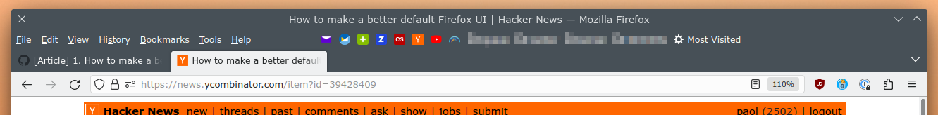
Yeah, this is a problem for me also. FF UI is so big. Also, why a huge white space between the reload and url bar???? It is a horrible waste of space.

gsich
0 replies
1d

"not supported" - that was out of spite for people who criticized the "modern" design choice.

3abiton
0 replies
1d10h

That was my issue with ir, I will try the flag today!

bloopernova
29 replies
1d8h

Better browser UX, in my strongly-held opinion, starts with vertical tabs. With horizontal tabs, you can have maybe 6 to 8 tabs open before things tabs get difficult to manage or track.

With vertical, nested tabs; links that open in a new tab are automatically made a child tab. From that you can infer structure and context more easily than horizontal tabs. Then you add colours to indicate different sites and now you see tab groups more easily. On top of that you can bookmark tab trees, thus saving progress of your research, documentation, etc etc.

My CSS file and a couple of screenshots are here: https://gist.github.com/aclarknexient/88673880d373864eee1927...

(I need to add a screenshot with nested and coloured tabs, will add that once I submit this comment)

015a
14 replies
1d7h

To each their own, but: I strongly believe the opposite.

Of course having more than 6 or 8 tabs open in a horizontal tab bar makes tabs difficult to manage and track. I've used Arc for the past 6 months. Having 6 or 8 tabs open in a vertical tab bar is also difficult to manage or track. I end up just spam-closing all of them and starting fresh pretty much every 4 hours anyway.

Here's the two arguments I've heard that I resonate more with, one in either direction.

(1) Count the number of pixels dedicated to the tab bar space when it is horizontal versus vertical. I've never seen a functional vertical tab bar that used the same or fewer pixels than a horizontal one.

(2) But: Monitors almost always have more horizontal pixels than vertical pixels. So, actually, a vertical tab bar better-leverages the aspect ratio your monitor is built at. This feels true at 16:9 and greater aspect ratios; it feels untrue, to me, at the 16:10 aspect ratio; and unfortunately, this is an extremely common aspect ratio as its ~the aspect ratio Macbooks are made at.

DonHopkins
9 replies
1d4h

It bewilders me that any rational UI designer would be so arrogant as to make the unilateral unchangeable decision for all their users that they should only have tabs on one side, be it the top, bottom, left or right of the window. Why restrict users to using tabs on only one side and one side only? What's so special about that side, and bad about the other sides? What if the user is left handed, or has a tall monitor, or a wide monitor, or lots of windows, or only a few?

While you're at it, why not just remove all the arrow keys from the keyboard except one? Then users can argue over whether the left-arrow key is better than the up-arrow key, and users who don't like having only an up-arrow key can buy a keyboard with only a left-arrow key.

But all keyboards have all four arrow keys, so there are no arguments about which arrow is better: you just use whichever arrow you want, whenever you want.

Most people prefer to use all four arrows at different times for different purposes, and put their tabs along all four edges, too!

jsrcout
6 replies
1d1h

I, too, remember when GUIs (not UXs!) respected the user's desires, workflow and general agency. That's not entirely gone yet, but it's going. Heck, Office 365 updated lately and now I have this ongoing little contest of displaying the tiniest number of coworker Teams comments in the hugest amount of white space. The results beggar belief.

Edit:

Teams (it's a Chrome browser window, but that's not really relevant to my rant) is taking up like two square feet on a 4K monitor, and 3-6 messages plus links to a couple attachments are all it will show me - along with enough white space for another 300 channel names (but only channel names, nothing else), headings the size of movie trailers, just oceans of space and garbage I don't need and can't use.

In an ideal world, there'd be some way to adjust the layout a bit, and in fact when we used Slack before Teams, that was pretty easy: you move the divider between channel names and messages to the left, thus giving less space to channel names, more space to message content. Done.

But that's too much power to allow a user to have, in these modern, enlightened times. So while Teams has such a divider, there's no provision to adjust it. Want to see more than a handful of messages at the same time? Gonna need a bigger monitor. Probably 55" would be a good size.

Of course, that's one example out of a billion. It's not that software won't cater to my particular workflow... it's is that software no longer allows me to make reasonable adjustments to support a workflow that works for me, and in fact removes still-remaining means to do so on a regular basis.

Really it's the whole "you're holding it wrong" mindset that I get so tired of. We all labor under our own constraints and just a little leeway on basic customization goes a very long way to making software more usable. Just let me view more than six messages at once, ok? Please?

throwaway-56453
2 replies
23h10m

Software maintenance is not the primary cost of a configuration option. The biggest cost is the customer support load [1]. This is especially a problem if the customer manages to get the application into a "busted" state.

Your complaint, where the software is less convenient than it could be because the sidebar is too big, will never result in a Priority 1 Customer Support Ticket. Adding the ability to resize a sidebar can actually cause that to happen.

Someone accidentally resizing the sidebar to become unusably small or large and calling support because they don't know what they did or how to fix it will describe it as an emergency. This is not a lie, since the thing they need to get at to complete their work is impossible to get to without resizing the sidebar, and they don't know how it happened or how to do that. They resized the sidebar while trying to drag and drop something else, and since they weren't using it at the time they went some twenty minutes without even realizing anything was wrong, and now they've forgotten what they did.

Hopefully, it escalates up the support chain until someone finally manages to figure out what happened, or it escalates high enough and the customer is willing to give remote desktop access to a support tech [2]. If you're not lucky, they just give up and switch to a program that, hopefully, doesn't break on them.

Source: I used to work the support line for customer-facing software. I don't any more, but I still work directly with customer success agents, so I still regularly see this exact kind of problem.

[1]: Or, if you won't take it from me, take it from Joel Spolsky: https://www.joelonsoftware.com/2000/04/12/choices/

[2]: Some companies just don't do remote desktop control support. This is so that they can directly tell their customers "we never ask for control of your computer, so if someone claiming to be us asks for it, they're a scammer." Remote desktop access is a dangerous way to do tech support because, if you accidentally wind up talking to a scammer instead of a real support tech, they can wreak havoc with that level of access. OTOH, the company I work for sells software that works with barcode scanners and printers, and I really don't feel keen on trying to talk people through setting them up so they work properly...

skydhash
1 replies
20h33m

Someone accidentally resizing the sidebar to become unusably small or large and calling support because they don't know what they did or how to fix it will describe it as an emergency.

And that's why you have an in-house support departments whose job is to solve these issues. It's like buying a tractor, then relying on the company several towns away to provide repairs.

Customizability is good. Because when I settled in a workflow, I don't want to see things I don't want occupying space or distracting me. It's like not using part of the desk because you're supposed to have piles of books in this place.

I'm not advocating to have trillion of options a la VIM. But anything except the core purpose of the software should be customizable in some way, including the options to hide it.

throwaway-56453
0 replies
18h40m

And that's why you have an in-house support departments whose job is to solve these issues.

There's a market for software that doesn't require that.

Small companies don't have in-house support departments. They contract with an IT provider. Big companies do, but theirs isn't materially different than the contracted one (a typical "big company" is really just three small companies standing on each others' shoulders wearing a trenchcoat). Their purchasing decisions are going to be based on what they think will reduce the amount of support calls they have to deal with.

It's like buying a tractor, then relying on the company several towns away to provide repairs.

John Deere software locks their parts. They haven't gone out of business, so a lot of farms must be doing just that.

Edit: This is not an argument against RTR. Anyone who's willing to break a warranty seal and tinker with the inside of the computer or tractor they own should be allowed to do so. Being able to customize is good. Being able to accidentally customize is bad.

hulitu
0 replies
3h42m

If you say "Teams" the rest is just redundant. It is the worst piece of UI ever created.

djao
0 replies
6h43m

For me, Pidgin with the MS Teams plugin solves this problem. Now I can chat with others on Teams, using a program designed for chat.

DonHopkins
0 replies
23h36m

I was less than satisfied about they layout of the buttons in xcalc, so I built a version of the window manager that let me specify the root window containing the windows to manage, and gave it the window id of the xcalc window, so it put window frames around each calculator button so I could move them around, resize them, even close them into icons (bigger than the button) if I didn't want to use them. Not what the xcalc or window manager designers had in mind, probably.

hulitu
0 replies
6h38m

But all keyboards have all four arrow keys,

Please don't tell that to UX experts. They will replace all four with a hamburgher menu. /s

015a
0 replies
3h25m

I agree that it is odd, even from an "efficient market hypothesis" angle. There are people who use Arc literally only because of the very well-integrated and implemented vertical tab bar (versus, oftentimes jank & ugly addons in Firefox/Chrome). In other words, we (humanity) have to create and maintain an entire new browser just to solve this one problem for users that could, very easily, be a checkbox in a settings menu.

Same with Windows 11; I know one person who refuses to upgrade literally only because the Windows 11 taskbar is bottom-of-monitor only; they don't support moving it to the left or right-hand side of the monitor.

Its actually unhinged. Our industry was filled with years, decades even, where we were so excited and proud to build things to be as powerful as possible, to do as much as possible. Nowadays, companies want to build the least they can possibly get away with. Its sad what we've lost.

J_Shelby_J
1 replies
1d6h

When chrome first started getting popular many Firefox users were on vertical tabs, and it was not lost on me that chrome was made for small screen laptop users. A smart design decision even if it feels gimped for vertical tab users.

jwells89
0 replies
1d6h

chrome was made for small screen laptop users

Makes sense if one considers how many 13” Macbooks and original MacBook Airs were likely being toted around the Google campus in the late 2000s, with Macs being the predominant development platform there at the time.

Further down the road in 2011, Chromebooks appeared, most of which are on the smaller side which also acts as incentive to keep Chrome usable on smaller screens.

Desktop Safari and MS Edge are also decent in this regard, likely a result of their parent companies being makers of popular small-screen computers.

pxc
0 replies
21h2m

(2) But: Monitors almost always have more horizontal pixels than vertical pixels. So, actually, a vertical tab bar better-leverages the aspect ratio your monitor is built at. This feels true at 16:9 and greater aspect ratios

This is true, and as a vertical tab bar user, it's important to me. However, when every app follows this logic and decides it gets to have a sidebar (or two!), all of a sudden I'm looking at a lot of apps that are barely usable unless they're maximized.

I often find myself thinking 'hey, fuck you, $APP! those pixels are for my vertical tab bar!!'

michaelmrose
0 replies
1d1h

If you squish vertical tabs so as to have as few characters shown as horizontal tabs you'll have plenty of horizontal space for an apples to apples comparison.

jwells89
2 replies
1d6h

Fan of vertical tabs here, it’s a major boon for how I browse, which tends to involve a number of long-running tasks. Tabs work better than this than bookmarks, because cleaning out bookmarks sucks with how undeveloped all browser bookmark managers somehow still are in 2024.

I’m not too partial to nested tabs, but I think “panes” (Firefox extension Sidebery nomenclature) or “spaces” (what Arc calls them) where you can swap what group of tabs (including pinned tabs) is represented by the tab sidebar with a click is powerful, particularly combined with association of a pane/space with a browser profile.

So for example, a single browser window can switch between being dedicated to general browsing, shopping, online university courses, or software development, and if I want to split a pane/space into a new window temporarily, this is possible too.

a_subsystem
1 replies
1d

I've been using Arc and I've become a fan of folders + vertical tabs also. But I also want bookmarks with tags. I don't want to keep 'pinouts for xyz motherboard' open somewhere all the time. I want to tag it with 'dell', 'motherboard', and 'pinout' and then search when I need it instead of having to remember what 'Space' I put it in. I prefer bookmarks to web search when possible because often enough I spend stupid amounts of time searching for a little tidbit and may want to come back to it later.

Rather than cleaning out bookmarks, I would keep a few main bookmarks and folders on the toolbar, and file away everything else under one few big folders with tags.

I use Firefox for tagging and it seems to be a fantastic way to keep track of thousands of sites with small cognitive load. Am I missing some workflow that's 'better'?

jwells89
0 replies
23h48m

Yeah, not having bookmarks is probably Arc’s biggest weakness. I find bookmarks useful too, but only add them when I know I’m going to keep them around for a while.

Tags might work well but the friction involved is likely too high for me to consistently use them. It’s easier to just keep anything remotely short term in tab form.

Dwedit
2 replies
1d3h

Vertical tabs would be unusable on a window that's resized to be half the width of a 16:9 display.

michaelmrose
0 replies
1d1h

This is a good point especially on laptops. It might be nice to display side tabs until a breakpoint and thereafter autohide

WorldMaker
0 replies
1d3h

I do it all the time and I don't think it is "unusable". About the only "issue" with it is often that it shrinks the viewport just enough to trigger "mobile" breakpoints in CSS, but for some websites (YouTube, especially) that can be a feature as much as a "bug".

dmix
1 replies
1d8h

Plus looking at the screenshots of the "controversial" FF89 one of the biggest changes seems to be redesigning the tabs w/ more padding.

I didn't even notice that change because I have the top tab bar hidden and use Tree Style Tab that has a design which blends nicely with FF.

I don't like FF in particular but the tab tree is 100% enough of a UX gain vs all the small details chrome/safari does slightly better that I don't think twice (besides dev panel, I use chrome for frontend work).

stevage
0 replies
1d1h

I use FF primarily, but sometimes Chrome for debugging, on macOS.

I literally cannot tell them apart.

FeepingCreature
1 replies
1d7h

Better browser UX, in my strongly-held opinion, starts with vertical tabs. With horizontal tabs, you can have maybe 6 to 8 tabs open before things tabs get difficult to manage or track.

TabMixPlus! Dynamic width vertically scrollable fully customizable multirow tab bar. I have 50 tabs open, 22 on screen, and perfect overview. It still technically runs on current Firefox, but you have to engage in some very vigorous modding. See the README https://github.com/onemen/TabMixPlus but be aware that this will completely disable extension signature validation. (I blame Mozilla.)

SSLy
0 replies
1d6h

I think Sideberry is nowadays more comfortable than TMP.

DonHopkins
1 replies
1d5h

Vertical tabs are better in some situations and for some users, horizontal tabs are better in other situations and for other users. So all users should be able to choose to place tabs along any side of any window, and change which side and what position any tab is at any time. Not just tabs for emacs frames or web browser windows, but for ALL windows including top level and internal application windows. And you should also be able to mix tabs from different apps in the same frame, of course. Why not?

I implemented tabbed window with pie menus for UniPress Emacs in 1988, and still miss them! Later in 1990 I developed several other versions of tabbed windows with pie menus for NeWS that let you manage any NeWS and X11 windows, and drag the tabs around to any edge.

https://news.ycombinator.com/item?id=38338008

DonHopkins 3 months ago | root | parent | next [–]

UniPress Emacs for NeWS, with tabbed windows and pie menus: 1988.

https://en.wikipedia.org/wiki/Tab_(interface)#/media/File:Hy...

https://www.youtube.com/watch?v=hhmU2B79EDU

https://news.ycombinator.com/item?id=38337808

DonHopkins 3 months ago | parent | context | favorite | on: Vertical Tabs in Visual Studio Code

This is why you should be able to choose which side and position any tab is positioned along any window at any time, and change them at any time by dragging them to where you want. Then you can assign meanings to each side, depending on your workflow, for example (this should be under user control, not set in stone, of course):

Tabs on the top for important stuff.

Tabs on the bottom for administrative stuff.

Tabs on left for things you haven't read yet.

Tabs on right for things you've already read.

Then drag the tab from the left to the right after you read something (like moving it from your "in box" to your "out box"), or pin its tab on the top or bottom of it's important and you want to keep it around and easy to find.

And if you really want, you should be able to hide the tab to save space.

And not only tabs for apps like browser and IDEs, but also the desktop window manager should support tabs on top level windows in a consistent manner, so you can drag tabbed windows in and out of other window frames, as well as arranging them in hierarchical outlines along the edges.

All this is super obvious, and saves a lot of time and effort, so it bewilders me why tabs like I described and implemented in the 1980's aren't universally supported on all desktops and applications by now.

It's not because they're patented. Adobe tried, and sued Macromedia over it, but that patent (illegitimate in my view, since it ignored the prior art, and was extremely obvious and not patentable) has long since expired.

https://www.metafilter.com/2805/Adobe-sues-Macromedia-over-i...

https://news.ycombinator.com/item?id=38337876

DonHopkins 3 months ago | root | parent | next [–]

Also, not everything is a file. Tabs should apply to all edges of all windows, including top level windows, not just one edge of only windows with files in them. And you should be able to drag any window out to top level and it still has its tab attached, then move it around to any position along any edge, or hide it, and of course snap windows together along their tabbed edges, either tiling or overlapping.

How do you control all of that? That's where the pie menus on the tabs come in, of course. Thanks to the tabs, you can even pop up pie menus on windows that are completely covered up, and perform commands on them even though they're not visible, like bringing them to the top (stroke up) or down (stroke down), or closing them (diagonal stroke for confirmation submenu, then stroke up to confirm), or whatever (paste into terminal emulator, evaluate code in editor, etc).

https://news.ycombinator.com/item?id=38347429

DonHopkins 3 months ago | prev | next [–]

And as long as you can have tabs on any side of a window, how about multiple tabs on the same window? Like child tabs as well as label tabs, that are links to other windows.

Another cool use of vertical tabs is for the tabs on the left to select between windows, and the tabs on the right select between children of the current window (not sub-windows, but related windows or sub-directories). And you can use the tabs along the top as breadcrumbs to navigate back up the tree.

Some IDEs kind of do that with a directory browser on the left and a function browser on the right, but with outlines and scrolling lists instead of actual tabs.

You could navigate the tab tree by clicking or gesturing left or right with a pie menu on a tab, sliding the right column of tabs over to the left to descend into the tree.

Like a Finder window that shows directories as tabs on the right instead of icons inside.

You could also have top and bottom edge tabs for different kinds of children (i.e. xml attributes vs elements, object methods vs properties, different views or editors, etc).

The original NeXT file browser had breadcrumbs along the top (but not tabs):

https://www.youtube.com/watch?v=rrTag7nSHlw&t=701s

https://news.ycombinator.com/item?id=38341279

donatj 3 months ago | prev | next [–]

VScode started with vertical tabs only back in the day. It was a very interesting design choice. They switched to horizontal tabs from pressure.

DonHopkins 3 months ago | parent | next [–]

I just can't get my head around the mentality of making that decision for all of the users, hard coding it, and forcing it on them, not allowing you to choose for every window, or change your mind at any time, and simply drag any tab to any edge you want, whenever you want. What makes user interface designers so arrogant and sure of themselves and lazy that they think one particular side is the only side, and the best for everyone, no matter what your screen size, resolution, aspect ratio, layout, number of tabs, icon or label size, workflow, direction of text flow, handedness, visual acuity, physical dexterity, task, and preference?

And then when you inevitably run out of space for tabs along the one edge, instead of simply allowing you to put more tabs along the other edges, you either add more horizontal rows along the top, so you get this abomination [1], or you have tiny little hard to use scrolling arrows at each edge so you can't see all the tabs at once, so you get that abomination [2]:

Is it ever okay to have multiple rows of tabs?

[1] https://ux.stackexchange.com/questions/15558/is-it-ever-okay...

Awesome Scrolling For Wide Tab-Interface Applications - ScrollTabs:

[2] https://www.jqueryscript.net/layout/Awesome-Scrolling-For-Wi...

It's like only putting only one arrow key on the keyboard.

https://news.ycombinator.com/item?id=38337425

DonHopkins 3 months ago | parent | context | favorite | on: Vertical Tabs in Visual Studio Code

I've been implementing and using vertical tabs since around 1988, with I released a commercial product with tabbed windows, the NeWS version of UniPress Emacs, and used it to develop a hypermedia authoring environment for HyperTIES at the UMD Human Computer Interaction Lab.

https://en.wikipedia.org/wiki/Tab_(interface)#/media/File:Hy...

Vertically tabbed windows combine synergistically well with pie menus, and are great for window management, especially when you have many windows.

They are purposefully NOT patented, since the idea is so fucking obvious, but it's disappointing they took so many decades to catch on finally. Still there aren't any decent desktop window managers I know of that implement tabs the right way. (tvtwm is not the right way!)

The later NeWS Toolkit versions from the early 1990's let you drag the tabs around to any side of the window you like: left, right, top or bottom, to any position along any edge. The user should be able to decide which edge and where the tabs are attached to for each window, it should not be hard wired like the tabs in VSCode and web browsers typically are. Being able to choose which edge the tab is on and where the tab is gives users better more flexible ways to organize and manipulate their windows.

https://en.wikipedia.org/wiki/Tab_(interface)

HCIL Demo - HyperTIES Authoring with UniPress Emacs on NeWS, tabbed windows, pie menus:

https://www.youtube.com/watch?v=hhmU2B79EDU

I had a video of the NeWS tabbed windows, demonstrating dragging the tabs to different window edges, but youtube took it down because it contained copyrighted music (Herbie Hancock's Rockit).

Oh, here's the original video you can download from my server:

https://donhopkins.com/home/movies/TabWindowDemo.mov

Here are some different version from 1988-1991 for different versions of NeWS:

https://donhopkins.com/home/archive/NeWS/tabwin.ps

https://donhopkins.com/home/archive/NeWS/tab-1.ps

https://donhopkins.com/home/archive/NeWS/tabframe-1.ps

https://donhopkins.com/home/archive/NeWS/tab-3.0.2.ps

Here's another NeWS program that uses vertical (by default, but any edge if you want) tabs on windows around PostScript objects that you can push and pop on the stack with "direct stack manipulation":

The Shape of PSIBER Space: PostScript Interactive Bug Eradication Routines — October 1989

https://donhopkins.medium.com/the-shape-of-psiber-space-octo...

PSIBER Space Deck Demo:

https://www.youtube.com/watch?v=iuC_DDgQmsM

black7375
0 replies
1d2h

And not only tabs for apps like browser and IDEs, but also the desktop window manager should support tabs on top level windows in a consistent manner

I miss the tabbed window feature in KDE 4. This is the feature I'm most disappointed to see missing from version 5.

- https://bugs.kde.org/show_bug.cgi?id=343690 - https://community.kde.org/Plasma/5.4_Errata

I think this is a really essential feature when displaying tiled windows.

kjkjadksj
0 replies
1d

Vertical tabs start to suck on a laptop. For one my auto hide sidebar hack for firefox broke and I am too lazy to fix it, so now I have basically a whole inch by several inches of dead gray space because I don’t have a full column of 100 tabs ever open, maybe 5 or 10.

This wouldn’t be so annoying except many modern websites use browser viewer size instead of the user agent to make the call you are a mobile or desktop user. So I basically have to use fullscreen browser windows because considering I already lose an inch to the tree style tabs, I really don’t have much width to lose before the site assumes I am an iPad and gives me a ton of hamburger menues that also suck to navigate because of how they tend to wrap text on constrained width browser viewers. Most of the time I just have to disable the sidebar entirely which of course adds a few clicks everytime I change tabs now.

bloopernova
0 replies
1d6h

Replying to my own comment: HN faux pas, or good information organization? :)

In the Tree Style Tab options page, there's an Advanced section that has a live-reloading user style sheet section. Very cool for testing out font choices without restarting the browser.

I've changed mine to use Apple's really nice SF Pro font, condensed. Somehow the Iosevka Mono that I use everywhere didn't look quite right on the tab titles.

The CSS:

  :root.sidebar tab-item.unread .label-content {
    font-style: italic !important;
  }

  :root.sidebar tab-item {
    font-family: "SF Pro" !important;
    font-stretch: condensed !important;
    font-weight: 300 !important;
  }

  :root.sidebar tab-item.active .label-content {
    font-weight: 500 !important;
  }
Same link as my previous comment now has a screenshot of the result of that CSS: https://gist.github.com/aclarknexient/88673880d373864eee1927...

ihateolives
27 replies
1d10h

Ever since Firefox borked their tabs I've given up on it as my default browser. Every now and then I open it up for testing and when I still see buttons instead of tabs I make a mental note of trying again in half a year or so. Light theme is especially insulting with white buttons on light-light gray. It even doesn't repsect Windows' system theme settings, because in Windows you can have apps keep light theme but apply colors to taskbar, Start menu and title bars. Edge gets it, Chrome doesn't, but at least there's enough contrast, Firefox completely misses the mark.

FirmwareBurner
21 replies
1d10h

I use Firefox as my alternate browser. And whenever I fire it up it needs first to get in my way and interrupt me to tell me about the new changes and features it has implemented since the last time I opened it like Pocket, VPN, etc.

God, stop it, just let me start browsing what I came here for, stop imitating Microsoft and their dark patterns of shoving Office 365 and Gamepass in your face between updates. Go and advertise your features to people who don't yet have Firefox installed, but I'm already your "customer", so stop bugging me.

This is why I'm mainly on Chrome. It may be inferior and spying on me but it never gets in my way.

hobs
17 replies
1d10h

Damn that new tab must pop up for me like... once a month! What a distraction! I guess giving all my data to Google is probably worth it.

FirmwareBurner
16 replies
1d10h

Joke all you want but Firefox's market share agrees with me as most users value convenience above all else.

At least Google knows not to be intrusive and not fuck with the UI so often. Chrome looks almost exactly like it did over 10 years ago. Why can't Firefox imitate that quality of life feature? It's not that hard to not change shit at the surface.

They've been bleeding market share for years including faithful long time users who enjoyed the 'old, boring' Firefox but don't agree with the current direction of imitating Chrome at every step.

Old Firefox = Windows 7

New Firefox = Windows 11

viraptor
5 replies
1d9h

Google mainly knows how to display ads. The raise of Chrome wasn't so much about features at the time as about people being bombarded with "install chrome" ads. On Google results, in Gmail, in Adsense, everywhere. There was an absurd amount of money sacrificed (not really spent since the ads were internal) to gain the users. I'm not sure any other aspect can be reliably compared in that scenario.

paldepind2
3 replies
1d7h

Do you have any data to back that narrative? I know Mozilla is pushing that explanation, but from how I remember it Chrome gained market share because it was technologically superior to Firefox when it was released. It had a much more modern UI, much faster JS implementation, sandboxed tabs, etc. All features that it took Firefox years to copy. Some would say that Firefox has never caught up.

I find the ads narrative pretty hard to believe. Back in the days, Firefox could compete with IE, which was the default in Windows, by being technically superior. It seems very likely that Firefox's users, who had gone out of their way to install Firefox, would also be very willing to go out of their way to install a new better browser even in the absence of ads.

viraptor
2 replies
1d1h

Ehh... UI was comparable. Chrome was a bit faster.

For the ads, see some snapshots of what that campaign looked like at the time https://searchengineland.com/googles-jaw-dropping-sponsored-... It was a massive push of basically spammy links all over the internet.

To be clear, I'm sure some people switched for the features. But given the scale of the sponsored push to every internet user, we can't really say features were the reason for most people. There's no way to run the experiment the other way.

paldepind2
1 replies
15h11m

Thanks for the link. That certainly shows that Google was sponsoring an aggressive and fairly ugly ad campaign.

UI was comparable.

They were not at all comparable. Here is an image of what Firefox looked like when Chrome was released [1]. Here is an image of what Chrome looked like at release [2]. Barring some design tweaks Chrome looks roughly like any modern browser whereas Firefox looks ancient by modern standards. It has the app menu, no integration with window decoration, a separate search box, tabs below the address bar, etc. Lots of things that Firefox would copy over the coming years. There's a reason Chrome was named after its Chrome–the UI was a huge selling point.

1: https://user-images.githubusercontent.com/25581533/141687681... 2: https://blogoscoped.com/files/google-chrome-browsing/search-...

viraptor
0 replies
6h14m

The bookmarks could be turned off in FF and many other things changed with extensions. Overall... I can see how someone could say they're different, but it's a "meh" for me. Yeah, they're different but not in a meaningful way for me.

dathinab
0 replies
1d6h

it also really helped that in difference to today wen Chrome was new it's performance gain over FF was often quite significant (same for security)

while that isn't really true anymore in any relevant way it's still stuck that way in many peoples heads

And sure part of the perf issues where quite often not well behaving FF extensions, toolbars etc. also often installed by unrelated programs preexisting installed on the same computer and that FF needed some major refactoring/rewriting just because it was quite a bit older (which are done by now but had inevitable but sad effects like XUL extensions being gone).

prmoustache
3 replies
1d9h

Chrome looks almost exactly like it did over 10 years ago.

I suggest you look for screenshot of Google Chrome in 2008.

Market share is what it is because google is pre installed in the majority of the mobile market, that firefox had bad performance rep in some areas, and that google is a synonym of internet in the mouth of the majority of people nowadays the same way explorer was a few decades ago.

Most people don't care about those UI changes.

Izkata
2 replies
1d4h

2008: https://techcrunch.com/2008/09/01/first-public-screen-captur...

2016: https://www.pcmag.com/reviews/google-chrome

2024: https://flathub.org/apps/com.google.Chrome

They're basically the same, nothing like what Firefox has been doing. Buttons went flat, bookmarks moved to the right, and two dropdowns got combined into one menu. Tabs haven't changed at all.

prmoustache
0 replies
10h13m

Tabs do not look as on your supposedly "2024" screenshot nowadays.

And most people don't care how their tabs look and are used to dropdowns menus being reorganized and losing or getting added entries. People are used to software slowly but gradually changing. It is not like mozilla went from original phoenix browser[1] to the current one in one release. These kind of changes only annoy a small fraction of people with some special disorders.

[1] whose simplicity and colored buttons I loved personnally

1317
0 replies
21h14m

your 2024 screenshot is outdated; here's a more recent one: https://www.google.com/chrome/static/images/heroes/browser_n...

hobs
3 replies
1d10h

I would agree that most people would be glad to give up their privacy for minor convenience. if I was a developer of Firefox I might care that its marketshare is falling, but truthfully nobody needs to be married to a web browser, or take its rise and fall too seriously.

Still not going to use a Google browser though, that's just a self own.

FirmwareBurner
2 replies
1d9h

The rise and fall reflects user popularity. And Firefox is less popular than ever, with both the new generation who grew up only knowing Safari and Chrome, and also with the old generation who they pissed off by trying to copy the shitty parts of Chrome instead of staying true to what made them popular in the first place such as speed, light weight, and getting out of your way by not charging the UI every 6 weeks.

yoavm
1 replies
1d9h

Sure, maybe everyone left Firefox because of the "what's new" tab and the UI changes. But maybe it's because Safari is default on some devices, and Chrome has the world biggest marketing company behind it.

FirmwareBurner
0 replies
1d9h

Of course Google won the browser war mainly because they're World Heavyweight Advertising Moneybags World Champion, but Firefox also did itself no favors by annoying it's old and faithful userbase with often, unnecessary and unpopular UI changes a while ago.

medstrom
0 replies
1d9h

But your premise that one is more intrusive, isn't even true. Like others said by now, Chrome does the same thing if you don't open it often.

dathinab
0 replies
1d6h

market share agrees

that's not how it works the marked share is there for reasons which have little to do with that, at least when it comes to "non technical people" (i.e. not HN crowd)

1. what matters the most is what is pre-installed (like iOs Safari, Android Chrome, etc.)

2. then what matters a lot is mind share, Chrome still has in many peoples minds the image of "the good alternative", "fast", "reliable", "modern UX". While many people still think about FF as slow and clunky even through a lot of this opinions came from well over 10 years ago

3. What also a huge amount is if you can use it for all task you do. Due to apps like Slack, MS outright refusing to fully support Firefox or for example Notion having had egregious FF only bugs a lot of "normal" users have over time moved away and just never come back. The most sad thing is if you look at the technical details it's seldomly FF fault. E.g. basically every time I looked into it when some media player (and I think it was also the case for Notion as far as I remember) didn't work it was because the sites not being standard compliant with CORS. Another (older) example is FF missing media codecs due to licensing issues which Apple/MS fixed by having an OS and Google by having a ton of money. Or polyfills for bleeding edge sometimes not yet even standardized Chrome features being slow. Stuff like that is in my experience kinda true for close to any (systematic) issue of a sites not working correctly on FF.

Lastly when it comes to non technical people the overlap of people which would stop using FF because of stuff like that and the ones which anyway wouldn't use FF because they use some fancy chromium derivative like brave is quite high.

The reason they are bleeding market share is not because they updated to a new UI.

It's because it's today hardly possible to run a browser which isn't either chromium or webkit based.

pprotas
1 replies
1d10h

Chrome automatically opens up a tab with an ad for their new features after every automatic update. Isn’t that kind of the same thing?

dathinab
0 replies
1d7h

yes hand the amount of times Firefox has done so in the last few years is also just a handful (like less then 1 time per year in average)

And some of this notifications where really reasonable to have like the containers. (Except the color thingy, that was some nonsense.)

The only exception is if you somehow end up in a situation where the browser (profile) is for whatever reason frequently fully reset, in which case you might have seen the same notification multiple times.

yoavm
0 replies
1d10h

I feel exactly this way, but about Chrome. I suspect it's just bias - I only open Chrome once a week or so so this screen is very annoying. Firefox is always open so I don't even recall seeing anything like that.

mikae1
4 replies
1d10h

Install Sidebery[1] and hide the native tabs[2]. This is the way. :)

[1] https://addons.mozilla.org/en-US/firefox/addon/sidebery/

[2] https://superuser.com/a/1424494

medstrom
3 replies
1d9h

I have neither! No visible tabs at all. Just cycle tabs with Ctrl+Tab hotkey.

This is clean. Once in a month I want some kind of overview, but extensions like Tab List can give me a popup menu. The tabs needn't be visible constantly!

DonHopkins
2 replies
1d4h

And the tabs should have pie menus, too.

medstrom
1 replies
1d

Are you serious? Details? This sounds new and interesting.

DonHopkins
0 replies
23h39m

See my other posts, and the links!

https://news.ycombinator.com/item?id=39432170

OJFord
25 replies
1d10h

Whenever I see someone using (or a screenshot of) horizontal tabs I'm just shocked that people put up with it, or perhaps even more so that it's still the default in all major (and minor?) browsers.

I recommend Sidebery, but more than that I just recommend something to get your tabs listed vertically in a sidebar, so they don't squash each other up as you add more until you can't tell what's what at a glance, the width is fixed, and you can always read the title.

Which probably means implicitly 'I recommend FF', since I imagine Safari/Chrome/Edge don't let you make that kind of modification? FF actually doesn't even need an add-on for it, I used to do it just with a userChrome tweak I copied from somewhere, but Sidebery has a nice 'panels' (like tabs of tabs to switch between that the sidebar shows) feature, and you can bind them to the built-in 'container tabs' (which I always think should surely be called 'tab containers'?) so that work stuff opens in your work panel, for example.

mvdtnz
5 replies
1d10h

Edge has vertical tabs out of the box. And yeah we get it, because vertical tabs people and tree tabs people are the vegans of browser discussions. Please, we get that you like vertical tabs. No need to keep going on about it.

medstrom
3 replies
1d9h

Please, don't perpetuate the myth that vegans "keep going on about things" unless you've seen someone do it in real life.

mvdtnz
0 replies
1d9h

I have.

a_gnostic
0 replies
1d8h

Most vegans I know use Edge.

OJFord
0 replies
1d4h

'unless you've seen someone' is not a good standard to use here, because of course some people are like that, that's where the stereotype comes from - but the vegans who don't 'keep going on about it' are inherently not as visible: it's not often you'll know someone is a vegan and not talking about it, essentially never for strangers.

So if you really care about reasoning with people to challenge the stereotype, you need to know % vegans (according to some survey or whatever) in a population relevant to a person so that you can ask them to consider not if they've ever seen one vegan talk about it, but if they've seen a number X close to that % of the total people they've seen talk about it (and if not that they've encountered that-X% extra vegans without realising it).

J_Shelby_J
0 replies
1d6h

I use tree style tabs btw

beAbU
4 replies
1d10h

Whenever I see someone using (or a screenshot of) vertical tabs I'm just shocked that people put up with so many open tabs at once.

I have maybe max 20 tabs open at any given time. When I'm done with $TASK I close all the tabs (save 2-3 that remain open and pinned, mail, calendar, etc). The tab bar is like my stack. I only fill it up for the task at hand, then clear the stack and move on when done. If there are things I need to come back to, I use bookmarks.

Vertical tabs and the browser's bookmarks manager are just too similar for me to want to use tabs over bookmarks. Especially considering a crash can wipe all open tabs.

I am glad the browser gives me this option as a setting. And a browser that forces vertical tabs on me will probably lose me as a user for life.

Also:

since I imagine Safari/Chrome/Edge don't let you make that kind of modification?

MS Edge supports vertical tabs out of the box. Brave also, but I can't comment on the rest in your list.

asadotzler
0 replies
23h0m

Look at Mozilla telemetry and you'll see most people have a few tabs open, and overwhelmingly most people's tabs all fit in the horizontal bar with no scrolling. People with more tabs than that are a low single digit percentage.

OJFord
0 replies
2h41m

20 vertical tabs would be a lot more readable and distinguishable from one another than 20 horizontal tabs.

Sure it makes it more manageable to treat them like temporary bookmarks (guilty!) but you don't have to, that's not why I like them.

J_Shelby_J
0 replies
1d6h

I feel the same way. Keep limited tabs open most of the time.

But the advantage to vertical and nested tabs is that when I need to open a dozen links (like grabbing interesting links from a page without stopping mid flow) I can do it without having to ruin my environment. The tabs are there ready to be consumed: nicely nested below the source tab. Doing that with a horizontal tab bar would destroy my productivity until I closed all of those tabs. It allows you to switch tasks.

As far as wasted space… I hardly ever use a laptop screen. Text content is ideal at 70ch? That’s like a 1/3rd of a 27” monitor.

DonHopkins
0 replies
1d4h

You wouldn't be having this argument if you could put your tabs on any edge you wanted to, at any time, even using multiple edges of you run out of space along one edge.

It's an entirely artificial argument that doesn't address the real problem: incompetent UI designers preemptively and inflexibly making that decision for all users in all situation, and forcing everyone to use one edge or the other instead of any or all, therefore squandering 3/4 of the usable perimeter.

foolswisdom
3 replies
1d10h

I know edge at least supports vertical tabs? I don't like them though (I don't have enough horizontal screen space, plus it doesn't free up the top bar space). If I start to have many open tabs I start cutting them down anyway.

OJFord
2 replies
1d9h

Fair enough not having the horizontal space for it. It's usually still the opposite that annoys me (small centred content not making use of space) but of course this depends on zoom level etc. too.

I'm not sure what you mean about not freeing the top bar though? The topmost thing I have is the back/forward/refresh/URL/extensions/menu bar. (file/edit/view/etc. hidden unless I press Alt, but that's not where tabs would be I don't think.)

foolswisdom
1 replies
1d2h

The space where tabs go (when horizontal) isn't removed in vertical tabs mode. So using vertical tabs doesn't save any extra on vertical space, only uses additional horizontal space.

OJFord
0 replies
1d1h

Well what I'm saying is I don't have it, so either Sidebery handles it or I put something in userChrome, but either way it's something I have not had to think about in all the years I've been using vertical tabs, such that I was not aware of the issue.

edit: the latter (or Sidebery does do it but my previous solution didn't and this is now redundant, I suppose), I have:

    #TabsToolbar {
      visibility: collapse;
    }

    #sidebar-header {
      display: none;
    }
(~/.config/mozilla/firefox/profile/chrome/userChrome.css)

mort96
2 replies
1d9h

I find that having a huge sidebar shifts the content off-center in a really uncomfortable way.

OJFord
0 replies
1d4h

Aren't you currently on a site where most of the content is more off-centre, and having a left sidebar would actually put it more in front of you?

I can sort of sympathise, I'm fairly 'OCD' (not actually, but as people say) about similar things, but it's never bothered me I don't think. Maybe try with it a bit smaller? I don't think mine's 'huge' - maybe a bit wider than single horizontally displayed tab would be (just as my choice for the length of title it allows me to read), a couple of inches on a 24"-diagonal monitor.

Izkata
0 replies
1d4h

There's userChrome modifications that make Firefox's sidebar collapsible, expands on mouseover and covers the page instead of pushing the page aside. I use that with TreeStyleTabs. Mine when collapsed is only ~3 favicons in width.

asadotzler
2 replies
23h1m

Most users, like 90% or more have tabs that all fit visibly in the horizontal space. Look it up. Mozilla's telemetry is public. 5 or 6 tabs fit just fine and in a sidebar are hugely wasteful of pixels. You think everyone browses just like you so you can't imagine why the browser is shaped for people not like you but your browsing habits are in the ultra-minority. Take a look at the telemetry before making silly posts like this.

justsomehnguy
0 replies
13h2m

sidebar are hugely wasteful of pixels

You know what is also a waste of pixels? Websites pretending they are mobile view only on my 4K desktop monitor in landscape. Blogs, new Reddit, Twitter, Mastodon, news sites, whatever else.

The vertical tabs wouldn't hurt that shit at all.

And if the vertical tabs would be a first class citizen in a browser it would greatly help so if needed I could have switch to it.

eitland
0 replies
15h53m

Most users also don't actually need modern processors.

Most drivers don't need to pull a trailer.

Most people don't need a wheelchair ramp.

Still arguing for stopping processor development, removing the possibility to use towing hitches and removing wheelchair ramps isn't something I hear people argue for.

It is almost like in other areas of life we accept that different people have different needs and wishes, but in software everything needs to be pixel perfect the way the designers envisioned it.

Why?

bscphil
1 replies
1d2h

I recommend Sidebery

I've seen several people mention this addon. Can you (or someone using it) give a reason or two to prefer it over the standard alternatives (e.g. Tree Style Tab)?

OJFord
0 replies
1d1h

I already mentioned 'panels' and container integration.

Idk, I don't know why Tree Style Tab is any more 'standard alternative' (or certainly not that any others are, afaict TST & Sidebery are the most popular two) - they're both extremely popular (Mozilla gives 196k users of TST & 75k of Sidebery; nothing else close) and both 'Recommended' by Mozilla.

Use whatever you want, I did say more than that I just recommend using something to get vertically listed tabs. The tree-ing is a much less big deal to me tbh, though Sidebery does do that too fwiw.

c-hendricks
0 replies
1d1h

Safari has a side bar where tabs are in fact vertical. Tab groups will also let you, um, group tabs, and they're presented as a tree in the sidebar.

bloopernova
0 replies
1d8h

My userChrome tweaks for vertical tabs: https://gist.github.com/aclarknexient/88673880d373864eee1927...

Includes screenshots! :)

thecosmicfrog
23 replies
1d10h

Is anyone else not at all bothered by the tabs "being buttons"? I feel like I'm the only one sometimes. Are they really that jarring for first-time users?

zx8080
2 replies
1d10h

There's so much things going south with each update I just don't care anymore.

The overall state of UX is very sad for Firefox and also Thunderbird (I had to stop using it after their menu bar fiasco and other "improvements").

encom
1 replies
1d5h

Firefox v89 was the last version I used. I just couldn't be bothered with them constantly changing and removing features for no reason. I switched to Vivaldi, which offer basic functionality like vertical tabs, and a fully customisable UI out of the box. It's far from perfect, notably being closed source which was hard for me to swallow, but it annoys me far less than Firefox ever did. I have it set up how I like it, and that setup has stayed static in the three years I've used it now. Firefox frankly feels user hostile in comparison.

Thunderbird was ruined with version 115, so I switched to Kmail. I miss calendar integration in my email client though.

djao
0 replies
2h52m

What exactly about Thunderbird 115 ruined it? I run 115 and it looks mostly the same as before. I avoid the "cards" view because it has numerous problems, but the "classic" view works fine for me.

ihateolives
2 replies
1d10h

It bothers me because it's different enough from everything else with tabs that I have (not only browsers, file managers, editors etc) and I just can't jibe with it. Why throw all semantics out of the window? It looks like a button but doesn't behave like one.

pndy
0 replies
1d6h

Why throw all semantics out of the window?

Almost everything nowadays is designed with mobile-first in mind approach - whether it's a smartphone or tablet, or desktop software. That throw all semantics out of the window - look what happen to e.g. Gnome over the years. What's worse I'd say, is that the lack of clear differentiation between types of interface elements made easier to hide options within GUI under various dark patterns (active element vs static information etc.) - whenever its required to do so.

As for Firefox GUI changes: Mozilla ask their users for feedback many times and the feedback was given - often strongly criticizing the upcoming changes but they ignored it and introduced changes anyway. I did submitted mine when they were about to rollout Australis but I didn't bother myself to say anything when Proton was about to be introduced because I knew that the corporate facet of Mozilla doesn't care and they'll do whatever they like.

kjkjadksj
0 replies
1d

A tab is literally a button with slightly different pixel shading. Its exactly the same thing as its always been.

Schlaefer
2 replies
1d8h

I moved on to sideberry and hide the normal tab bar completely. But if you open two identical tabs in the default layout I have no clue which one is active anymore. You can't understand that UI, you have learn it. It's infuriating.

SiempreViernes
1 replies
1d7h

It doesn't render the one you clicked on in a different colour? That might be a issue with the theme you use, my firefox shows the active tab in a clearly different colour from the inactive one.

Schlaefer
0 replies
5h11m

It changes the color, but that color has no inherent meaning. Let's eradicate any prior knowledge of what was clicked. Let's say you make screenshot of the current state, and show that to a random person on the street, who has never used FF before.

What are the odds of that person identifying what is currently active?

If the counter is "you know because you remembered" or you "know because you learned" then any of these answers indicate a inferior and non-intuitive UI design.

zx8080
0 replies
1d10h

Why wasting space for a button lower border if it's actually a tab's title and not a button?

werdnapk
0 replies
1d10h

I'm a daily FF user and I wasn't even aware this was considered an "issue". I haven't put a single thought into this until seeing these comments... and I'll go back to not thinking about it again as I find the tab bar completely usable as-is. Thanks for the thoughts though.

tvshtr
0 replies
1d10h

It doesn't freaking matter on hi-dpi screen. Also I've just hidden them (tabbar) and I'm using compact vertical tabs.

tiltowait
0 replies
1d5h

I see constant complaints about how "garbage" the Firefox UI is, and I just don't see it. It's ... fine? I mean, it's basically Chrome's UI with a slightly different tab bar, yet here we are with a very long post about alleged fixes.

square_usual
0 replies
1d4h

Every time someone says "button tabs are objectively wrong" I'm reminded of the fact that most normal, non technical users I know prefer Safari's button tabs. That's a feature you have to seek out and turn on, btw.

mvdtnz
0 replies
1d10h

I don't care about it at all. None of this UI criticism seems very important to me. I'd rather the Firefox team spent time making the browser less buggy and get feature parity for obvious missing features.

mavamaarten
0 replies
1d7h

I had exactly the same thought. I even installed the theme in question to see if I would like tabs better and honestly I prefer how Firefox does it stock.

madeofpalk
0 replies
1d8h

I can understand why someone would make a different design decision, and I would probably agree with their rationale to prefer 'connected' tabs.

But no, I don't have a problem with Firefox's tab style. It's immedaitely learnable. I've never once second guessed which was the active tab or what those things up there are.

jwells89
0 replies
1d6h

I wouldn’t say they bother me per se, but they don’t exactly feel right either. They’re incongruent without good reason.

flurdy
0 replies
1d8h

I don't give a monkey if it looks like a button or not.

But I have a problem with a lot of the Firefox themes making it very difficult to quickly see which tab is the active one. I generally look for themes where this is obvious.

badsectoracula
0 replies
1d10h

Tabs being buttons doesn't really bother me and if anything this is such a common alternative to tab appearance that even Windows 95's tab control has a mode to make tabs look like buttons (AFAIK it was used in the original task bar). It was also used for, e.g. switching channels/windows on mIRC since the 90s too.

However personally i do not like how these particular "tab buttons" look like and if nothing else (they remind me of those long pills that often feel hard to swallow :-P), i am used to them looking like tabs and see no reason for that change (fortunately Firefox allows you to customize its look and i have a userChrome.css that makes it look more to my liking).

alimbada
0 replies
1d9h

I never noticed it and even after it's been pointed out it's not an issue. Seems very nitpicky by those for whom it is an issue.

PaulKeeble
0 replies
1d10h

It doesn't impact my use of Firefox. They are just wasting pixels putting a gap where one doesn't belong. But I think at this point I am used to insane UI decisions and just roll with whatever organisations give me, few seem interested in any form of consistency or easy discovery.

Archelaos
0 replies
1d8h

It is ugly, but I can live with it.

lopkeny12ko
18 replies
1d9h

My greatest "unnecessary Firefox UI change gripe" is the removal of browser.urlbar.clickSelectsAll 4 years ago. And as you might expect, Mozilla does not care. If you read the bug report, this literally cannot be explained by anything except user hostility. https://bugzilla.mozilla.org/show_bug.cgi?id=1621570

Literally no other text field in any UI behaves like this. I cannot fathom why Mozilla chose to both ship this "feature" AND remove the option to opt out of it.

Some users prefer it. And that's fine! But don't take away my god damn option and force it down my throat.

_notreallyme_
6 replies
1d8h

Actually their argument was that all other major browsers behaved like that. You can check with chrome, and indeed it behaves like firefox.

For the user hostility, there argument was that people who dislike the new behavior do not have telemetry enabled, and thus they do not deserve to have the features they want. It's quite ironic considering firefox main advantage is their privacy oriented model...

Yaina
4 replies
1d6h

I don't find it ironic at all. The purpose of telemetry is to be able to obtain information about the user population at large. It's anonymous and the data only flows one way (i.e. you don't see personalized ads based on telemetry data), but of course some data about your browsing behavior is being sent somewhere, yes.

It's a trade-off: You sent some anonymous usage data but in turn that contributes to decisions made about the product. If you opt-out of sending this data, obviously, it does not contribute to the pool of data from which decisions are being made.

Now, that a small group of people with very specific opinions and preferences is the same that disproportionally also opt out of sending telemetry... I don't see how that is Mozilla's problem.

You can't have your cake and eat it too, as the saying goes.

bscphil
1 replies
1d2h

Now, that a small group of people with very specific opinions and preferences is the same that disproportionally also opt out of sending telemetry... I don't see how that is Mozilla's problem.

I disagree. If you create a piece of software and develop a userbase that disproportionately opts out of telemetry relative to your software's alternatives, congratulations, you won. You got the power users, the developers, the people who care enough to submit quality bug reports, they're all on your side. Game over.

You don't need telemetry to understand what features these users need because they will tell you - loudly and forcefully - in bug reports filed if you break something. Assuming we're talking about open source software, and we are, they may also be the people sending you patches and improvements for these features.

Telemetry is what you need if you're making a mass market product that meets the needs of 80% of users. It isn't necessary, and in fact may not be useful, if you're developing software designed around the needs of the people contributing to the software. Some software tries to do both. But the way you do that isn't by looking exclusively at telemetry and then pretending that what you see there describes the behavior of all user categories, at least when it comports with the plans of your UX team. It's by listening to the people who are most passionate about the software.

asadotzler
0 replies
23h3m

The users who opt out of telemetry are a very tiny minority barely worth considering in terms of numbers. Further, they are explicitly saying "I don't value my vote on feature usage as much as I value turning off this data report which contains zero personal information and is used for no other purposes than changing the product. Again, don't want a voice in how the product evolves, cool, just don't complain about not having a voice down the road when something you don't like happens. It's like people who don't like their local politician who spent the year before bragging about how voting was stupid and just a way for the government to track you so you weren't going to do it.

bigDinosaur
1 replies
23h30m

An idea can be good regardless of telemetry, telemetry is descriptive and not prescriptive. Telemetry is inherently reductive in that sense. You're making a leap of logic that's genuinely unfounded - an idea can be good or bad and this is wholly independent of telemetry unless your only concern is maximising or minimising use of some kind of feature. I would never dismiss an idea because someone has telemetry disabled and it seems like a genuinely disturbing idea to even hold the position that a user with telemetry disabled is lacking value.

asadotzler
0 replies
23h7m

A user with telemetry disabled isn't lacking value, it's throwing away its vote. Plain and simple, if you want a vote that tells the software maker how you think the product is best used, that's telemetry. If you don't care about that vote, throw it away by turning off telemetry. Now, telemetry is only one (small) input into whether a feature warrants maintenance in a codebase of over 20 million lines, but it is one input that you have involvement in. As I said, up to you if you want to use your vote or throw it away but it's silly to complain about not having a voice after tossing yours in the dumpster.

lopkeny12ko
0 replies
1d8h

Actually their argument was that all other major browsers behaved like that

Yes, I understand, and that's true. But no other native text field behaves like this; only other browsers. In fact, one of the formerly big selling points of Firefox over Chrome for me, at the time, was that in Firefox, interacting with the URL bar didn't select all (read: it behaved like all other GTK text fields). "Making Firefox behave more like Chrome" is an anti-feature when most of your users aren't using Chrome precisely because of asinine behaviors like this.

mrob
3 replies
1d7h

And it's still broken, because the "Paste and Go" feature doesn't work.

Common sense suggests "Paste and Go" would be equivalent to using "Paste" (which correctly inserts text from the clipboard at the cursor position) followed by "Go to the address in the Location Bar." But if you unselect the automatically selected URL, position the cursor within it, then use "paste and go", Firefox ignores the previous URL and simply tries to go to the text in the clipboard. This could potentially be a security risk by tricking people into visiting URLs they didn't intend to.

If they don't want to fix this, it should be renamed to "Clear, Paste, and Go", because that's what it actually does.

dathinab
2 replies
1d6h

For non-technical people it would be a huge security risk of not behaving that way, similar Clear, Past and Go would just be unnecessary confusing.

Technical people have the tendency to use keyboard shortcuts.

mrob
1 replies
1d5h

If there is one command called "Paste", and another command beginning with and commonly abbreviated to "Go", "Paste and Go" should be equivalent to using both in sequence. If it's impossible to make it act in the expected manner, and impossible to label it correctly, the only remaining option is to remove the feature.

dathinab
0 replies
1d1h

you are missing the point

most non-technical people treat urls mostly as blobs (which doesn't mean they don't understand it's consisted of parts, but that's irrelevant)

so the URL field is mostly operating one urls as a while

that's why if you click on it in difference to normal text it will always select the whole url, because most times most people will either copy that url or fully replace it

similar "Past and Go" also operates as the url as a whole, not text segments. So it pasts the new url to where the old url was and "goes" to the new website

additionally if you don't just replace an url but edit it a "do this edit and directly go without giving me a chance to double check it" functionality doesn't really have any reason to exist as its way too niche and people who do that likely anyway use keyboard shortkuts instead of the context menu

sure there probably could be a better name e.g. "Replace Tab and Go". Or they could not show it if you don't have all text selected.

But "Past and Go" isn't a description of functionality anymore but has become something like a slogan or special term. So neither renaming it nor changing behavior is really acceptable from a UX POV.

ikt
2 replies
1d8h

this literally cannot be explained by anything except user hostility

Really?

It literally says why it was changed:

it was a special behavior only implemented for Linux, it was not consistent with Firefox on other OSes, and with other browsers on Linux itself. The prefs were causing broken edge cases complicate to handle, taking into account all the possible pref combinations (for example under certain combinations it was not possible to select a word), and having to execute more tests for them. Not removing the prefs would have not saved many resources, since we still need to maintain them.

lopkeny12ko
1 replies
1d8h

it was a special behavior only implemented for Linux, it was not consistent with Firefox on other OSes, and with other browsers on Linux itself.

So GTK text fields behave a certain way on the entire platform (Linux). Other browsers choose to implement a behavior that is totally inconsistent with the rest of the platform. As far as I am concerned, Firefox was the only browser that implemented this correctly. Do you truly personally believe the right move here was to match the beahvior of other browsers, who themselves are incorrect by not respecting platform conventions?

The prefs were causing broken edge cases complicate to handle

Don't fix something that isn't broken.

Not removing the prefs would have not saved many resources, since we still need to maintain them

I can hardly see how "having more code means it makes it harder for me to maintain" is a legitimate argument. This argument makes no sense. Delete the entire URL bar then. The URL bar requires lots of code and is hard to write unit tests for. (/s) 1. Mozilla engineers are literally paid to maintain the browser, 2. not wanting to update unit tests to deal with a pref is pure laziness, no excuse.

FeepingCreature
0 replies
1d8h

I agree. It seems there are two conflicting views here.

"Firefox is a kind of browser, which happens to be running on a desktop."

"Firefox is a kind of desktop app, which happens to be rendering websites."

In the first, Firefox should act like other browsers because "browsers" are the relevant reference group. In the second, Firefox should act like other apps on the platform because the platform is the relevant reference group. Personally, I think the second view is simply correct. How often do you switch between browsers? For all but a few power users, switching browsers is vanishingly rare compared to switching desktop apps. This suggests that at least for browser chrome, desktop consistency is much more important than browser consistency.

cannam
1 replies
1d7h

My greatest "unnecessary Firefox UI change gripe" is the removal of browser.urlbar.clickSelectsAll 4 years ago

Totally agree. Four years on, and it still trips me up daily.

Ironically, the usual failure mode for me is actually the one this change was supposed to help with - I want to select the whole URL, so I instinctively double-click it. This has the effect of selecting everything on the first click, then reducing the selection to a single word on the second. I am momentarily perplexed, then I recover and start clicking again, but now it takes three more clicks to get the whole URL selected.

It's surprising how annoying this is!

The explanation given in the tracker seems to amount to "at some point in the future, we might do something else that justifies this". Four years later and I'm not seeing it?

magicalhippo
0 replies
1d7h

I vastly prefer the current way. It makes it very easy to manipulate parts of the URL. If I want to replace the URL I just open a new tab instead, and if I want to copy it I use ctrl+d which focuses URL and selects all.

keyneus
0 replies
1d8h

I switched to Vivaldi as a result of the removal of this feature from Firefox, because Vivaldi still allows you to choose this behavior. Are there other Unix browsers you're aware of that allow you to disable click-to-select? It'd be nice to at least have some options, although I'm generally happy with Vivaldi.

dathinab
0 replies
1d6h

as you might expect, Mozilla does not care

internal options are internal options, no browser cares much about them outside of e.g. some huge company support contracts

if you have to go to `about:config` for anything but dev or MDA related things then you can't expect things to continue working with any update

and every option is code which needs to be maintained

if I should guess they rewrote the code which used the option and did the faster/cheaper thing of not re-implementing a feature they officially anyway don't support

black7375
10 replies
1d11h

I'm the author of Lepton, a popular theme for Firefox. You can see how I made various decisions from my perspective and how I improved on some of Mozilla's less-than-stellar decisions.

I think that might explain how we improved it and made it popular.

This article is part of a series. - https://github.com/black7375/Firefox-UI-Fix/wiki/%5BArticle%...

tetris11
3 replies
1d10h

How I find Lepton? In the addons store there's nothing listed under themes for that name.

Or is Lepton a previous generation UI for Firefox that no longer exists except on old releases?

Sorry if these are stupid questions, I did read the article but I may have missed some things.

black7375
2 replies
1d10h

Since Mozilla does not allow it as an add-on, you must download and install it yourself.

Yes. I know it's really uncomfortable. Nevertheless, the fact that it was this popular is also proof that the existing UI was inconvenient.

https://github.com/black7375/Firefox-UI-Fix/wiki/Installatio...

user_7832
0 replies
1d5h

Do you know how lepton would interact with the various firefox css themes (like those on the r/firefoxcss subreddit)? Some of them look really good but I'd imagine there might be conflicts and resulting instabilities. Btw thanks for posting this, I remember using lepton a long time back, I need to switch from edge soon haha

iruoy
0 replies
1d10h

It takes 2 minutes and the instructions are very clear. Should not be a problem.

This is the first time I've heard of Lepton. Now I've installed it I don't think I will go back. Thanks!

I don't care about the tabs being buttons though. Mainly the huge amount of space the new design uses. And the lack of icons.

AlienRobot
3 replies
1d9h

That's very interesting, specially that telemetry is being used to justify removing interface items. In my opinion the address bar is so incredibly large you could put 10 buttons in there and you would still have space, so I can't imagine a reason to bother removing things besides wanting to remove everything until there is nothing you can remove left.

You seem to be knowledgeable about UI/UX. May I ask you a question? I have a theory that monochrome icons are worse than colored icons. Do you know if there are studies about this or if there's any consensus? Thanks in advance.

black7375
1 replies
1d8h

In the middle of the article, there is a brief discussion about icons and colors. I also think that well-coordinated color icons are good for readability and usability.

https://github.com/black7375/Firefox-UI-Fix/wiki/%5BArticle%...

However, it is difficult to apply it universally to support a variety of colors. If it is similar to the background color, it is difficult to distinguish and there may be contrast issues depending on the light/dark theme. I think it's just the ease of development of a solid color icon that matches the color of the text.

AlienRobot
0 replies
1d7h

Oh, I missed that. It's satisfying to see what I assumed to be true to be laid out so concretely as data points.

I just wish it was something more 3D and "skeuomorphic" instead of just making a flat gray arrow into a flat green arrow. For example, if Chrome used a yellow star instead of a white star outline, I bet a lot of people would say it looks ugly as hell and sticks out like a sore thumb, but I'd prefer it. I can barely tell these monochrome icons apart.

wolverine876
0 replies
1d4h

the address bar is so incredibly large you could put 10 buttons in there and you would still have space, so I can't imagine a reason to bother removing things

Space isn't the only issue. Fewer options generally (very generally) yields better design - it's easier to find things, less distraction, cleaner, etc.

jraph
0 replies
1d10h

I would not usually customize too much my UIs and just try to get used to stuff instead. It's just less friction, and it's nice to be able to install something and be used to the defaults.

Your Firefox UI customization are so good and easy to setup that this is an exception. Thanks for making them. And they feel maintained, which is an important point.

I didn't know you wrote extensively on this, it looks interesting and it looks like it is well documented, I'll be sure to read this. Thanks again!

12345hn6789
0 replies
1d4h

thank you for your work. The installation process was very easy. I would recommend though, to simply outline the steps and move the advanced section to the bottom completely.

```

1. Run script in your OS cmd line.

2. Navigate to `about:support` and click clear startup cache.

```

j1elo
8 replies
1d7h

Everyone is writing their pet peeves, so here are mine:

* Having a large tree of bookmark folders, navigating it to add a new bookmark is horrible in the small pop-up that is the "Add Bookmark" UI.

* The Bookmarks sidebar allows to search by name but not to find where they are. A bookmark search add-on (Bookmark search plus 2) solves this, but it shouldn't be needed.

EDIT: I've been told about right-click -> Show in Folder. This is great! Not the best UI, though (the mentioned add-on is still much more intuitive)

* Cannot have multiple sidebars. So you cannot have Tree Style Tabs opened (for vertical tab handling) and the bookmarks folders & search at the same time. Bonkers.

Actually, that's all. Mostly it's about handling of bookmarks! Not sure if the rest of the UI is just fine or that I got used to it and I'm now blind to its quirks, but I feel pretty comfortable with Firefox. I never felt a strong need to complain about style redesigns, like some other people do.

yorwba
3 replies
1d7h

Do you perhaps have muscle memory for the Ctrl+Shift+B shortcut that used to open a large side panel but now just shows a narrow horizontal bar?

I do and I'm certainly annoyed by this redesign, but I discovered the "manage bookmarks" shortcut Ctrl+Shift+O that opens a larger pop-up window with your bookmarks, which so far seems almost as comfortable as the old side panel.

It also lets you search for bookmarks and right-clicking to select "show in folder" in the context menu shows you where in the hierarchy it is. (Though all my bookmarks are in "other bookmarks", so I don't expect to be using this much.)

donkeybeer
1 replies
11h36m

I am not sure what Ctrl+Shift+B used to show you, but Ctrl+B shows me a sidepanel (similar to the History panel) for bookmarks for me.

yorwba
0 replies
29m

Thanks! Turns out I might not have muscle memory after all and simply forgot which shortcut to use.

j1elo
0 replies
1d7h

No, I don't have muscle memory, and in fact you have introduced me to the Ctrl+Shift+B shortcut to show or hide the Bookmarks Toolbar! :-D I won't use it though, because I have it visible and it's not something one typically changes a lot.

With "side panels" I mean what strictly speaking Firefox calls "Sidebar": menu View -> Sidebar -> choose ONE among Bookmarks, History, Synced Tabs, Bookmark search plus 2, or Tree Style Tab.

Why the hell I cannot have e.g. Tree Style Tab AND a Bookmarks sidebars on the left, at the same time? Seems silly to me. Ages ago I worked with Qt and made desktop applications that could have detachable panels (QDockWidget), or their native equivalents such as palettes on Windows, that could be placed anywhere on a main window; but now that we're living in the future it seems we went backwards on what our UIs are able to do.

jwells89
3 replies
1d6h

Bookmarks have received woefully little attention in all browsers for reasons unknown to me. If one pulls up a browser from 20 years ago, bookmark management is basically identical or even slightly better in some circumstances.

I guess making bookmarks better isn’t sexy so nobody’s bothered.

TillE
2 replies
22h7m

Over the years, there have been dozens of serious attempts at reinventing bookmarks (from third-party services and plugins), and none of them have caught on.

My conclusion is that they're just not a concept that works for people; they got squeezed out by web search on one side and complex note-taking applications on the other.

jwells89
1 replies
21h32m

I think there’s room for better bookmarks, but they have to be a part of the browser proper… third party apps and even browser extensions can never be integrated to the required extent, but none of the big browser makers have iterated in this space at all.

eitland
0 replies
16h44m

but they have to be a part of the browser proper…

Raindrop is more or less perfect for me.

Yes, for a lot of things I just start typing: <customername wiki> or < git customername> but that works without bookmarking.

For longer time storage however, I just click the raindrop icon and fill inn tags and it is done.

Astraco
6 replies
1d10h

The same happens with Thunderbird. The new UI is a mess I can't find anything now. I fear when the rename K9 mail for Android to Thunderbird they break the UI too.

thrdbndndn
3 replies
1d9h

It's (almost) every major software.

I mainly use Chrome, and in their newest M121 release they made not one, but three major UI changes and I hate every single one of them.

For the curious, they are (together with my rant):

1. the new "simplified" bookmark save flow which is more complicated than the old one;

2. loss of the ability to disable system notification (i.e. to use Chrome's built-in one, which I prefer);

3. loss of the ability to disable "copy to highlight" context menu option via a command line argument, which I never use and it just messes up my muscle memory for right click -> copy.*

* Seriously, why is it so tough for software in the CURRENT YEAR to just offer fully customizable context menus? How hard is that? Funnily enough, this used to be a staple feature in nearly all the popular freeware back in the 2000s and 2010s. It feels like the whole UI/UX scene has taken a nosedive lately.

encom
0 replies
1d5h

fully customizable context menus? How hard is that?

It's not hard at all, Vivaldi does it. I consider Vivaldi the least worst browser.

KTibow
0 replies
1d8h

If I had to guess why they might not let you customize it

- the people who make the software don't know or don't care about the other way you want it

- it adds a bit more complexity / sometimes code debt to let that thing be customized

- the design might be a specific way that they don't want to change

DonHopkins
0 replies
1d4h

Simon Schneegan's "Kandu" cross platform pie menus, as well as his older "Fly-Pie" and "Gnome-Pie" projects, let you create and edit your own pie menus with a WYSIWYG drag-and-drop direct manipulation interface.

Kando: The Cross-Platform Pie Menu (github.com/kando-menu)

https://news.ycombinator.com/item?id=39206966

https://github.com/kando-menu/kando

A first glimpse at Kando's Menu Editor!

https://www.youtube.com/watch?v=rLJ1-z9i3cI

Development Update for Kando's Menu Editor!

https://www.youtube.com/watch?v=FIF6k9OxQ80

Item labels in Fly-Pie!

https://www.youtube.com/watch?v=Yyl5nMPI1f0

Fly-Pie 10: A new Clipboard Menu, proper touch support & much more!

https://www.youtube.com/watch?v=BGXtckqhEIk

Fly-Pie 7: GNOME Shell 40+ and a new WYSIWYG Menu Editor!

https://www.youtube.com/watch?v=sRT3O9-H5Xs

Gnome-Pie

https://vimeo.com/30618179

Gnome-Pie 0.4 (12 years ago)

https://vimeo.com/35385121

https://schneegans.github.io/gnome-pie

atomicfiredoll
0 replies
1d4h

I recently got fed up with Gmail and downloaded Thunderbird, which I haven't used in a looong time. I was wildly disappointed by the modern incarnation. The lack of checkboxes feels mind boggling... I still feel like I must be not grasping something. Sometimes one of my hands isn't on my mouse or keyboard, but the interface felt like it constantly demanded I use both together (e.g. shift+click) to get things done.

I ended up cleaning my inbox with the Gmail web interface. Despite my gripes, at the end of the day Gmail was just better and more efficient at it. Maybe it's nostalgia, but it legitimately feels like a 15 year old version of Outlook would run circles around Thunderbird's UI.

This is painting with a broad brush, but coming from a background that included design, I've honestly come to resent modern UX designers. There are great ones, but there are also ones who are more interested in the design than the user and who ignore or bend the user data to support their (sometimes wild) opinions.

amelius
0 replies
1d9h

Rule number #1 of interface design: don't change the interface!

yoavm
4 replies
1d10h

If anyone is interested, I've worked on creating a cleaner interface for Firefox with sidebar tabs here: https://github.com/bjesus/fireside

rekado
1 replies
1d10h

This is very nice. I'm using [Sidebery](https://addons.mozilla.org/en-US/firefox/addon/sidebery/) for vertical sidebar tabs. How does fireside differ?

yoavm
0 replies
1d9h

You can use Sidebery with Fireside. Fireside doesn't really care what extension you're using for your tabs sidebar, but you might need to adjust some spacing. Fireside isn't an extension - it's a userChrome customization to hide the tabs, and move the location bar to the left so it's feel "merged" with the sidebar.

tvshtr
0 replies
1d10h

This is great

black7375
0 replies
1d10h

Oh, it looks pretty neat.

vdaea
4 replies
1d10h

This is the same problem that modern Windows has: these systems are designed by 20-something year old designers who wear specs with thick coloured frames and who only use Mac and Safari. They don't give a shit because they don't have to use these systems ever; for them these systems are something they screenshot and put in their portfolios.

dudefeliciano
3 replies
1d10h

these systems are designed by ...

I don't understand what you're referring to, this firefox addon? Or standard firefox? I'd image that firefox developers actually use it as their browser too..

vdaea
2 replies
1d10h

Standard Firefox.

I'd image that firefox developers actually use it as their browser too..

The graphic design of Firefox is not made by developers, it's made by designers who don't use Firefox.

Yaina
1 replies
1d10h

Citation needed, I'd say.

a_gnostic
0 replies
1d7h

vdaea just said it

pxoe
3 replies
1d9h

the real UI/UX nightmare of firefox is the legacy cruft. it's like every single basic browser function opens in it's own kind of a different view.

settings - browser tab. history - a sidebar. actually that's just when you hit ctrl+h, manage history? ctrl+shift+h? that's a separate window. bookmarks, downloads - also that window. (that Library window that seems to be dragged up all the way from firefox 3/4.) downloads have their own little popup, but ctrl+j and manage downloads open that window. bookmarks - ctrl+shift+o opens that window, but ctrl+b opens a sidebar. profiles? just kidding, there isn't really a user-facing user-usable profile function, but there is a what looks like a legacy interface hidden at about:profiles. passwords? browser tab, with it's own look that doesn't really correspond to anything.

there's one bit of cohesion - settings and addons are both browser tabs and even have links to each other. everything else, an absolute mish mash of browser tabs, windows, sidebars, popouts, different uis everywhere. and it's been a mess like this for a while, and seems like it will be like that for a while still, because there is just no singular vision and no real effort to straighten that out.

they added a firefox view thing recently - and it just seems to be a yet another thing that piles on to those different uis with a yet another different ui. (it has history there, so there's like three different ways to view history, which is at least one too much.) one could guess that maaaybe they are trying to fix it with that, and maybe port functionality from Library window to View tab, but at this point in time, it's just adding to the mess.

to a degree this is an exaggeration, cause well, other browsers have recently taken a liking to sidebars and have their popups and menu things as well. but the real sticking out thing is (legacy? it looks legacy) Library window that pops up here and there, and how that contrasts with some functions (settings, addons, passwords) that open in a browser tab. it ends up making opening browser functions somewhat unpredictable as to what kind of thing it'd open, definitely so at first and with just a persisting feeling of 'everything opens up differently just because'. you get used to it, but it's still a mess.

jwells89
2 replies
1d6h

I think it’s fine for some things to have a popover and window, but it needs to be implemented intelligently.

Like in Safari, downloads are a popover by default, but the popover can be “torn off” to become a window. Use cases for both are served, yet consistency is maintained.

Firefox could use a good dose of this thinking.

kjkjadksj
1 replies
1d

Thats exactly how firefox works out of the box, no? On my firefox at least theres a popover with a few recent downloads and a button to show all downloads.

jwells89
0 replies
22h43m

Not quite, in Firefox the downloads popover and downloads window are totally separate from each other with different UIs that can both be open simultaneously. In Safari the window and popup are one in the same, with the user being able to choose how to present it.

alex3305
3 replies
1d10h

Brave browser recently also introduced buttons. I was a tad annoyed with it, but accepted it. Until my wife recently saw the new look while I was working and asked how I could even put up with this. She argued that tabs should look like tabs and not buttons.

Fortunately for Brave the rollback is quite easy with a flag in `brave://flags` where you can disable the `brave-horizontal-tabs-update` feature.

madeofpalk
1 replies
1d8h

The downside of using hidden flags like this is that most of the time you're just delaying the inevitable, as opposed to just biting the bullet now. Up to you to decide which is the least worst.

alex3305
0 replies
8h50m

You are right. However sometimes a change can be so bad, that there is no other option. For instance when Chrome changed the way zoom worked in their Android browser. I had to revert, otherwise it was unusable for me.

1. https://old.reddit.com/r/chrome/comments/143ynrk/text_scalin...

kilroy123
0 replies
1d10h

Yes, I don't love it either. However, they FINALLY have truly pinned tabs that don't go out of sight, like Firefox. So I'm happy with the change.

amon22
2 replies
1d7h

I love Firefox but my biggest issue with it is that "History" fucking sucks. It's comically bad.

jraph
0 replies
1d4h

In which ways? Please entertain us :-)

In my case it has done its job of helping me find stuff when I needed it, occasionally.

asadotzler
0 replies
22h57m

I find the Ctrl+Shift+H history History Manager window to be the best in the browser game after a couple of decades of use.

Yaina
2 replies
1d9h

I don't know, this post wants to convince readers that there are UX rules from which the theme author created an objectively better Firefox theme, yet most of the changes strike me as personal preferences.

It's obviously well made and maintained, but personally I don't think it's visually very appealing and looks in parts more cluttered. So I think people have different preferences, Firefox went with one design but they also enable support to make these changes, and that's all nice.

But I find the post to a bit silly, in that the author wants to prove that their preferences are empirically right.

black7375
1 replies
1d9h

The UI is definitely a matter of taste, which is why I created the distribution in three different shapes.

However, it was confusing that when muting, there was no indication that it was loading or there was no tab separator.

Yaina
0 replies
1d8h

yeah, all the things that happen in the Korean version seem like bugs that should be filed IMO!

wafriedemann
1 replies
1d7h

Catering to these types of hardcore fans makes any progress basically impossible. This dude writes a PhD thesis, because the top bar became like 5 pixels bigger some 40 versions ago.

12345hn6789
0 replies
1d4h

Does reinventing the wheel every 3 years count as progress?

silon42
1 replies
1d10h

The first thing that I do is to enable standard WM title bar.

badsectoracula
0 replies
1d10h

Same, also show the menu bar. And use a custom userChrome.css that makes the UI a bit more to my liking[0] (after an update the tab shading got a bit wrong and that red line showed up - i'm certain that one comes from the theme because this red color also appears in Thunderbird and i haven't customized that - but it hasn't bothered me enough yet to track it down).

I might dislike how Firefox looks out of the box but at the same time i think it is the most customizable browser, so i stick with it.

Also, not shown in the shot, but my userChrome.css puts the search bar (Ctrl+F) at the top of the viewport instead of at the bottom.

[0] https://i.imgur.com/VNghjFA.png

qwertox
1 replies
1d9h

Where can I vent about that "upgraded"-page which wants me to click through many dialog boxes of stuff I don't want to know about?

A bigger problem with it is that it unfocuses from the last used/selected tab to this newly added tab so that it's hard to find where I left off, which can get a bit hard when using many nested tabs in Sidebery because the tab gets appended at the very end.

KTibow
0 replies
1d8h

I've never seen any page like that (I'm on Fedora)

A bigger problem with it is that it unfocuses from the last used/selected tab to this newly added tab so that it's hard to find where I left off

Often Firefox remembers the last tab you were at when you do ctrl+w, not sure if it works for this though

yashasolutions
0 replies
1d3h

Well, honestly since I have found Tridactyl, I have fixed the UI with

   guiset_quiet gui none
it remove all the problems. Literally.

vikeri
0 replies
1d9h

Will try it out. Regardless of if I’ll use it or not I think this project is a great example of the rare type of engineering craft that seems to be a pre-requisite to build truly great software. A great signal if I were hiring.

stainablesteel
0 replies
1d7h

look, if you guys aren't using vertical tabs you're living in the past

pndy
0 replies
1d6h

I'm pretty sure that Waterfox fork uses Lepton already for quite some time

paol
0 replies
1d9h

The Lepton theme looks good. If I'd known about it I may not have bothered to cook up my own userchrome hacks. I'm pretty happy with the current results[0] though so I'll be sticking with them for the time being.

[0] https://draic.org/scratch/ffoxuserchrome.png

nyx_land
0 replies
1d8h

The worst thing about the Proton UI that I never hear anyone talk about is that it is objectively a massive downgrade if you're not using a modern 1080p (or higher res) monitor. My laptop is an old X220 Thinkpad, so that change actually affected my ability to work efficiently by pointlessly wasting a ton of screen space, and it's part of the same trend in software engineering of user-hostile decisions that impact people who either can't afford or don't want to use newer hardware for whatever reason. Except in this case it's not even something like making everything a bloated Electron or React app, it was just changing the UI to something that looks way worse for no reason other than to create the superficial impression that Mozilla still cares about Firefox. I run a customized userchrome because Proton sucks so much for me to use.

nubinetwork
0 replies
18h10m

I wish applications would stop changing their UIs for the sake of being hip and trendy. The new thunderbird, Firefox, and the desktop applications of O365 come to mind.

medstrom
0 replies
1d7h

This thread is discussing tabs a lot. So I want to ask why do tabs need to be visible constantly in the first place? https://edstrom.dev/wgfjk/no-tabs-in-firefox

maverick74
0 replies
1d5h
maverick74
0 replies
1d5h

With all those changes to GUI (such as tabs on bottom) i have to ask why can't i put Bookmarks above the Tabs Bar (and URL bar)???

I mean, in a tab it's included the URL bar, but the bookmarks toolbar has nothing to do with the page we're at. It should be above Tabs!

jchw
0 replies
1d8h

I like the Photon-style version of this, looks pretty good.

If anyone is using Nix + Home Manager, I lazily set it up with my Librewolf configuration by just manually porting the preferences and then @importing from the Git repository. Could probably be done better (is there a good way to import other JS files from the user.js file?) but it works.

Much smaller (and better looking) tabs, and yeah, the addition of icons back to the menus is an improvement for sure.

https://github.com/jchv/nixos-config/commit/d3db419ff44347a8...

jFriedensreich
0 replies
1d9h

Instead of losing the basics of usability I whish firefox would embrace new directions that have been shown by arc browser or at least allow the level of customiziation it used to. I made a prototype but the step to fork just to modify the ui seems ridiculous. https://www.youtube.com/watch?v=IxE8CD4dylQ

hendersoon
0 replies
1d6h

I find the new default UI usable with the compact mode enabled. I did prefer the old one with the blue highlight line on the active tab, though.

giamma
0 replies
1d9h

On MacOS in my opinion this theme makes the experience much better: https://github.com/ideaweb/firefox-safari-style

genericacct
0 replies
1d7h

My 2c:

i spend 8 hrs+ a day in a vnc session to a remote computer where browsers are running.

In the last months firefox has begun crashing every few hours, apparently because of an xsystem exception.

on the other hand chrome after a few minutes from starting will stop accepting return keypresses along with a few others (pressing 5 not only will not work, but sometimes causes unexpected behavior)

i suspect my non english keyboard layout doesnt help

etiam
0 replies
1d10h

Anybody aware of corresponding damage mitigations for Thunderbird after the start of version 115 ?

cassepipe
0 replies
1d3h

Ho wow, it's good to read what you were thinking about the new UI from the beginning.

It was so easy to install. And it looks fantastic.

butz
0 replies
1d6h

Thanks for saving the animals. Illustrations were great touch and added so much needed whimsy to usually boring error pages. Another improvement that is a must - removable "Add-ons" button. I understand why "Menu" button is not allowed to be removed (although, it would be neat experiment to move it around toolbar), but "Add-ons" is just taking up space. And considering, that other browsers allow to hide their variant of "Add-ons" button, there should be no excuses for Firefox. Customization is a rare feature in browsers these days, and huge pro considering other browsers.

bathwaterpizza
0 replies
5h48m

I'm still amazed at how Firefox history view is atrocious compared to Chrome.

Log_out_
0 replies
16h9m

How about a non default configurable shortkeys one, so that we can undo atrocities like right click t not always opening a new tab.

Dwedit
0 replies
1d3h

Thank you very much for making Firefox UI Fix. I wish we didn't need it.

BMSR
0 replies
1d10h

I use Grasshopper for vertical tabs.

It has a lot of stuff including 182 commands and 253 settings.

You can assign commands to different actions including mouse gestures.

https://addons.mozilla.org/en-US/firefox/addon/grasshopper-u...