return to table of content

In Loving Memory of Square Checkbox

lstamour
80 replies
9h47m

I’m surprised nobody has mentioned that iOS has had round checkboxes since forever? https://ux.stackexchange.com/questions/116712/apples-round-c...

Likewise I thought the article’s punchline was going to be the increasing use of on-off toggles instead of checkboxes. Like how the settings app on macOS now has more on-off toggles than ever before.

Personally though, my fav pet peeve remains the unclear toggle button. When the icon is white, is it on? Is it off? Does the line through the microphone mean it’s muted? Or that it mutes when tapped? No one knows, tap it a few more times to find out…

albert_e
25 replies
7h21m

When a button displays the text "mute" ... does it mean that the status is CURRENTLY muted, or that pressing that button will make it MUTE?

joenot443
18 replies
4h56m

I'm designing an app right now with this pattern and I'd love to get it "right".

We've got a video playing and an icon button which controls whether the video is muted. We've got a "playing speaker" and a "muted speaker" icon.

What's the correct pattern? Should the icon reflect the current state, or the expected state after pressing the button?

snet0
4 replies
4h45m

I think, bizarrely, the control pattern for mute "flows" the opposite way to the control for pause/play. If there's a play icon, and you click it, you expect it to play the video. If there's a pause button, you expect it to pause the video. Going against this pattern, if I see a speaker icon, and I click it, I expect it to transition to a crossed-speaker, and mute the video, and vise versa. That is: the current button state in play/pause reflects the action of the button, while the current button state in volume reflects the state of the button.

I think these conventions are easily solved for video, anyway, because it's obvious when the video is muted or not (hopefully).

onionisafruit
3 replies
3h50m

it's obvious when the video is muted or not (hopefully).

It isn’t always obvious to me. Sometimes I can’t tell if a video player is muted vs the system volume being low. There’s also the situation where a video is silent and I don’t know if I’m supposed to be hearing anything.

skydhash
2 replies
3h19m

I think these conventions come from actual players like VHS and walkmans. The play, pause, stop,… where actual buttons and mute was an icon on the status display. Buttons are actions while icons are state. The rare case where there was a mute button, it was toggleable (or have a led on it) and these always reflect the state.

dylan604
1 replies
2h9m

my memory of a Walkman had a wheel for volume but a mute button was not something I'm familiar on this device. see this image for reference:

https://vintomatic.com/wp-content/uploads/2022/11/Vintomatic...

fireflash38
0 replies
1h40m

They frequently had a "click" at the end of the volume wheel that would fully mute.

teo_zero
3 replies
2h35m

The icon should depict a muted speaker and shouldn't change. Then add a LED-like dot to show when the function is active.

sgc
0 replies
44m

Not as unambiguous as it sounds. My keyboard has an led that lights up when the speaker or microphone is muted. But the camera only lights up when it is on. Do we want to show when the function is active, or when the device being controlled is active? I would say the latter is generally better, since it indicates a potential vulnerability / exposure. But then we have to deal with security devices!

pilgrim0
0 replies
1h39m

This nails it! It’s essentially equivalent to a Boolean property, muted = true|false.

dylan604
0 replies
2h7m

I always appreciated Mackie's Rude Solo Light. It was very difficult to not realize it was enabled.

1over137
3 replies
3h22m

Don't use icons then, use words. Words like "video is muted" or "mute the video".

Long ago, Apple's HI group had a saying: "a word is worth a thousand pictures".

xp84
0 replies
3h1m

wow, what a great slogan. It seems so far removed from modern, minimalist-flat-icon-obsessed design which Apple is now the poster child for.

teo_zero
0 replies
2h27m

I strongly disagree.

In a conferencing app, for example, "mute" could mean switch audio off, or just the mic, or both.

And consider that a word, even "mute", might not have an equivalent in every languages.

dylan604
0 replies
2h4m

words take up precious real estate and makes the UI look congested/cluttered and is exactly the opposite of the desired clean look. if things are more ambiguous, it is just something for the user to come to terms with. --Jony Ive in some unwritten extract of thoughts

augustk
2 replies
4h28m

One button one function if you ask Dieter.

https://en.wikipedia.org/wiki/Dieter_Rams#/media/File:Dieter...

Although not standard, I'm thinking that a slider with a muted speaker icon to the left and a playing speaker icon to the right would be unambiguous.

dylan604
1 replies
2h15m

a dedicated mute button for single click action is much appreciated instead of several clicks or click-drag to get to the desired state

augustk
0 replies
1h40m

Sorry, I used the wrong word. I had an iPhone-style switch in mind which slides when you tap it.

kps
0 replies
3h0m

If you have one button, I think it has to match what people are familiar with, and the major players all show the current state. If you have a volume slider or buttons, the mute button is adjacent to the silent end (bottom or left for me; I don't know whether RTL languages flip volume controls).

cpsempek
0 replies
4h14m

current state - this easily generalizes to settings with multiple options.

Y-bar
5 replies
7h4m

Yep!

When the _state_ and _action_ are intermixed it becomes ambiguous. This is one of may things we lost in the war on skeumorphism. The skeumorphic interfaces could mix both more clearly, using shading and texture and "lights" to indicate that a play button was pressed down and active.

Look at this UI, it's mix of state and action: https://discussions.apple.com/content/attachment/861693040

fast backward rewinds: Probably showing action

Play: 100% ambiguous if action or state

fast forward: Probably showing action

Volume slider: showing state

Back-forward buttons: showing action

Select drop-down: Showing state

iamtedd
4 replies
6h20m

As someone who has no experience with this version of iTunes:

- The lower row is definitely a row of buttons. Back, forward, categories in the library (?), I don't know what the last one is supposed to do.

- Are the things above that row buttons? Why don't they look like them then?

- If they are, what does fast forward and rewind do? Skip to the next track and to the beginning of the same track? Actually move quickly through the track (like fast forward and rewind used to do)? Does pressing rewind go to the beginning of the track or to the previous track? If it's to the same track, how quickly do I have to click again to go to the previous track?

- Is that slider a progress bar or volume slider?

- Where do I click and drag to move the window? If it's in that top row, why are there things cluttering up the title bar? How much space do I have left to move the window?

- I assume the coloured things are the window management controls. Does clicking the red one close the window and keep the music going, or does it stop?

Y-bar
2 replies
5h32m

what the last one is supposed to do.

It's indicating an iOS device being locally, e.g. for administration, backup, file transfer and the like.

Are the things above that row buttons? Why don't they look like them then?

Haha yeah. That's modern Apple for you!

what does fast forward and rewind do?

They sort of behave the way ff and fr does on a remote. Click/press fast and you skip to the next/previous song/chapter or equivalent. Hold down and you scrub at something like 4x speed.

Is that slider a progress bar or volume slider?

A volume slider.

Where do I click and drag to move the window? If it's in that top row, why are there things cluttering up the title bar? How much space do I have left to move the window?

I ask myself the same thing every day and have the same problem with many many apps, also in Windows. For example Firefox has the same design problem where its buttons have nor border and therefore have no clear place where draggable top space is and button is.

I assume the coloured things are the window management controls.

Yes, these have remained mostly unchanged for over 20 years, they have gotten a bit flatter and lost some subtle small iconography.

Does clicking the red one close the window and keep the music going

At least this part works well and in a predictable fashion. It consistently follows Apple's Human Interface Guidelines since well over 30 years: Closing a window or document of a Mac OS application should not quit the application. (there are some exceptions, but that is the default behaviour).

Muehe
1 replies
4h5m

For example Firefox has the same design problem where its buttons have nor border and therefore have no clear place where draggable top space is and button is.

This can be changed by going to "about:settings" page and setting the option "browser.tabs.inTitlebar" to 0.

Y-bar
0 replies
2h22m

That about:config setting is a halfway okay solution for a single app, it loses vertical space however, which is my premium. Optimally I would like a way to (in all applications which has this problem) to _simply show me_ what is a UI widget/button and what part is "inert" draggable window chrome, like this older screen shot where the distinction is unambiguous and clear:

https://i.stack.imgur.com/Se6i0.png

dylan604
0 replies
2h19m

what does fast forward and rewind do?

symbols in "traditional" media playback, the icon shown would traditionally be for fast reverse/forward. skip back/forward to the previous/next would had a vertical bar to the point of the triangle. some also go so far to differentiate skip/scanning where scanning uses two triangles while skip uses one triangle with the bar. not really sure what Apple has done to them though. i would almost expect them to be skip instead of the scan with Apple expecting you to use the playhead (in whatever format it is made available) for scanning.

the play button in Apple's use is typically action instead of state. so in this state, clicking it would start play, and then the button changes to the "pause" symbol (an = rotated 90°).

so this is a really good example of mixing usage.

grumbel
15 replies
4h24m

My "favorite" toggle button is the one where they add on/off labels[1] to it, but only one, and the slider hides the label. So the label actually tells you the state, not the state it would be when you move the slider over the label. Or at least that's how I think how they work, it breaks my brain a little whenever I look at them.

[1] https://itsfoss.com/content/images/size/w1000/wordpress/2022...

mc32
8 replies
3h55m

Those are terrible. I think I’ve had analogs in the physical world where toggles indicated state by the color exposed (green = on, red = off) but this tries to be better by having both color indicator and text indicator) and you’re left deciphering their language a bit. Yes, it is terrible.

teo_zero
6 replies
2h44m

green = on, red = off

Are you sure? I think the opposite is more common.

dylan604
4 replies
2h28m

where have you seen red = on, green = off?

pwython
1 replies
2h1m

Most safety switches on firearms expose a red dot meaning the weapon is "ON"/ready to fire.

DiggyJohnson
0 replies
1h57m

I agree with you on that, but I’ve never seen green be the contrasting or alternative color.

teo_zero
0 replies
1h20m

In electrical industry, red used to mean powered or hot or dangerous, green unpowered or harmless.

All earth-leakage breakers in my area are like this: https://en.m.wikipedia.org/wiki/File:Schneider_Electric_A9D3... https://i.ebayimg.com/images/g/sHYAAOSwu2ZkBk5~/s-l960.webp

Electronics industry have diverged.

Y-bar
0 replies
23m

In security red generally means encryption/protection is active.

And then there is this: https://en.wikipedia.org/wiki/Tally_light

In the active (on air) mode, tally lights are typically red.

Some cameras and video switchers are capable of additionally showing a preview tally signal (typically green) for when the camera is about to be switched to and become the main source of video signal. Once the switch happens, green changes to red.
djbusby
0 replies
2h29m

I have at TV that is red-lamp off, blue lamp on.

Jasper_
0 replies
1h12m

The intended analog is lightswitches with the text on them.

https://cdn.thisiswhyimbroke.com/images/lightswitch-identifi...

phkahler
4 replies
3h32m

An icon or text should indicate the current state while hover text should indicate what will happen if you click. At least that's what we do. It's still confusing, but I agree you should be able to infer current state by looking at it. The person who designs it thinks it's obvious but it's usually not.

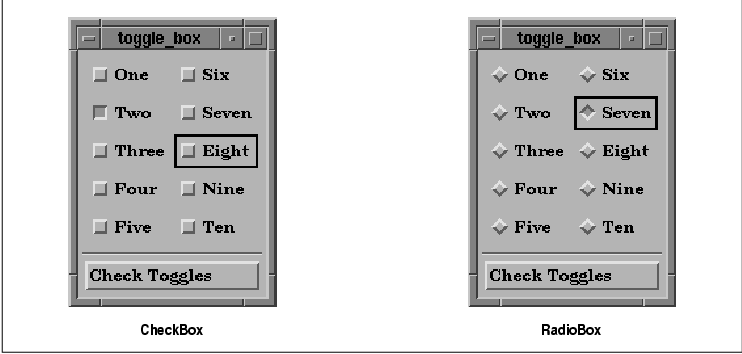
Checkbooks are quite self explanitory.

coffeebeqn
2 replies
3h11m

Hover isn’t really acceptable UX since the touchscreen era

jfengel
1 replies
2h45m

Even on desktops it's not great for accessibility. There isn't an indicator for what has tooltips, and they appear out of the usual flow of control.

Accessibility guidelines usually allow them but encourage you to make it a last resort.

caymanjim
0 replies
2h35m

Not to mention that half the time tooltips don't show up until you wiggle the mouse over them a bunch, and tooltip delays are arbitrarily timed and usually far, far too delayed (often on the order of hundreds of milliseconds when they should be like 10-50ms at most). And my biggest pet peeve about them is that, at least in Chromium-based browsers, they really don't like to go away once they finally show up, to the extent that I can often scroll the page until they're offscreen and they still don't disappear. Or they leave the farm entirely and persist outside the browser window.

bmitc
0 replies
2h42m

An element should do one thing, not two.

vel0city
0 replies
19m

Showing the current state matches light switches with the state on them.

https://www.homedepot.com/p/Leviton-15-Amp-Single-Pole-Switc...

Or car door locks which show red (unsafe) when unlocked. It's showing the current state, not the state that will be when toggled.

ncruces
7 replies
9h0m

The toggle is supposed to convey immediateness, like a light switch turning on bluetooth is immediate.

A checkbox is like filling a form, it requires submission for the action to take place.

ratg13
4 replies
8h34m

The parent comment is talking about how the colors are often set on a toggle.

That the user never knows if the toggle is in the on or off position.

stavros
3 replies
8h18m

Your parent is talking about their parent's second paragraph, about toggles in settings.

ratg13
2 replies
7h34m

That is what I am talking about as well

When the icon is white, is it on? Is it off?

They reinforce this with another example of ambiguity.

The user can’t be suggested to take any actions if they can’t figure out what the default settings are.

stavros
0 replies
7h29m

lstamour talked about two things, the proliferation of toggles, and the unclear toggle buttons.

ncruces replied clarifying the former, that the toggles proliferate because they convey immediateness. They didn't say anything about the "unclear toggle button" point.

Your comment, then, aimed to correct ncruces' comment, clarifying that lstamour was talking about unclear toggles, when ncruces was talking about the other point in lstamour's comment, and thus was already correct.

rezonant
0 replies
7h28m

Likewise I thought the article’s punchline was going to be the increasing use of on-off toggles instead of checkboxes.

That's the second paragraph. This would be those left/right toggles that became popularized with iOS on the original iPhone (since you could physically slide them with your finger). These also do have color insanity associated, though.

The third paragraph used "toggle" in a more general sense.

To be fair, the comment has a lot going on.

layer8
0 replies
5h57m

The real reason is that in contexts like the Settings app, where toggleable items are mixed with other items, checkboxes on the left would take too much space on mobile (especially on the early small-screen iPhones), because it would require the left margin to be increased for all items. Checkboxes on the right are awkward though, and thus were replaced by the toggle switches. The immediateness argument is just a convenient excuse. Immediately-effective checkboxes weren't uncommon on desktop before. In addition, there is "previous art" in the form of boolean-toggle menu items that are immediately effective and show a checkmark when active.

ajitid
0 replies
7h27m

This assumption breaks if you use macOS. Windows uses (or used to use) Apply button in its settings. Macintosh OSes were reactive from the start. Which means that checkboxes have immediate-ness on Macs.

arrrg
7 replies
6h4m

Ha! That‘s a surprise to me, I never noticed.

So, checking out Apple‘s first party apps it seems that checkboxes are either solid color round circles (just the outline when unchecked) with a checkmark in the middle (for multi selections in lists) or just toggles (typically in settings).

Those round checkboxes I could only find being used for list selections (even when the list is horizontal, e.g. when sharing a photo). Toggles for settings.

Radiobuttons seem to always come with one element already selected. I couldn’t find an instance of an empty list where you select one element. In those cases (e.g. when picking your WiFi network) they are just a solitary checkmark on the left without the circle.

It‘s internally consistent (as I assume visionOS is, too) and the checkbox design in visionOS is actually closer to iOS than macOS. I assume that‘s the origin with quite some history behind it. Nearly two decades.

I think the more exact statement would be that as far as iOS is concerned the checkbox already was dead for nearly two decades.

As far as UI conventions go I‘m not too worried. What worries me a bit more that this much more clearly frames visionOS (as well as running iPad apps) as a iOS descendant when this might be the platform with the space to be more clearly in the tradition of the Mac.

Y-bar
6 replies
5h51m

Radiobuttons seem to always come with one element already selected.

This Apple behaviour follows the HTML spec:

At all times, exactly one of the radio buttons in a set is checked. If none of the <INPUT> elements of a set of radio buttons specifies `CHECKED', then the user agent must check the first radio button of the set initially.

https://www.w3.org/TR/html401/interact/forms.html#radio

Kwpolska
5 replies
4h6m

The current standard says something else:

If none of the radio buttons in a radio button group are checked, then they will all be initially unchecked in the interface, until such time as one of them is checked (either by the user or by script).

That behaviour makes more sense for the Web, so that the user is required to make an explicit choice, and I'm not sure if browsers ever cared about this little part of the standard. When interacting with OS components, it makes sense that there's some default or already configured value.

https://html.spec.whatwg.org/multipage/input.html#radio-butt...

Y-bar
4 replies
2h44m

Huh, that's odd that it got changed. I can't think of any valid case where [no option] checked is part of a set of radio buttons. The user must be presented by a default, their entire reason for existing as is that one of them is checked all of the time.

Microsoft's Windows guidelines implicitly says that one option must always be checked: https://learn.microsoft.com/en-gb/windows/win32/uxguide/ctrl...

If none of the options is a valid choice, add another option to reflect this choice, such as None or Does not apply.
teo_zero
2 replies
2h20m

I can't think of any valid case where [no option] checked is part of a set of radio buttons. The user must be presented by a default

In a political vote, wouldn't that be untolerable bias?

Y-bar
1 replies
2h2m

I would never use a group of radio buttons in such a case, would you?

But if hard pressed and not allowed to design a better UI I would do the following options with radio buttons:

( * ) blank vote

( ) Option A (potentially in random order vs other non-blank options)

( ) Option B (potentially in random order vs other non-blank options)

( ) Option ... n

arrrg
0 replies
14m

Why would you not use radio buttons? And what pattern would you use instead? I don’t get it …

Radio buttons are the correct metaphor for picking one option among a list of options. Why use something else? What use interface element do you think exists that works for this kind of interaction?

I’m honestly confused why you think radio buttons are the wrong type of interface element for this interaction. What‘s the reasoning as to why this seems so obvious to you? I’m honestly just trying to understand you.

arrrg
0 replies
2h17m

Surveys are a valid use case for radio buttons that come unchecked by default.

You do not want to influence people by presenting them with a default (already checked) choice. (You also typically want to randomize the order, at least when there is no inherent order to the options, e.g. when you are asking about frequency.)

Surveys are also the place where that distinction between single choice (radio buttons) and multiple choice (checkboxes) becomes most apparent because surveys tend to liberally mix the two, so any additional UI signposts you can use to help people filling out the survey are helpful. (The typical recommendation for multiple choice is to still explicitly call out in text that multiple options can be checked.)

Surveys sometimes also have the absolutely wild combined list with checkboxes and – typically as the fixed last option even if you randomize the rest of the options – a radio button (e.g. “None of the above”) that automatically unchecks all other options (and is unchecks itself if any other option is picked).

I don’t think this exists in any spec anywhere but is the most normal thing in the world in most survey software.

I‘m always very precise with whether I use checkboxes or radio buttons when designing surveys.

rezonant
6 replies
7h30m

White/black "indicators" of toggles are horrid. A lot of phone and meeting apps do this and it's horrible.

As for mute, I think it's pretty objective at this point that an icon based toggle should show the current state, not the state that tapping on the icon will produce. That's because the icon is serving two jobs: Convey the state and let the user change it. When a developer gets this wrong and shows a crossed out speaker while audio is playing, that's just frustrating.

Y-bar
5 replies
6h56m

As for mute, I think it's pretty objective at this point that an icon based toggle should show the current state,

I can't see this holding up as the primary UI rule. And exceptions only for things like mute toggles are seldom a good thing in interfaces where predictability should be the king. It breaks down on play/pause toggles. The answer in my opinion is to separate the concern of the action and the state and distinctly show both at the same time.

rezonant
4 replies
5h54m

That's true, but I just can't live in a world where mute goes the opposite way. I'm not aware of a major media player that doesn't cross out the mute when audio is muted (assuming it uses a crossed out icon at all).

I also can't live in a world where play/pause is opposite to the way it is now: play icon should mean the media is paused, pause icon should mean the media is playing, as you suggest.

If we constrain ourselves to only having two buttons (one play/pause, one mute/unmute), and only differentiating them by the shown icon, then I'm afraid it just has to go with the convention. They are inconsistent with each other, but intuitiveness beats consistency I guess.

The answer in my opinion is to separate the concern of the action and the state and distinctly show both at the same time.

I don't think this is practical, especially on mobile. There is a need for these UIs to be concise, and even if there is enough space, each visual element comes at a cognitive premium to the user.

Y-bar
1 replies
5h45m

each visual element comes at a cognitive premium to the user.

As someone who studied two years of cognitive sciences as part of my degree, this is not necessarily true. Lack of information can often lead to even more cognitive load as the user then has to imagine virtual scenarios, an cognitive process which is linear. Visual processing however is largely parallel, faster and less consuming, as we have evolved to live in a visually complex and noisy environment.

rezonant
0 replies
5h26m

Fair, but I think there's a middle ground here, obviously an entire screen of buttons on top of a video occludes the content that you want to watch. Even if our visual cortex can handle it, I don't think its desirable if it can be avoided.

Of course, admittedly if all you have is a play button and a mute button (or some other very simple player) it probably doesn't matter much.

I think Twitch's UI is a good example of where the clutter goes too far. It's loaded with tons of distracting bits and bobs. Makes sense for their business model (most of these relate to how you can spend money on the platform), but from a user perspective it's unpleasant.

waqf
0 replies
5h12m

The mute on the touchbar on my MacBook Pro has a slash when unmuted (and also when muted).

It looks like this unmuted: https://discussions.apple.com/content/attachment/e909bffc-81...

and this muted: https://discussions.apple.com/content/attachment/e3e9c230-e4...

I believe the reason it always has the slash is to distinguish it from the "change volume" button (which, when pressed, pops up a volume slider). But it's still confusing.

thaumasiotes
0 replies
4h58m

Traditionally, the play / pause button is labeled with both icons. It has no need to display state, because the state of playing or being paused is obvious to the user. That button would be telling you the same thing you see by watching your video.

But a mute indicator isn't telling you how other people appear to you. (That would be "deafen".) It's telling you how you appear to other people, which you have no other way of knowing.

coffeebeqn
2 replies
3h11m

Toggle buttons are hard! I tried making some for a game I made once but ended up just using text because half the people thought it meant the opposite of what it did

hn_throwaway_99
1 replies
2h43m

So why not use a check box?

coffeebeqn
0 replies
1h56m

Re-inventing the wheel I guess

weinzierl
1 replies
8h59m

On iOS the toggles are off left, and shown as dim grey. They turn green when you shove them to the right into the on position. That's about as much as my brain can process.

In many other environments these clues are more subtle or completely absent and I never know which is which.

I don't necessarily wish my check-box back, because I think a slider is easier to handle on touch devices[1], but it should be done in a way that indicates the status clearly. Apple's use of color is also not perfect, but at least they did not fall into the trap of using red and green. Light grey and vibrant green should be distinguishable for most people with color deficiencies even.

[1] At least when implemented properly. I am looking at you Ninebot. Your huge on/off slider only let's me turn off my scooter when the stars are aligned right. I don't even bother anymore and just use the button on the scooter.

rezonant
0 replies
7h22m

because I think a slider is easier to handle on touch devices

I guess because the toggle has more real estate for you to tap? If so, then couldn't you just make the checkbox bigger and get the same ergonomics?

hermitcrab
1 replies
7h42m

I find toggles very confusing. Is it showing the current state, or what happens when I toggle the state?

dspillett
0 replies
7h6m

This doesn't need to be the case, though depending on context extra design elements (colour, descriptive text, …) may be needed to make the interpretation truly unambiguous.

Sometimes (advert stalking preferences being the key example) the confusion is very deliberately not dealt with, and furthermore on occasion extra steps are actively taken to ensure the confusion.

samstave
0 replies
2h26m

>>"...increasing use of on-off toggles instead of checkboxes"

One of the most egregiously angering thing to me is toggles that self un-toggle:

"Disconnecting Bluetooth Until Tomorrow"

WHAT?

I literally just commanded the device to turn something off which required me to pick it up, unlock it with a biometric identification, navigate to the settings containing the option I want to control with my physical hands, look at the screen, read the results for the object I want. Make the decision to turn a thing off. Do so by physically touching the device and adjusting the setting - not the Device says

"Oh you want that off? More than for just a little bit? Well, I'll have you know that we use your Bluetooth radio for a lot of our data tracking systems, so its important to us that its on - so we've coded your device's operating system to only allow you to turn off your Bluetooth radio temporarily so you feel like you're in control of it. Why? Because Fuck You Thats Why. Now go back to browsing reddit"

moontear
0 replies
4h33m

The articles punchline IS the use of toggle buttons?! Or have I misunderstood you?

gcanyon
0 replies
3h5m

I’m ashamed I never noticed this until you pointed it out. Standards can be broken insidiously, and it’s disappointing that a company that cared about consistent UI enough to put out the HIG. Having typed that, I read the HIG on toggles and realized that those items in iOS aren’t checkboxes. A checkbox turns something on or off. The “round checkboxes” used in iOS are to select multiple items for further action. I don’t know what those are, or if/where they’re covered in the HIG.

https://developer.apple.com/design/human-interface-guideline...

fsckboy
0 replies
3h27m

iOS has had round checkboxes since forever?

but iOS hasn't been around forever. In the spirit of TFA, iOS marks the start of the Vandals climbing over the gates and sacking what had been to melt it all down and make a soup of melty things.

dartos
0 replies
2h5m

Likewise I thought the article’s punchline was going to be the increasing use of on-off toggles instead of checkboxes

It kind of was. The last line of the article is “Kids these days will just use a toggle anyway”

cyclotron3k
0 replies
9h9m

Google Mail and Google Photos on Android also have round checkboxes.

amadeuspagel
0 replies
40m

Of course the entire point of the article is whining about the web and web developers.

LeonB
0 replies
3h52m

Yes absolutely this —

my fav pet peeve remains the unclear toggle button. When the icon is white, is it on? Is it off? Does the line through the microphone mean it’s muted? Or that it mutes when tapped? No one knows, tap it a few more times to find out…

There’s no UX consideration just design by committee, looking at static renders of the “design language”

al_borland
26 replies
11h20m

It sounds like this may be done in an effort to improve the reliability of eye tracking in VisionOS when dealing with checkbox, not Apple just throwing the design book out the window for no reason.

In general, prefer circular or capsule-shape buttons. People’s eyes tend to be drawn toward the corners in a shape, making it difficult to keep looking at the shape’s center. The more rounded a button’s shape, the easier it is for people to look steadily at it. When you need to display a button by itself, prefer a capsule-shape button.

https://developer.apple.com/design/human-interface-guideline...

Mtinie
16 replies
10h35m

I may be missing a fundamental point of your comment or from the linked content, but given the minuscule number of users who’d be concerned with this in practical presentation, I sincerely hope that the UXers involved didn’t optimize for this use case.

al_borland
13 replies
10h22m

From the OP’s article:

Apple is the first major operating system vendor who had abandoned a four-decades-long tradition. Their new visionOS — for the first time in the history of Apple — will have round checkboxes.

So the death of the square checkbox they are predicting is only in the context of VisionOS. Apple’s HIG explain why this decision was made (my link), so I don’t think it is part of a larger trend and we shouldn’t expect it to impact anyone not using VisionOS, or other such headsets with eye tracking. It was done for technical reasons relating how the person will interact with the device, not style reasons.

Dalewyn
10 replies
9h55m

Have you been living under a rock for the past few decades?

Apple has (re)defined and led the way on most if not all aesthetic trends followed by the IT industry. Round corners? Big touchpads? Chicklet keyboards? Thin and light? High resolution screens? The Notch(tm)?

If Apple redefines checkboxes to be round, they will be round everywhere subsequently. Reasoning be damned: Apple is doing round checkboxes, we (Microsoft, Google, Dell, HP, Lenovo, ASUS, MSI, et al.) must follow suit.

ludwik
9 replies
7h45m

I don't understand why some people feel the need to attack the only person in this thread who provided context about the change being discussed. You may agree with Apple's decision, or you may not. You might believe that it will have far-reaching negative consequences for the entire industry. Regardless, al_borland sharing the reasoning behind the decision (and linking to the source) is valuable and is the opposite of 'living under a rock'.

Dalewyn
8 replies
7h34m

I'm not disputing the logical reasoning behind circular checkboxes, I'm saying that if Apple does something then everyone else will follow suit regardless of any reasons.

Apple is the fashion leader and trend setter of the IT industry, everyone else will follow them. It's appropriate to ring the death bell for square checkboxes, given that track record.

ludwik
5 replies
7h19m

Of course, you can have your view and express it in this thread. I just don't get why that needs to come with being rude and confrontational towards the person who simply provided important context.

thaumasiotes
4 replies
4h45m

He did more than that. He also assured everyone that this was an isolated phenomenon:

>> Apple’s HIG explain why this decision was made (my link), so I don’t think it is part of a larger trend and we shouldn’t expect it to impact anyone not using VisionOS, or other such headsets with eye tracking.

Dalewyn's response makes perfect sense in this context.

ludwik
2 replies
3h39m

This is a factual statement. As it stands, the change isn't part of a larger trend even within Apple itself. It's isolated to a single niche platform that has specific UI constraints where the change actually makes sense. Apple hasn't applied this change to its other platforms, where it could become widespread and influence other vendors. Of course, it's entirely valid to argue that this might change in the future. But again, why resort to personal attacks against someone who's simply bringing important context to the discussion?

thaumasiotes
1 replies
3h23m

But again, why resort to personal attacks against someone who's simply bringing important context to the discussion?

Because that is an intentionally dishonest way to describe what he's doing? He's bringing context, and he's providing some low-quality opinions. What's being attacked are the opinions. They are not factual.

al_borland
0 replies
1h37m

A change made to a single OS, which was designed around a fundamentally different way of interaction than any other OS they have, that hasn’t been used anywhere else, is not a trend. If they start moving this to other operating systems, then it becomes a trend and I’d agree with you. It is currently a one-off on a niche device, which has UI requirements that differ from the requirements of the past 4 decades, as explained in the HIG.

You’re attacking opinions based on your own opinions and assumptions about the future and how all other companies might react, but that hasn’t happened yet and everyone doesn’t follow Apple blindly.

Apple still doesn’t have touch screens on laptops, a human interface decision based on how a person will interact with the device, and the industry at large has decided to go their own way on this and not follow Apple’s lead.

Apple has been making a mouse with a touch surface and a trackpad for desktops for many years, this is a decision based on how a human will interact with the system, that the industry has also not followed.

There are also UI elements in iOS, especial early iOS [1], that were changed to better work on a small touch screen that were never brought to macOS, or adopted by the whole industry. They have been used less and less as screens have gotten larger and better able to use more standard conventions. The select dropdown is alive and well, despite Apple changing its implementation in 2007, for similar reasons to the stated reason for changing the checkbox implementation on VisionOS.

[1] https://i.stack.imgur.com/Fi0ex.jpg

Dalewyn
0 replies
4h17m

Exactly. Apple's influence with regards to design and aesthetics is unparalleled, to downplay it is either straight ignorance or naivety.

Everything from naming schemes (iPhone -> Core i3/5/7/9, Macbook -> ASUS Zenbook, et al.), to desktop interfaces (MacOS -> Windows 11 Explorer, GNOME), to phone interfaces (iOS -> Android), to connectivity (rather the lack thereof), to form factor (Macbook Air -> Intel ultrabooks and EVO), to entire markets (smartphones, tablets, portable music players) and more have all been defined or redefined and led by Apple.

To suggest anything Apple does concerning design would be an isolated incident is ridiculous. If Apple says "jump", the IT industry asks "how high?".

mst
0 replies
4h49m

You could have posted that opinion as a top-level comment and/or skipped the 'living under a rock' snipe in your initial reply, given they weren't talking about that so they focused on the thing they -were- talking about and no rock needed to've been involved.

Implying the other person is a fool for not already agreeing with you before making your actual point doesn't generally tend to strengthen said point.

DanHulton
0 replies
1h50m

Apple has, for very specific reasons for a very specific (and niche) OS, started using rounded checkboxes. They have not (so far) started using them in any of their other, major OSes.

The claim that this is the death of checkboxes is at best too broad and too early. The death of checkboxes in AR/VR? POTENTIALLY. That's about as authoritative as I think anyone can claim to be at this point.

I liked this article a whole lot more when I thought it was tongue-in-cheek, but these comments, whoo boy.

troupo
0 replies
6h38m

Apple’s HIG explain why this decision was made

Honestly, I wouldn't trust any modern Apple HIGs. After the UX butchery of BigSur they retroactively updated the HIGs to justify their decisions.

hulitu
0 replies
9h21m

Apple’s HIG explain why this decision was made (my link), so I don’t think it is part of a larger trend

After seeing everybody adopt the Android flat UI (win 10), i really think that stupidity is contagious.

n2d4
1 replies
10h1m

It's not a "minuscule number" because visionOS is controlled by looking at things and pinching your fingers. If people subconsciously stare at the edges of a square button, can you imagine how often they'll misclick? (mispinch?)

layer8
0 replies
5h52m

Controls are highlighted in visionOS when you focus on them, making it clear when the pinching will or won't work.

kibwen
3 replies
7h47m

Even a rounded rectangle would be more distinguishable than a circle. This is a poor excuse that decreases usability masquerading as an increase to usability.

musha68k
2 replies
6h55m

“The sudden realization that the throne was empty.”

Y_Y
1 replies
4h24m

Is this a biblical reference?

FrontierProject
0 replies
3h35m

No.

endofreach
3 replies
7h21m

Great point. Very disappointing to read an critique that tries to appear thoroughly thought through, but not even considers that the company that has been very consistent in UX design choices, might have thought about what they're doing in a system, that probably requires fundamentally different approaches to UX.

I mean: > Apple is the first major operating system vendor who had abandoned a four-decades-long tradition. Their new visionOS — for the first time in the history of Apple — will have round checkboxes.

And yet the author is too lazy to think about that this might have a reason other than "they're stupid, look at all my screenshots, i know better than them".

Btw: not saying i agree with this decision. But why even take the time to write when not trying to actually think about what you're criticising?

Laughable.

toyg
1 replies
6h32m

Dad must know better, surely! It's absolutely impossible that almighty Apple is now full of subpar UX wannabes.

Apple design has been on a downright trajectory for a long time now, basically since Ive was promoted to the very top (yes he left now, but the damage was done). The Peter Principle doesn't make exceptions.

MichaelZuo
0 replies
1h40m

If someone spends over an hour writing a blog post than the normal expectation is that they at least spend a few minutes confirming the point based on information, or lack of, in publicly available resources, such as Apple design documents.

wonrax
0 replies
2h36m

Totally agree. I'm surprised that a post making a big claim with little research and shallow content like this got to the frontpage with over 800 upvotes. Sad you're being downvoted too.

demondemidi
0 replies
9h56m

I'm glad you actually brought a reason to this debate. Not sure I agree but there is at least a reason.

musha68k
21 replies
9h3m

Since ~2013 Apple designers have been throwing over board lots of conventions the company had been itself establishing for decades.

I remember user interface design class at my university ca. 2005 where 20 out of the 30 best practice interaction design patterns originated at Apple!

Steve Jobs for the most part really cared and you could feel those priorities clearly: "it's how it works, not how it looks!"

Aside from some natural missteps, the "form over function" critique at the time was predominantly false. Apple is slowly getting there though, joining "ignorant web" as correctly called out here by Nikita.

The thing is that none of this is a joke or could be taken however lightly. It's 2024 and by now we've fundamentally realized the "Software is Eating the World" prophecy; living in a digitally permeated world.

Bad design is a moral issue, in worst case scenarios it has been killing people before and will increasingly kill or harm even more going forward. It always starts with the little things, especially so in design / engineering.

I desperately hope that Zoomers at least will start to realize that Millenials really fucked it up in that regard. I know, I know it also were the bosses pushing for this but we clearly should have said "no" much more often as the professionals (?) implementing this stuff.

There is much satisfaction waiting in learning; a full-grown craft with deep history.

Zoomers: Alan Cooper's "About Face" is a great start, probably super cheap these days as seemingly no one cares anymore.

anon373839
15 replies
8h0m

For a few years in the last decade, it seemed that UX design was getting recognized as a serious discipline rooted in user research. Then, somehow, it devolved into fashion. When/why did that happen?

kibwen
4 replies
7h50m

> When/why did that happen?

There's no money in making a thing that works well, only in making things that look good. Effectively 100% of people who are using software are using it for things that fundamentally don't matter, so why should they care if the functionality is shit? Personal computers and phones are fashion statements, not useful devices. Business computers and phones exist to facilitate the bullshit jobs that employ the majority of the white-collar population. Follow the money; nobody with money cares.

wolletd
0 replies
6h51m

There's no money in making a thing that works well, only in making things that look good.

I work in a company building vending machines and such and it's the other way around here. Most products are shipped with a pretty mediocre UI because it just isn't valued. The software has to run the machine, vend products to people and don't eat their money.

tnolet
0 replies
6h42m

There's no money in making a thing that works well, only in making things that look good

Amazon, AWS, Salesforce and anything Oracle entered the chat.

More seriously, I think it really depends. People will use and pay large amounts of cash for stuff that solves there problem and does not have a fancy looking UI.

rezonant
0 replies
7h37m

Maybe a bit cynical and hyperbolic, but the point is good.

I'd boil it down further and say it's a focus on short term gains over long term gains. If the pan flashes, that's a win, full stop. When the pan stops flashing and people don't want to use your software because it's confusing, that doesn't matter because they can just flash another pan.

qznc
0 replies
5h29m

In other words: Make something people want. Ignore what people need.

j4yav
4 replies
7h8m

I'm sure there are many exceptions but a decent amount I've seen is portfolio-driven design, where the goal is more to have something eye-catching, unique and interesting that will look good in a portfolio and to show other designers, more than building something well considered and reliable/predictable. There can be a sense, especially amongst more junior designers, that the job of design is to add some style, and that design should be fun and much more like creating abstract art than making sure door handles are in a reasonable place and turn in the expected direction. The end result is, as you say, more fashion than function.

kossTKR
3 replies
5h11m

Does anyone have a design inspiration site that isn't this useless portfolio garbage?

It's incredibly annoying, and i say that with a an interest art, the abstract, cool concepts etc. but i want to see sites and interfaces with "actual messy real life content" not just one big image or whatever idiotic whitespace hell everyone's doing with way too much scrolling on Awwwards, Behance, Httpster, Gsap etc.

It's relatively easy to make a big font, a big picture and a 3d effect look cool, much harder to present 15+ items on one page and create a cool visual narrative around it that both grabs attention and lets the user go solo if he wants to without scrolling two miles.

I feel like a few newspapers were okay examples of this 5-10 years ago, but now they've also gone whitespace crazy.

We need a site like "Real life UX" or "Actual usable design" inspiration.

pilgrim0
0 replies
1h5m

Honestly? Install classic software and use it! I needed exactly those sort of references to design a project and knowing I wouldn’t find them on the web, I booted a win95 vm and studied it. My designs improved dramatically.

j4yav
0 replies
4h45m

Not that I’m aware of but that would be really cool. Case studies, with visual components, of how complex, real-world design problems were solved.

airstrike
0 replies
3h47m

If you find out the answer, I've also been looking for that everywhere to no avail. Sometimes I go to websites like https://dribbble.com/ and search "Rich UI" but results are really hit or miss (mostly miss)

gherkinnn
1 replies
7h31m

It started as user-centric research and when the user became the product the intent of this research shifted.

endgame
0 replies
7h17m

Doing research on the user, instead of for the user.

pilgrim0
0 replies
1h14m

I’ll give my perspective as a designer turned developer. People have always conflated design with “desenho” (drawing). But design is supposed to be more about information architecture. It just so happens that what’s usually trusted to be architected by designers is materialized graphically. But when the whole ecosystem of training and employment robs designers of their impact by not integrating them in both higher and lower level industrial processes, they’re hopelessly left at their corner, with a lot of energy to spend on what they actually have a stake on: visuals.

ksec
0 replies
3h40m

1. 99.99999% of management have zero understanding of UX. So their view of UX is basically some designer making it "pretty".

2. Most UX design aren't probably taught. Especially Software User Interface.

3. A lot of Design in that era came from Web. And if we read this article we already know or could guess what web design were like.

4. It is my observation that Tech, or Silicon Valley historically speaking learns very little about history of their industry. Unlike many other discipline, things comes and goes like fashion industry. Combine with Hype machine and VC money. Apart from Politics or Finance there is no other industry that contains as much noise as Tech.

5. Conservatism ( Not politics ) is generally not well accepted. Finished Software is not appreciated. And if you cant improve, or remake something, there is no way you can move up the ladder. The fundamental of not doing anything hype or large changes is against Resume Driven Development model.

gsich
0 replies
6h24m

Designers still want to work, so they change stuff randomly and sell it as "modern".

jstummbillig
1 replies
6h5m

I am quite positive, that (despite this and countless others fun examples to the contrary) the average the UX floor has risen by a lot.

Sure, things regress and move in waves, but on the whole user design has been established as the primary of software development and that really was a not the case back when.

Take something like error handling in a form. In a lot of average software, it was not at all uncommon for a form to just say "Error" when something went wrong (or just not submit). Or lose all form input after unsuccessful submission. Programmers were unironically confused about why people would not just enter correct information. People then wrote books about how to design form errors. Now, basically every web framework includes at least some form of validation and error handling by default(-ish), and most people would be seriously confused if they saw something like the above.

If you find it easy to poke holes into this one, please consider the average across all the little things that go into not fucking up a form, which is still hard to get really good, but again I am describing something of an average expectation here.

I would pin this to two major developments:

1. Designers are increasingly everywhere. If you think "duh?", this is entirely not how software was made. Programmers, commanded by business people, made software.

2. Most programmers today are also designers, and I don't mean in the sense that they always were (designing the software), but as in "thinking about people using the product".

Again, this might feel like a comical thing to even say but in most places programmers were just not expected to do anything to make the users life simple, unless explicitly told so. That was the designers job. In fact, a lot of programmers considered it a holy duty to fight any feature that was merely a convenience, and were quite adamant that, surely, the user could simply be expected to suffer a little and work a bit harder to get things done, if that meant keeping the code base pristine.

couchand
0 replies
4h34m

I think your point 2 is absolutely on the nose here. It fits in with broader industry trends in testing and operations.

And perhaps that's where the OP's question originated from?

As we've watched the despecialization of our field in testing and ops, we've seen that things improve, as ideas are introduced more widely, while also seeing them get mimicked and cargo-culted when the ideas are diffused.

Maybe the coders who were fighting against testing mandates or devops or design thinking were just insecurely admitting to their own ignorance on these topics and asking for assistance in being able to perform their new duties effectively?

One value in specialists is the freedom that comes with specialization enables them to do their job more completely. Fred Brooks's surgical team could not be more relevant.

robviren
0 replies
6h5m

I blame the human spirit. User interfaces could have been the one thing we collectively agreed to "stop innovating" on and delivered better experiences for everyone. People are unable to stop innovating. People paid to look at design can't just say, it's done, we did it. And now I fully expect for the rest of my life I will need to explore an increasingly complex labyrinth user interfaces for which I will one day be unable to figure out.

mst
0 replies
5h2m

Alan Cooper's "About Face" is a great start

I'm not sure if I read all the way through it when I first got my copy but it -is- very good and I have it stashed for the next time I end up doing UI design.

Well worth a look.

ksec
0 replies
3h53m

Since ~2013 Apple designers have been throwing over board lots of conventions the company had been itself establishing for decades.

2013 was when we first witness it in effect. It started a little earlier inside Apple. When Scot Forstall was forced out, the whole Software User Interface falls to Jony Ive and he basically ripped everything out and redesigned it with iOS 7. There is a huge different, or dare I say 95% completely unrelated field in Software UX and Hardware UX. Apple then spend the next 3-4 years walking back on all the design changes made in iOS 7.

Unfortunately a lot of UX learning was lost during that period. Including the Seniors of Human User Interface retiring during 2015 - 2020. The group has also grown rapidly in terms of numbers under Tim Cook. A lot of the Steve Jobs design requirement and "why" were diluted with more new members.

The design from Apple today may still look beautiful, but they are no longer as functional as they once were.

eviks
19 replies
11h9m

While the checkbox is less confusing than a lot of toggles (eg, the ones in Windows' settings are bad), relying on the unintuitive distinction between a circle and a square is just one of those bad old UI traditions that, I guess, persist until the next tech generation, little to love here.

The better UI would be for the circles to be visually connected somehow to illustrate that only one selection is possible like you have in physical switches with more than two positions

saghm
5 replies
10h31m

The better UI would be for the circles to be visually connected somehow to illustrate that only one selection is possible like you have in physical switches with more than two positions

This is an interesting point. Radio buttons are kind of weird in terms of their initial position because unlike with checkboxes, there's no way to get back to the "empty" state where none is selected. It took me a bit to wrap my head around what you described, but the more I think about it, the more it seems like a "slider" with clearly marked stopping positions. If it's too confusing for people to have some sort of "default" option, maybe having a different color for the part of the slider that's moved based on whether it's in a valid position could help; at the top of the slider, it could be one color indicating "must be moved", and then when you slide and drop it at one of the marked options (or click the option; it could move automatically to the position like a scrollbar), it changes color to show it's valid.

xg15
1 replies
9h37m

Microsoft briefly experimented with this, in the "security zones" dialog in Windows XP:

http://hs.windows.microsoft.com/resbox/en/6.2/main/9f04b9c9-...

It's not the exact design you describe: The slider is there, but only the label of the selected option is shown, the other options are only represented as tick marks.

I think there are two problems with the design though, (which would also still be there if all labels were shown):

- The slider widget back then was normally used for selecting continuous numeric or at least interval scaled input values: That's what the mechanism of dragging it with the mouse was developed for. It could be configured with a small number of discrete values as options, but then dragging became awkward: Either the ticks were spaced very far, then you had to drag the cursor a long distance before there was any kind of visual feedback at all - or the ticks were spaced closely, like here, but then dragging the slider to one specific tick became difficult.

- It's possible to click the slider, but there is no visual indication that you can do so. In fact, the visual indicators are almost inverse to how you'd need them: The selected option has a big handle that you can not click (only drag), the unselected options have no handle though you can actually click on the empty slider bar to move the handle in that direction.

I guess that's why they never did this again after this one try - which is sort of a pity, because you could probably build a redesigned slider widget optimized for discrete input that solved those problems.

8n4vidtmkvmk
0 replies
9h12m

But if it was implemented the way the parent poster said then it would be much more clear the discrete points are clickable.

wruza
1 replies
9h39m

Radio buttons are always one-of. Initially unselected is just a bug.

8n4vidtmkvmk
0 replies
9h10m

Not always. I've seen plenty of forms that are like "only fill this section out if XYZ" and if you accidentally start before reading that you're screwed.

eviks
0 replies
9h38m

Could be a slider with the same radio circles denoting the stopping position, could be those circle volume buttons with labeled marks, could be non-circle switches like these (other/position/steer on the right) https://img1.wsimg.com/isteam/ip/b81ca6f4-730a-4561-852c-096..., etc

Re. the missing default - you can have an explicit element "none selected" with the slider positioned there

Plenty of options to make UI more intuitive

wruza
4 replies
9h41m

Your disrespect for tradition will vanish the moment you’ll feel old and software that you were proficient with becomes inaccessible chunk of nonsense for no clear reason.

eviks
3 replies
9h34m

Or my disrespect for tradition will get reinforced when the old chunks of nonsense are replaced with something I can get proficient even when I feel old for the clear reason that it's so intuitive even the old folks can grasp it

wruza
0 replies
9h15m

We’ll celebrate this day all together! Meanwhile, let’s make life for older people harder, cause round checkboxes are so much more proficient. /snark

moffkalast
0 replies
6h51m

Best joke I've heard this week.

8n4vidtmkvmk
0 replies
9h16m

That's not the direction we're headed in though.

Some things are swipeable with no indication, or long pressable with no indication, we've removed scroll bars almost everywhere so no indication that something is scrollable unless the content gets cut off and you have reason to try to get to the rest of it, but sometimes it aligns nicely so you assume that's the end. Links and buttons we not only removed the underlines from but now they're grey which historically meant disabled... So no, none of this is intuitive.

Findecanor
3 replies
8h34m

For mutually-exclusive buttons with the labels inside the buttons, there exists such a convention: Group the buttons together with no space between them. Sometimes, the corners of the buttons at the far edges are rounded but the lines between them are not. You will often see these in word processors, for aligning text ( left | centred | or right ).

A related issue with radio buttons and check boxes is that in some GUIs, clicking the label next to the box/button also clicks the widget, but there was no visual indication that that is the case. Sometimes the clickable area even extends the whole width of the window. This carries the risk of users making a selection when all they wanted to do was to click the window in a seemingly inactive area to make it come to front.

I think we could solve that issue and visually connect radio buttons by placing them onto a background rectangle with rounded corners — thus adapting a visual cue from the button group widget. Then highlight the background portion that is clickable when the mouse hovers over it, and when the button/area gets clicked. Further, you could choose to make the colours consistent with those you'd use for selecting items in lists.

eviks
2 replies
7h57m

The text alignment buttons work because you know you can't have both centered and left, otherwise relying on subtle spacing would mostly signal some connection, not mutual exclusivity (similar to how those | symbols group related buttons together)

One solution to selectable labels would be to add the indeed missing indicator, e.g., you could have the whole label have a border when it's active (though in this case maybe you don't need radio buttons, but just have multiple lines that look like distinct lines?)

Hard to access the background group, I know it doesn't work if it includes labels like in the screenshot in another comment, but maybe only for buttons it'd be more understandable

chrismorgan
1 replies
5h28m

I thought there was an actual difference in presentation back in the days toolbar buttons actually had borders, but no, when you look at https://winworldpc.com/res/img/screenshots/6x-a08a659bdbb00f..., Word 6, you see it’s all just simple grouping of toolbar buttons, nothing to do with mutual exclusivity at all: New|Open|Save, Print|Preview|Spellcheck, Cut|Copy|Paste|PasteFormatting (if my memory serves me correctly?), …, AlignLeft|AlignCentre|AlignRight|Justify, Numbered|Bulleted|Dedent|Indent.

eviks
0 replies
1h27m

I thought it was true when compared alignment group with bold/italics, in the Word Ribbon UI they do seem to have less space separating them, but then in Wordpad the paragraph button next to alignment group seems to have the visually very similar space width and the icon is very similar, so there is no way such poorly perceptible convention helps even if it does exist

laurent123456
2 replies
10h11m

The better UI would be for the circles to be visually connected somehow to illustrate that only one selection is possible like you have in physical switches with more than two positions

Normally they are within a radio button group so that they are visually connected: https://i.stack.imgur.com/03p3T.jpg

eviks
1 replies
9h57m

Nope, this group tells you nothing about the fact that these are mutually exclusive, you could just as well group checkboxes because they are all related to some "Icon"

zilti
0 replies
8h4m

That's why the idea is that radio buttons are round, and checkboxes are rectangular.

hulitu
0 replies
8h20m

I agree. What the world needs, it is more circles. Damn those rectangular monitors. /s

ggm
15 replies
11h22m

In a similar vein, try explaining to a senior with fading skills that under material design literally nothing is a clue that a region on your screen is a button you can press.

Only prior use can inform what is active, and what is not.

Dalewyn
6 replies
11h18m

I am a mid-30s senior by this definition.

Well, maybe I am a senior. I know I spend far more time screaming at clouds nowadays and grow increasingly distant from what kids today are into.

sph
5 replies
9h43m

I don't blame the kids: the brutalist yet colorful zoomer UI design is much easier to parse for 30 year old seniors than the flat UI/material crap our generation created.

I have no way to defend this argument but my eyes, but I can say that Google's Material design is the most bland, insipid of them all, and I would rather see Bootstrap again than another Material-inspired with its white cards on white background and tap animations. Just kidding, Bootstrap was as bland.

I miss Windows 2000 every day.

zilti
3 replies
8h14m

What is that zoomer UI you are referring to?

sph
2 replies
7h10m

I have heard it referred that way, I didn't use zoomer as a slur.

I can't think of any example off my head, but I remember mention of a striking online clothing store with bold colours, thick black borders and large fonts that's very popular in that age range.

From a quick search on google: https://thedigitalmaze.com/blog/three-awesome-ui-design-tren...

See also the design for Gumroad: https://gumroad.com/

zilti
0 replies
5h10m

Ah, that is what that design is called? Heh. I've seen it, among other names, also been referred to as "chalkboard design". It also reminds me quite a bit of the style you use when drawing on flipcharts, and actually of 90s web design; the good parts of it, that is. I like the ideas behind it and the clarity, but I think everything tends to be hideously oversized on it.

hydrolox
0 replies
35m

Commonly called neo-brutalist ui, iirc. The only issue I have (well not only, but main), is that many have really really large text and it's hard to read. For example: gumroad

KTibow
0 replies
3h15m

At least M3's cards are slightly tinted

wolpoli
1 replies
10h57m

Don't forget to explain that some buttons are inside faint pill shaped shading (or it could be a search field in which they could tap without consequence) and that chips (to show options for a specific context, so they could tap without consequence) are rounded rectangles.

Except if the site is still on Material Design 2, then it is the reverse in which some buttons are inside rounded rectangles and that chips are inside pill shaped shading.

Are we confused yet?

Tempest1981
0 replies
6h52m

Can you share a picture of this?

demondemidi
1 replies
9h54m

a senior with fading skills

Recently had to help an aging parent use their phone to obtain medical care: an app was required to access their MyChart to get a message from their case manager. Having to explain what is "clickable" is infuriating. The race for UX/UI novelty is leaving seniors behind, which is tragic since hospitals are pushing them online.

Tempest1981
0 replies
6h48m

What does the 2035+ version of this look like? Seniors pushed to VR UIs?

resolutebat
0 replies
8h58m

The annoyance this causes is not limited to seniors.

divbzero
0 replies
1h20m

It’s definitely not just seniors. If you watch young kids use apps, they tap all over the screen to figure out which elements are actually interactive.

WesolyKubeczek
0 replies
8h53m

I have to argue that it’s not the senior’s skills that are fading.

Smoosh
0 replies
11h1m

And making it worse, past experience with other apps cannot be relied upon.

dexwiz
15 replies
11h37m

I like the checkboxes and loath the toggle. But after surveying people outside of the tech scene, for anyone with processing issues like ADHD, they report check boxes as easy to misinterpret. Something about the physical movement of the toggle helps them. So I relent and implement toggles.

But yeah, fuck round checkboxes. Shows the people driving now are more business oriented and have no love for the culture.

orangepanda
4 replies
10h42m

I dislike toggles as the on/off state is not always obvious. Some fun examples I've encountered:

* red is "on" and by default already selected, black is "off";

* black is "on";

* saw one cookie consent form with red meaning "on", and green meaning "off".

emayljames
1 replies
10h16m

That is frustrating, and very bad accessibility.

It should always be grey = off, darker = on.

jameshart
0 replies
3h53m

Except in dark mode when lighter should be on.

mike256
0 replies
10h3m

If you like to design good UX, you shouldn't look at any cookie consent forms.

masklinn
0 replies
6h19m

saw one cookie consent form with red meaning "on", and green meaning "off".

Cookie consent forms are specifically designed with all sorts of misleading and user-hostile patterns, so I would not take them as an example of anything. I'm sure there are consent forms out there with checkboxes where checked means no.

Too
3 replies
10h23m

There is a significant difference between checkboxes and toggles. Checkboxes expect a secondary submit step, whereas toggles have instant effect. https://blog.uxtweak.com/checkbox-vs-toggle-switch/ explains this better. Especially the pizza toppings example, that obviously make no sense with toggles.

emayljames
1 replies
10h19m

Only if that is how you implement it.

I have done tons of toggles that are not reactive, being a form submit

Too
0 replies
9h53m

You can...but it will be unexpected for most users and for most use cases. Look at the pizza toppings example in the link above again, it’s a clear semantic difference.

I can implement a radio button that allows multiple choices also, doesn’t mean it is the right thing to do.

Now there are of course exceptions to the rule. One case where instant reaction on checkboxes are common is filters in online stores. I think that’s a leftover design from the days you had to actively click search on each change to the filters. Those will work equally good with toggles.

zogrodea
0 replies
9h27m

Checkboxes can also have an indeterminate state (usually with a "-" in place of the checkmark), like the ones you can see at the below link (and which your link also mentions).

https://storybook.react95.io/?path=/story/controls-checkbox-...

I think the ternary checkbox has two uses: when it's a master checkbox, showing whether all of the binary checkboxes in a group are selected, and it may also be used on its own (the UI may have different actions for the three possible states).

Y_Y
1 replies
9h21m

My particular cultivar of ADHD doesn't have a problem with check boxes, and in fact I dislike toggles for some reason I can't quite identify. That alone is not a very useful anecdatum, but I'm having trouble figuring out what it is that would cause different adhdemons to favour the toggles.

There is a nice visual distinction for toggles, as if you have an "On" and "Off" column for each option. Then again that idea would have a conflict where it should be a radio circle because you can't be both On and Off, but a checkbox square because more than on option (row) could be On. Maybe a shape with a flat top and rounded sides (a "stadium") would be good for following the conventions while being worse and more confusing overall.

masklinn
0 replies
6h20m

in fact I dislike toggles for some reason I can't quite identify.

For me it's that the "on" and "off" state are styled inconsistently and can be difficult to guess without toggling. Whether a checkbox is checked or not is never in question.

There is a nice visual distinction for toggles, as if you have an "On" and "Off" column for each option.

Except there is no such column, so the visual distinction is not self documenting, whereas a checkbox or radio very much is.

Calzifer
1 replies
9h41m

The first time my mother encountered a toggle she tried to actually slide it. I also once saw a website which replaced in a redesign checkboxes with toggles where the cursor changes to a "grab hand" but of cause you cannot grab and slide them need to click it. Imo it is not intuitive that you have to click toggles and they magically start sliding but you cannot slide them.

Findecanor
0 replies
8h23m

I've encountered many toggle switches where you can grab the knob and drag it, but just clicking it will toggle it too. Sometimes the cursor has changed to a pointing hand.

moffkalast
0 replies
6h47m

Toggles are better than checkboxes imo, but checkboxes are a lot harder to mess up design-wise. It's really easy to make a toggle that makes it completely impossible to tell if it's on or off.

dheera
0 replies
11h14m

I like toggles, they are much larger touch targets and easier to hit one-handed when you're running late to a meeting and can't hold your phone still.

HackerThemAll
13 replies
4h28m

"people on the Web think conventions are boring. That regular controls need to be reinvented and redesigned. They don’t believe there are any norms."

That's why we have the accept button in dialogs (e.g. OK) on the left, or on the right, or in the window's title bar, depending on the intensity of mental disorder of the one designing the website theme.

Kwpolska
6 replies
4h14m

You don't need the Web for that. Windows puts the positive button on the left, macOS has it on the right, and Windows CE (for embedded stuff and palmtops with small screens) had OK buttons in the title bar.

coliveira
3 replies
2h58m

But at the least the decision is the same across the OS. If you spend several hours using the system you will know the "right" way. But in the web you're on nowhere's land.

hyperpape
2 replies
2h21m

When you put it that way, it kind of undermines the snark towards web developers. Of course things are inconsistent, no one is in charge to say “this is the way the platform does it.”

There are lots of other design sins this doesn’t excuse (low contrast, for instance), but expecting conventions to be as consistent as on a desktop OS feels naive.

kps
1 replies
1h38m

Doesn't a plain old <input> do it the way the platform does it?

hyperpape
0 replies
1h28m

I'm a little confused by your question. The discussion is about which button should be ok, and which should be cancel. The browser will not lay that out for you, you have to pick a layout.

There are some things where the browser will apply platform conventions, but nothing resembling the consistency you'd expect from (well-designed) native apps.

wruza
0 replies
3h49m

These are three different languages which are (ought to be) internally consistent though. Humans are pretty good at switching contexts when there's a clear difference between these, like using their PC, their Mac or holding their phone. What they suck at is learning something that isn't consistent at all.

red_admiral
0 replies
2h53m

At least in windows you can pretty consistently hit ENTER in a dialog box to close it with the default action, though. That's something that has always annoyed me on Mac.

jesterson
3 replies
4h21m

It’s not necessarily mental disorder. In some companies, when management runs out of ideas what to do, they start changing UI and pull revenue fluctuations as consequences of those “improvements”.

javajosh
2 replies
4h13m

It would be a real tragedy if they discovered you could write a webapp such that all such "pushing around the plate" activity could be done via CSS. But of course that is insufficient "drag" to dissipate managements excess energy, so this activity requires backend work as well.

Note that this only applies to management at cash cow businesses - startups have plenty of real work to do. This sets up an interesting dimension in the tension between the needs of Enterprise ("make small changes labor intensive") and startups ("make large changes quickly"): too much developer productivity would eliminate 80% of a huge set of bullshit jobs.

jesterson
0 replies
3h29m

They know about it, but they need to generate some activity. Just changing CSS is way too simple and you can’t claim much credit for that

gedy
0 replies
3h4m

You guys seem to be pinning this on developers, but 90% of this comes from ux designers and sometimes product. Devs are usually "just tell me what to do"

VoodooJuJu
0 replies
2h15m

Isn't another reason they constantly change up UIs is for the sake of novelty? Doesn't novel design signal "newness" to a prospect, which gives a desirable air of greater relevancy and trendiness? And does not this "newness" convert into more sales?

Kwpolska
0 replies
4h14m

You don't need the Web for that. Windows puts the positive button on the left, macOS has it on the right, and Windows CE (for embedded stuff and palmtops with small screens) had OK buttons in the title bar.

antonyme
8 replies
10h5m

Great article, and terrible idea. Wonder why the UI guidelines were bent here.

It's astonishing how many web designers have no idea about the difference between inclusive and mutually exclusive options.

I see checkboxes used all the time when they should be radio buttons. It's not rocket surgery. https://www.nngroup.com/articles/checkboxes-vs-radio-buttons...

tussa
3 replies
9h59m

All in the name of simplicity. Eventually Apple devices will just have one button that says "give us money".

vitiral
0 replies
3h7m
tialaramex
0 replies
8h7m

Pressing a button would be optional. No need to give Apple's customers a confusing choice - just transfer all their money to Apple who can prioritise Apple's needs appropriately.

5-
0 replies
3h10m

the technology is already there[0].

we're just a few reforms[1] away from having that commercialised.

[0] https://pubmed.ncbi.nlm.nih.gov/3492699/

[1] https://reason.com/2021/04/03/abolish-the-fda/

robador
3 replies
9h29m

Rocket surgery I'm gonna use this as the superlative of rocket science
code_biologist
2 replies
9h1m

I suspect that phrase may be a oblique reference to the absolutely lovely UI testing book "Rocket Surgery Made Easy: The Do-It-Yourself Guide to Finding and Fixing Usability Problems" by Steve Krug.

stavros
0 replies
8h13m

We've been using "rocket surgery" as a portmanteau of "rocket science" and "brain surgery" for decades, though.

almostnormal
0 replies
8h10m

The use of that mixture of rocket science and brain surgery predates that book from 2009 by at least 15 years.

romwell
6 replies
11h54m

Windows 95 remains the pinnacle of clear, discoverable GUI.

It's like the companies rolling out UI elements don't even bother running them past people, and are guided solely by what the design department thinks looks cool that day.

function_seven
2 replies
11h36m

I’m might quibble a bit and choose Windows 2000, or even XP despite the Fischer Price skin, but generally I agree.

Clickable things should have some minimal skeuomorphic detail and scrollbars need to be a minimum of some thickness.

ginko
0 replies
7h6m

You could disable the Fischer Price skin in XP. Many people did.

emayljames
0 replies
10h22m

Especially scrollbars. For a webdev trying to figure out what element triggers the scrollbar is extremely difficult with thin disappearing scrollbars.

vultour
0 replies
7h5m

Windows 7 was the last one that let you select the "classical" pre-XP theme. I was the only person I know who used it, and I miss it to this day.

beders
0 replies
10h35m

It was IBM who established the standards with its CUA books.

https://en.wikipedia.org/wiki/IBM_Common_User_Access

TheChaplain
0 replies
10h7m

This with MacOS 9 and GTK2 not far behind.

ipsum2
6 replies
9h27m

TIL radio buttons were named after the physical buttons used on older radios to select preset stations[0]. IMO they look nothing like the actual buttons on radios.

0: https://en.wikipedia.org/wiki/Radio_button

jeroenhd
2 replies
8h21m

We have controls that mimic the actual radio buttons in the form of toggle buttons (buttons that stay depressed after pressing them), but in many APIs the programmer needs to toggle the press state of all other buttons in the group to use them.

Preset radios came in a huge variety and some of them were actually round. Car radios (the radios that have stuck around the longest) need big and bulky buttons so you can operate them without taking your eyes off the road, but some home radios had smaller, circular buttons instead.

The "radio" buttons I used as a kid were small, rectangular sticks poking out of a metal plate that you pushed in. Every brand had their own shapes and designs. Unfortunately, I can't find any pictures of older radios on the internet because every image searching site seems to have been overtaken with badly generated AI art, stock photos, and cheap, plastic "retro vintage" Amazon listings.

hnbad
1 replies
6h39m

Here's one that seems genuine and has round radio buttons: https://i.pinimg.com/originals/f4/c8/8b/f4c88b861769e24674b4...

jeroenhd
0 replies
2h50m

Thank you!

eskodhi
1 replies
9h16m

Yeah the name definitely refers more to the functionality/behavior of the buttons.

You'd push one of those buttons in to select a station and it'd stay pressed. When you push another button in to choose another station, the previously pressed button would "pop" back up/depress (thereby "unselecting" itself), thereby enforcing the mutual exclusivity of a station selection.

thaumasiotes
0 replies
4h34m

That wasn't anything to do with radios though. That was just the way mutually exclusive buttons worked. I had a portable tape player where the playback controls were the same way.

vitiral
0 replies
3h4m

Huh, I thought they were "radio" because they communicated with each other. Still not a bad mnemonic IMO

Findecanor
6 replies
8h15m

BTW. Motif (on X11) used small bevelled squares for check boxes and a bevelled diamond shape for radio buttons. There was no checkmark, cross or coloured circle. Bevelled in was active. Bevelled out was not.

Example: https://www.oreilly.com/openbook/motif/vol6a/Vol6a_html/V6a....

josephg
4 replies
7h2m

For some reason I've always found this design incredibly ugly. My eyes just hate it for some reason.

Nevermark
1 replies
4h33m

Nearly all gray, with flat black, no gradients to smooth anything. Gives the impression of harsh lighting.

Very sharp-edged 3D boxy window design creates heavy cumbersome feel.

Inconsistent pixelly fonts.

Oddly aligned text in button.

Diamonds happen to be a shape that maximizes pixelation.

Indent in vs. out is cognitive heavy to process, relative to something less pure-dual.

Black selection border doesn't have consistent widths.

Separation line between big button and little buttons, despite obvious size and shape differences that already make that distinction.

Extra little borders defining window box corners from horizontal and vertical borders - a distinction that surely didn't need highlighting.

No rounding. (Granted, rounding would look pixelated.)

TLDR; It looks like an industrial lead brick you really don't want to drop onto your foot.

FrontierProject
0 replies
3h13m

Extra little borders defining window box corners from horizontal and vertical borders - a distinction that surely didn't need highlighting.

This actually designates an area where you can click and drag to resize the window. I'd argue that this behavior has become a ubiquitous expectation because of this design.

mwcampbell
0 replies
2h16m

To clarify, are you referring only to Motif, or the Windows 9x classic look as well?

Findecanor
0 replies
4h52m

When GTK 1.x and WindowMaker copied Motif's diamond, I hacked/themed both for personal use to make it a circle.

SGI had their own version of Motif with a look that was more like Mac and Windows of the time.

Kwpolska
0 replies
4h0m

Early builds of Windows 95 had diamonds too: http://toastytech.com/guis/chic58test.png

sumuyuda
4 replies
10h35m

I think the difference with the square checkbox is that it is for desktop UIs and clicking with a mouse. The circle checkbox is for mobile UIs where you are tapping with your finger.

mseepgood
1 replies
10h7m

You can't tap a square with your finger?

steezeburger
0 replies
9h51m

You might cut your finger on the sharp corners

emayljames
1 replies
10h26m

It removes the ability to instantly know whether you have a multiselect situation or a select-one situation.

hulitu
0 replies
8h24m

It doesn't matter. The user is an idiot. Just make sure that he enters its credit card details correctly. /s

davidverhasselt
4 replies
7h52m

I'm missing a good reason why the distinction needs to be made visually clear. More about this at the end.

I think a lot of this design thinking is stuck in the past, and we should be able to challenge and throw off some of the shackles or crutches that made sense back then, but might not anymore today, in order to advance and give priority to different goals.

In this specific case, it should be clear that you can select multiple options from context or by text, or it should be encouraged to try it out (i.e. easy to undo). If you need to rely on the visual difference of the icon, then you've already lost more than 50% of the people who don't realise this.

My thesis is that this visual difference is only useful to a select, minority group of people who have an above average level of interest in software, who would even be aware of it. Yes, they were probably the target market decades ago, but nowadays software caters to a wider group than that, and I wonder if you would survey a group of "normies" how many would actually rely on the visual distinction in any way (even just supportive).

I'm late 30s and I remember being confused about the difference between "radio buttons" and "checkboxes" when trying to learn HTML4 when I was young - even the name "radio button" was back then already only something older folks would be able to understand, why it's called that way. The distinction, even conceptually, was more confusing than helpful. It's really just a property of a list of checkboxes, how many you can select, not an entirely different class of UI component.

To continue on from my first sentence, and conclude my argument, this whole article does not contain a single good reason why that visual distinction is important in 2024. The closest I could find, is this line which implies confusion: "There was a brief confusion up until 1986 when Apple used rounded rectangles instead of circles". Just the fact that the article has to describe the difference and show visual examples, tells me that this is just no longer a concept that's important, as it may have been 30 years ago, from when it originated.

Instead, it only makes references to "tradition", "convention", "internal training", or arguments from authority such as "art director says so".

I think that kind of supports my point - in the context of UI of 2024, the only reason that one would keep the distinction visually is for tradition, not for any actual practical reason anymore, or the practical benefits that may still be there have diminished in value so that they don't outweigh the downsides or extra constraint anymore.

mixmastamyk
2 replies
7h3m

If you have to “try it out” to understand the interface for each program you’re wasting everyone’s time. No loss in giving clues to those who understand either.

There’s a real productivity benefit to learning and using standardized interfaces. The rest of your post reads like an appeal to “closed mindset” theory.

davidverhasselt
1 replies
6h22m

You've missed the point of my comment entirely and pulled two items out of context.

wruza
0 replies
4h1m

You seem to ignore the fact that people ignore ux advices. You can ask them politely, but they'll still slap something together and call it a day. And there's no way a complex control that you described can get into popular ui libs. Or to be approved by all "designers". These default looks of type="radio" and type="checkbox" are the last stand. If you break it, you'll complain even more but nobody would listen still. Cause defaults and easy ways rule the world. Accessibility is a rough battle already even without ideas that definitely won't work.

simion314
0 replies
7h12m

It's really just a property of a list of checkboxes, how many you can select, not an entirely different class of UI component.

Not really at all. Radio buttons are part of a group so 3 radio buttons are related and exclusive, there 3 check-boxes represent 3 different unrelated things. The typical example is selecting your gender/sex , you use a radio btn group and put 2 radio buttons or if you are less competent dev you recreate this with checkboxes, scripting and extra validation.

rubymamis
3 replies
9h56m

Apple ditched square checkboxes long ago in Apple Notes: https://imgur.com/a/HLrnXn3

I believe it was this way since the introduction of iOS 7 in 2014[1] (article from 2016).

[1] https://osxdaily.com/2016/01/25/how-to-add-checklists-to-not...

deafpolygon
2 replies
9h46m

This may be petty, but this is one of the reasons why I don't use Apple Notes. The design.

sph
0 replies
9h35m

I bought a Macbook in 2015 because I always loved their UI design. Safe to say, whatever's going on with Apple Notes was not what I had in mind.

The best designers in the world, keeping alive the worst UI trend of making everything flat and white without any separation, border or shading whatsoever.

rubymamis
0 replies
9h42m

I like its design - it's simple and familiar and just works. The circular checkboxes are annoying tho.

abraae
3 replies
9h59m

Much as I love a good rant like this, I have to wonder if this is just the world moving on.

I used to hate it (still do a little) when I toggle a checkbox, then go to hit "Save" and realise that the checkbox had immediate effect.

Now I observe that this is almost the norm. I guess I need to get over it.

I also hate it when people changed the scrollbar behaviour in any way. Then today I realised that one of my micro-frustrations with eclipse is that some UX genius decided to make the scrollbars fade away if there is inactivity. (Inactivity of a few seconds in an IDE is pretty normal - it represents thinking!).

But then I reflect that eclipse is a hard core programming tool, used by exactly the kind of people I would have expected to hate on this kind of thing. Instead, it seems that this highly technical audience is OK with this.

This article is absolutely on the money, and using rounded checkboxes is deliberately sabotaging one of the few strong mental models that we are able to hold about a UI.

But maybe this battle is over, and the UX enshittifiers have won.

hulitu
0 replies
8h21m

if this is just the world moving on.

It is just running in circles. It took Microsoft 3 releases to insert a background color selection in Win 10. I think that around Win 12 it will regain the option for foreground color. /s

demondemidi
0 replies
9h51m

hard core programming tool

lol. eclipse is a bucket of rusty panels held together with duct tape, but embedded companies that can't afford software devs and have never heard of UX/UI cling to it.

Kwpolska
0 replies
9h8m

Eclipse is a hardcore masochism tool, try IntelliJ IDEA for Java or just about anything else.

That said, is this behaviour actually Eclipse's, or is it following the settings of your OS? Windows 11, macOS, and probably some Linux things, decided that scrollbars are not cool and should be hidden or shrunk — but there should be an option to disable that (in Accessibility settings in Windows, in Appearance on macOS). Eclipse might also have its own setting.

xg15
2 replies
9h29m

My impression is that in modern UIs, both checkboxes and option buttons are being phased out: Checkboxes seems to be replaced with apple-style toggle buttons, which I guess are more intuitive for some people?

Option buttons don't have any direct replacement that I can think of, you just see them incredibly rarely. My guess is that they always were one of several possible means to have the user select from a set of choices, the other prominent ones being a plain listbox widget or a combobox/dropdown widget - or of course, just use plain buttons.

For some reason, designers seem to prefer plain buttons or a dropdown for this usecase today.

toyg
0 replies
6h24m

> apple-style toggle buttons, which I guess are more intuitive for some people?

You seriously overestimate the average competency in UX circles.

The algorithm outside Apple is basically "what would Apple use here?".

The algorithm inside Apple is basically "what will make people talk about us?"

Serious studies are for boring people. Design hipsters don't want to look boring.

lou1306
0 replies
4h22m

Toggles are actually not that bad as a checkbox replacement. But I feel they convey a lot of meaning through color (in iOS, sliders turn green when selected), whereas checkboxes reimain immediate even in b/w. I wonder whether people with severe colour blindness have any issue with that?

Ahh why didn't I take interface design as a career :)

pgeorgi
2 replies
9h42m

I suppose people forgot what "radio buttons" are (and where the name comes from). At least I haven't seen them on non-vintage devices in ages.

WIth that, it might make sense to reevaluate if they're still a useful UI language idiom, and if the different handling is still necessary.

skgough
0 replies
9h12m

I also think the visual idiom doesn't hold up, especially since implementers don't use radio buttons correctly half the time. To help people get the idea that they are possible choices for the same attribute, I like to wrap them in a <fieldset> with a <legend> that explains what their [name] attribute is associated with. I think this is how Win95 did it back in the day too

Kwpolska
0 replies
9h16m

The name might be antiquated, but the difference is still important and understood.

Nevermark
2 replies
6h41m

Forgive me for reflexively jumping to one of my favorite critiques of the universe:

Flat design weeds out a myriad of built in affordances of our visual system:

- Color to help us more quickly distinguish between things, what the things are, and their roles.

- Borders, to demark edges of active usable elements, communicate roles, encapsulate closely related things.

- Translucence as a way to combine subtle elements into a single form in a way our visual system can quickly interpret.

- Texture as another means of quickly communicating topic separation and indicating roles. Especially useful for areas containing other elements.

- Shading that our native visual system naturally interprets as rich 3D information. For processing separation, function, including the state of dynamic function.

- Smooth motions to draw attention to, and indicate changes of state.

I am NOT suggesting graphical interfaces should:

- Resemble a rainbow Christmas tree of "look-at-me!" ornaments.

- Organize hierarchical information in n-level nested Mondrian boxes.

- Be performatively stylish: overly glassy, shiny, lickable.

- Have unsubtle textures, or painstakingly recreate leather, felt, marble, or (dear baby Zeus) grass.

- Spray shading and shadows onto everything in an attempt to recreate VR on a flat screen.

- Sparkle, blink, bob and weave, and otherwise snow and distract us with motion.

I am suggesting that it is madness not to sparingly use large dimensions of our visual processing system, to communicate visual information.

These extra dimensions not only provide richer information for our visual fovea, but to our peripheral vision. Our brain is constantly processing peripheral vision to create context.

A classic case of form over function.

A classic case of "simple" as in "less design work, trivial brand language consistency", not "simple" as in "easy to discover, understand and use".

(As with the check/radio/button/selector, I cannot process that Apple fell for flat design. Such corporate amnesia. From design leader to lowest common denominator follower.)

xuhu
0 replies
3h47m

At some point material design will advance far enough that we can create material design apps in the terminal. I'm looking forward to it.

red_admiral
0 replies
2h49m

Good points, but just to be picky - there are a few good "flat + color" combinations out there, flat and colorless don't necessarily come as a package. After all, who doesn't want the default button to be in their brand's accent color?

Calzifer
2 replies
9h55m

If I think of square checkboxes I think of sharp corners. Maybe I should write an article "In Loving Memory of sharp corners" because I definitely miss them but they seem to be extinct from the modern Web and GUI in general. If I skim the article only old screenshots contain sharp corners. None of the new once.

I have a browser where I configured "border-radius: 0 !importent" as userContent.css for fun. Was sometimes surprised how much it is used. Especially how many circles are today actually boxes with a large border radius.

chrismorgan
0 replies
6h49m

Especially how many circles are today actually boxes with a large border radius.

HTML is all about rectangles. If you want circles, your choices are a straightforward CSS border-radius, or an SVG <circle>. And let me tell you, if you can just slap style="border-radius:50%;overflow:hidden" onto an <img>, or faff around with <svg>, <image>, <clipPath> and <circle> (or maybe you can even use clip-path="circle() fill-box" these days, can’t remember if support is there yet), I know which a sensible person will prefer.

Kwpolska
0 replies
9h12m

border-radius: 50% is the easiest and most compatible way to make a circle in CSS.

userbinator
1 replies
9h16m

Apple seems to have been one of the main forces behind the trend of adding rounded corners everywhere in UIs, which frankly is a style I don't like at all.

The irony is that some of their hardware has painfully sharp corners, the one place where rounding them would greatly improve comfort --- anyone touched the edges of a MacBook or Mac Mini and thought "why did they not smooth these off"?

thaumasiotes
0 replies
4h26m

When I had a macbook, I had to buy a plastic case for it, because otherwise its hard, pointy metal surface damaged my fingernails.

its-summertime
1 replies
9h9m

That’s why it’s common to see radio buttons containing checkmarks

The radio-buttons prior all included an additional inner circle to imply a selected state. You can't just have empty and filled, since filled could be off, and empty could be a filled circle over a filled circle, in other words on.

La, the prior was only good design because it was common design.

the_gipsy
0 replies
8h27m

It's the same for radio and checkox. All combinations of checked/unchecked, enabled/disabled, and focused/unfocused exist.

crucialfelix
1 replies
9h25m

Actual radio buttons in cars were for the most part rectangular

https://www.shutterstock.com/search/radio-buttons-old-car-ra...

There's a good explanation of how they worked here:

https://www.physicsforums.com/threads/how-do-old-timey-radio...

barnabee
0 replies
3h20m

It's obvious with hindsight, but I had never realised that that is why they're called radio buttons!

annabyrd
1 replies
9h51m

This made me feel warm and fuzzy inside! TY

hi083
0 replies
9h47m

me too

alentred
1 replies
9h8m

I remember reading a book about UX years ago, and one of the fundamental principles there was the discoverability and the intuitive use, which boiled down to sticking to conventions that are rooted in everyone's experience. Stuff like using check boxes and radio buttons properly, having the "OK" and "Cancel" buttons in their regular places (and not a "Maybe later"), using unambiguous confirmations (unlike the "Are you sure you do not want to not unsubscribe?"), sticking to the same navigation patterns users see in most other apps.

Now, I don't subscribe to it in full. There needs to be room for innovation. To my taste, it was quite boring when all software looked literally the same. Nevertheless, I agree there needs to be some reason too. Some short time ago every new app looked like a new game where you needed go through a tutorial to learn the basics. That was probably too much.

But, I don't know, as of late it feels like this iteration comes to and end, the apps start being intuitive again and reuse some patterns. The sidebars, user menus, etc. all in the same place. Mostly.

So, yay discoverability and intuitive use. But that doesn't mean we can't innovate in UX, while keeping it intuitive. Just not the "Maybe later" abusive way, please.

jeroenhd
0 replies
8h6m

There's nothing wrong with innovation, of course. A lot of controls needed to change to work well on touch interfaces, like the sliding toggles iOS use(d), and the large, connected touch areas that have replaced the small labels and click targets that computers used to have.

There's no reason to abandon the toggle button/checkbox distinction, though. They're still used distinctively, there are common practices to indicate those distinctions that go back decades, and I don't see any need to unify these controls.

NoZebra120vClip
1 replies
9h35m

Around 2015, I authored my résumé in LibreOffice, and I sprinkled in an assortment of bullet points. Some were indented. I used open squares, filled squares, open and filled circles, right-arrows, stars, etc.

I brought it into an employment center for critique, and my mentor informed me that those shapes all had different meanings and functions. It was a wake-up call for me.

I am not a UX/UI designer, so my experience with the UI elements in applications had been intuitive, and moreover, disconnected from the activity of authoring a non-interactive document.

So I believe that these UI features were imitating paper-based forms. Those ovals or circles on Scantron sheets: you'd better not fill in more than one per line! And being named "radio buttons": yes, if you pressed "AM" then the "FM" button popped out. If you had six presets in a car--wait a minute, those were oblong...

teddyh
0 replies
3h30m

my mentor informed me that those shapes all had different meanings and functions.

I have never heard of this. It sounds dubious, like those “flower language” lists which are all different.

AlienRobot
1 replies
8h23m

Is everybody insane?

I go to Windows, terrible GUI choices.

I go to Linux, GNOME makes terrible GUI choices. (Thank God for KDE)

I hear about Mac, terrible GUI choices.

Did all the people with experience in graphical user interfaces die off or retire?

zilti
0 replies
8h10m

Pretty much so, yes. It is cheaper to just get some random dude on Fiverr who has no clue about GUI design, but can whip up something pretty that impresses the manager who has no idea about UX and GUI design either.

wigster
0 replies
6h56m

the horizontal switch has doomed us all. terrible design. i absolutely loathe them.

is it on or is it off?

erm, hard to tell

so let's put a little mark inside it to show its on. a little mark. a check mark. you know, like a check box.

ffs

vasvir
0 replies
11h23m

Nice Article with a lot of research to gather all these screeshots that sent me down the memory line.

What can I say? The world (of computing) changes under our feet.

Nostalgia on Sunday morning...

usrbinbash
0 replies
6h19m

I therefore officially announce 2024 to be the year when the square checkbox has finally died.

Or, alternatively, I could just not put up with Apples crap and use something else ;-)

squarefoot
0 replies
10h39m

Not to mention the confusion arising from checkboxes in web pages used in place of checkmarks. A checkmark alone should be the correct object to use for output only, while a checkbox normally would accept an input from the user. I don't recall where, but have seen this some times around the web and found it misleading.

seydor
0 replies
9h15m

they are replaced by those slider-switch that came from mobile and are supposed to resemble lightbulb switches. A specific type of switch that seems to be popular in america, and it s hard to immediately grasp for most others

secondcoming
0 replies
2h58m

First they came for our scrollbars and I said nothing, Then they came for visible control edges and I said nothing...

UI design has had some really questionable 'improvements' over the years.

scelerat
0 replies
1h6m

Small nit: I'm pretty certain the Mac System software from pre-1.0 up until System 7 had identical UI widgets for things like check boxes, radio buttons, buttons, etc. The screen shot in the article is from the Control Panel desktop accessory (DA) which is showing radio buttons in a compressed or stylized way because of the compact nature of the DA

rc_kas
0 replies
3h33m

This makes me more angry than I expected to be or should be. Fuckin Apple, fix your checkboxes.

punkspider
0 replies
8h8m

I chuckled when switching to dark mode on this website. The result is hilarious. When clicking it the page becomes dark and your cursor becomes like a flashlight. Definitely doesn't help with reading. Feels like it's a statement against dark mode. I love opinionated blogs like this.

palisade
0 replies
3h31m

I think maybe the concept of () vs [] for radio buttons and checkboxes respectively is in part due to the mathematical concept of a bounded number range where the numbers at the end of the range are included inclusively or exclusively. I'm not saying they're the same concept, but that it might have inspired their usage. Just a theory.

neilv
0 replies
7h48m

I’m not sure when the distinction between square/round was introduced, but it seems to already exist in the 90-s:

I always thought everyone was mimicking the 1984 Macintosh on this.

mtillman
0 replies
2h53m

Good grief Sonoma looks like garbage. Hadn’t looked at side by side comps before. Going to adopt a “don’t hire designers from Apple” policy like the old “don’t hire product people from yahoo” policy.

matricaria
0 replies
7h2m

Apples Reminders app has been using round checkboxes for a long time. Not to defend that choice, but visionOS is not the first occurrence.

krick
0 replies
48m

The only place I've noticed this is Telegram UI, and this really throws me off every time. There's absolutely no way to tell if it's a multiple-choice and since you usually cannot just un-vote in Telegram, it is very confusing.

keb_
0 replies
5h7m

This blog's neon yellow color scheme makes it unreadable. Luckily, it has a dark mode... which is unusable on mobile. Ironic this post about design is on a blog that's poorly designed.

karaterobot
0 replies
3h39m

Though I have seen a few instances of it happening, I don't see a widespread lack of square checkboxes. I think he's cherry-picking. But then I spend more time on the web than in mobile.

In general, I'm not worried about this. To the extent that it is confusing to users, and to the extent that confusion causes problems, it will be corrected in time. Nobody is incentivized to have bad UI if it costs them money. People on HN seem to think designers run everything, and that they spend most of the day trying to make things harder for users (out of native malice, or because it makes them feel smart). The reality is that in most places, designers actually want things to be better, and product choices are driven exclusively by money made by users successfully using your app. "We can't fix our bad UI because it will make our designers angry" is not something I have ever heard said at any company I've worked for.

hermitcrab
0 replies
7h45m

Damn you Apple!

herbcso
0 replies
6h19m

Fuuuuuuuuuuuuuuu...

I am DEEPLY offended by this travesty! Why can't we have nice things!? The enshittification is real...

endofreach
0 replies
7h26m

How should we even call these? Radio checks? Check buttons?

Duh, obviously it's a quantum-radio button!

eduction
0 replies
3h7m

Actually!, having two subtly different click-on selectors was never a good idea.

There should be no “radio buttons” only checkboxes and then use select menus for exclusive selection.

Physical push-in radio buttons have not been in new cars since the 1970s. Even digital radio preset buttons are gone now.

Select menus, the kind that popup when you click on them, are unambiguously exclusive-choice menus. Just use those.

cloudking
0 replies
5h21m

Took me a while to find CSS property "accent-color" to style the color of selected checkboxes.

atoav
0 replies
6h48m

There are two explainationa for apple deciding to make checkboxes round:

- they don't know the difference between radio buttons and checkboxes

- they know the difference between radio and checkboxes, but don't care

I don't know which of those is worse.

at_a_remove
0 replies
9h20m

If it is round, it isn't a checkbox, it is a checkhole.

People see something round, "box" isn't the first word that comes to mind.

In my previous history as a ... as a web person (I think that's both broad and vague enough to encompass the yes-I-did-that-too sense of things), I had an ever-growing disdain for the designers who were off on their own flights of fancy. Usable? Explainable? Accessible? Senior-friendly? Then, late to the party, I got this iPhone thing and I was astonished at how much the device expected me to know about how the interface worked, on a deep level. I tried to get my mother into an iPad and, frustratingly, could find no good cheat sheets on the "gestures," to the point where I made a laminated, color-coded and numbered set of sheet on gestures, screen, etc. I help out an even older senior with her computer and ... well, I think the i-UX people are frankly out in their own la-la land and their hubris is sustained only by Apple's inertia/network effect/market dominance.

In a kinder, gentler world, these UX teams would be required to make a general style sheet document, which would be applied to various real-world applications, and then they would be forced to watch a senior citizen attempt to navigate their trash to, say, get a test result from the hospital. Should this not be accomplished in under five minutes, they are thrown into a hell of leather-clad demons who beat them with sticks while patiently explaining that their design, in fact, sucks.

UX design has begun to resemble fashion in an Oscar Wilde manner, "so intolerable that we have to alter it every six months." It's getting divorced from meaning and utility, and worse yet, constancy. Nobody wants to relearn UX for your crap app just so you can be cutting edge with sliders that resemble the phases of the moon.

almostnormal
0 replies
7h54m

If I remember correctly Borland claimed compliance with some standard for the TUI toolkit provided as part of Turbo Pascal. I cannot remeber which ISO it may have been, or if details like checkboxes were covered by it.

Does the current ISO 9241 cover that topic?

The three recent main losses of clarity/usability seem to be: 1) links no longer visually identifiable, 2) changes applying instantly instead of only when pressing apply/ok and no cancel button to revert, 3) now the loss of visually identifiable checkboxes.

Shouldn't things become easier and more clearly identifiable to use with todays user base of 100% of mankind compared to limited few persons 30 years ago? Why is the opposite happening?

Eikcalb
0 replies
7h55m

This site somehow made me dislike dark mode in a good way. That was wayyyy too dark